Telling Effective Data Stories with Data, Narrative, and Visuals

“Storytelling is the most powerful way to put ideas into the world today,” says Robert McKee, a screenwriting guru. Today’s corporate world is rife with poorly designed slides cluttered with inappropriate charts, and data storytelling is the key to converting data to insights that drive actions and value.
Data stories are proven to be more memorable, persuasive, and engaging than statistics alone. But how do we tell data stories? Brent Dykes, the author of Effective Data Storytelling: How to Drive Change with Data, Narrative, and Visuals, formulated a valuable framework for building data stories.
In this framework, data stories are made up of three components – narrative, data, and visuals. In this post, we will deep dive into each of these components of data stories.
 Figure 1: Narrative, visuals and data are data stories that drive changes
Narrative Structure
Most stories follow a common arc – a protagonist who faces a complication goes on a journey of resolving a difficulty before returning to their normal lives. Aristotle’s Tragedy Structure, Campbell’s Hero’s Journey, and Freytag’s Pyramid are variations of these common patterns in stories.
Data stories stand to benefit from the age-old narrative structure. A data story begins by setting the scene of the current situation, proceeds by providing insights that lead up to the central insight, and ends with relevant recommendations.
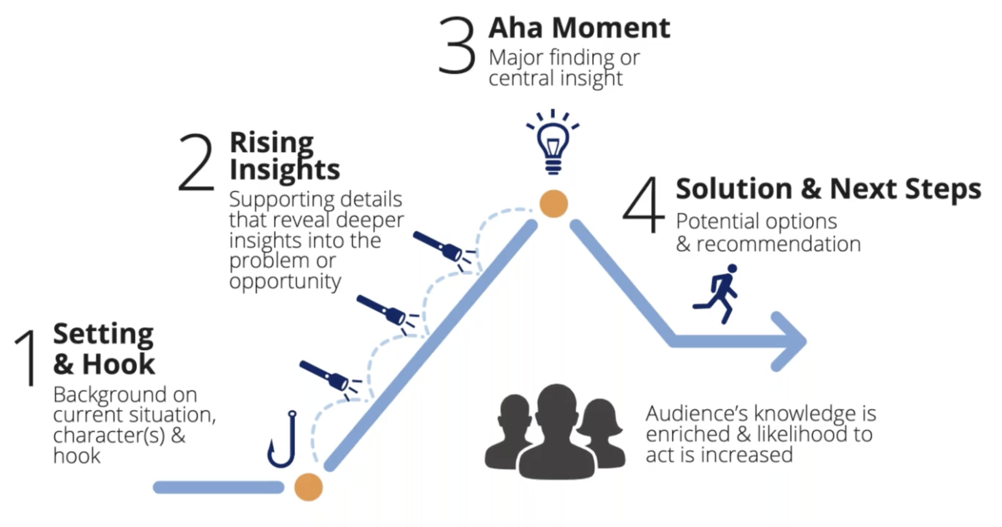 Figure 2. The narrative structure of a data story
Data
Analysts facing a deluge of data may be tempted to squeeze all the available data into one chart. Those who do so risk muddling their data stories with noise and confusing their audience.
That is why selecting the right data in a data story is crucial. Brent Dykes advised data storytellers to remove or aggregate secondary data points, as the examples below demonstrate.
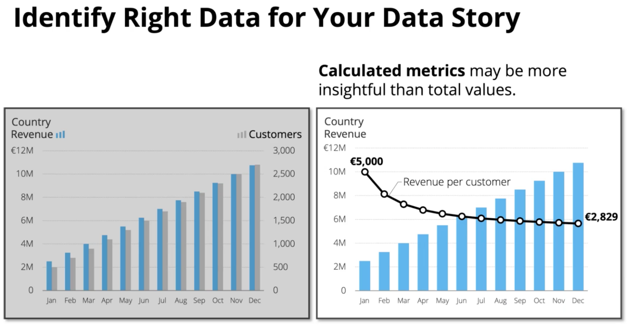 Figure 3. Explicitly demonstrating that the revenue per customer is falling (right) is a better choice than plotting the total revenue and customer side-by-side (left)
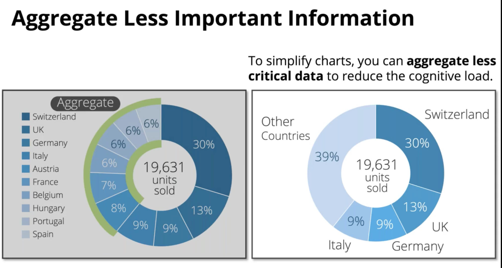 Figure 4. The market shares of the largest markets become apparent when the smallest markets are aggregated.
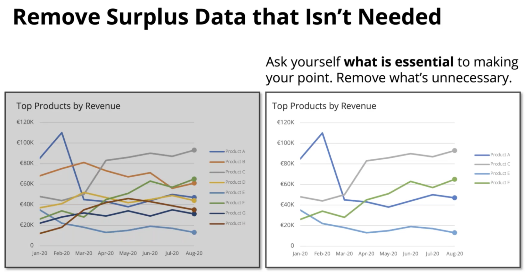 Figure 5. Often, less is more when it comes to showing multiple charts in one graph.
Visuals
Armed with the right structure and data, we are ready to use visuals to tell the data story. Here, Brent offers useful tips in crafting the perfect visual for the data story.
1. Choose the appropriate visualization
Visualizations differ in effectiveness based on the context of the data story. The key is to select the best chart based on the message.
For example, bar charts are superior to pie charts in communicating differences in proportions (Figure 6A vs Figure 6B). On the other hand, pie charts are a better choice when illustrating the sum of proportions across categories (Figure 7A vs Figure 7B).
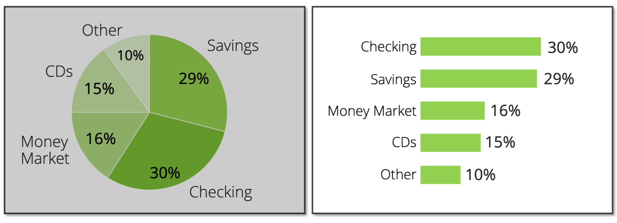 Figure 6A and 6B
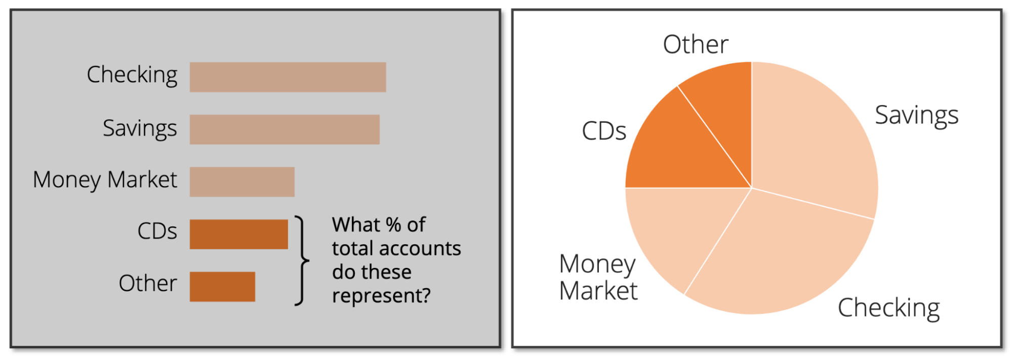 Figure 7A and Figure 7B
2. Calibrate the visuals to the message
A proper data story arranges the visuals such that they meet the audience’s needs. In demonstrating the point, Dykes compared two charts that convey the same data optimized for slightly different goals.
Comparing Figures 7A with 7B, we observe how the alignment of horizontal axes makes it easier for the audience to make quick comparisons.
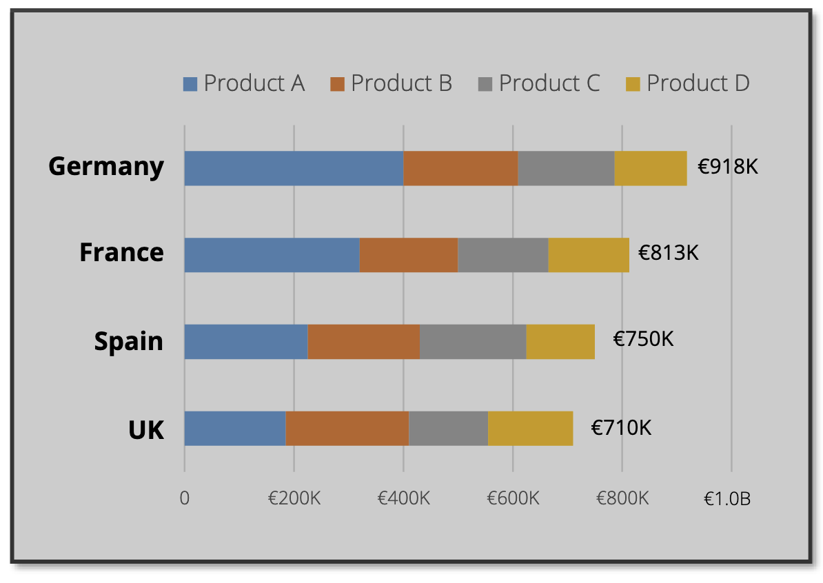 Figure 8A. A comparison of the total revenue from each country
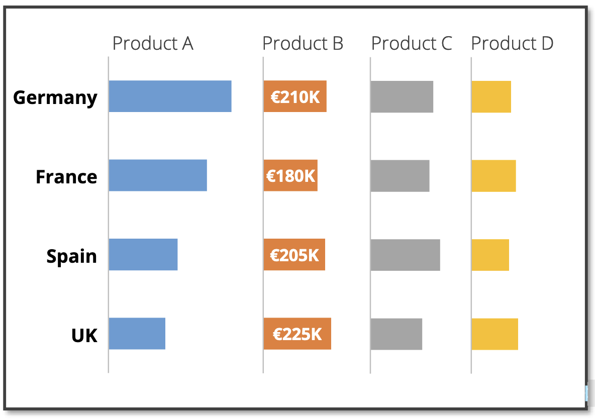 Figure 8B. A comparison of the revenue of individual products across countries, especially for product B
On the other hand, Figure 9A and 9B are rearranged slightly differently depending on the goal of the visualization.
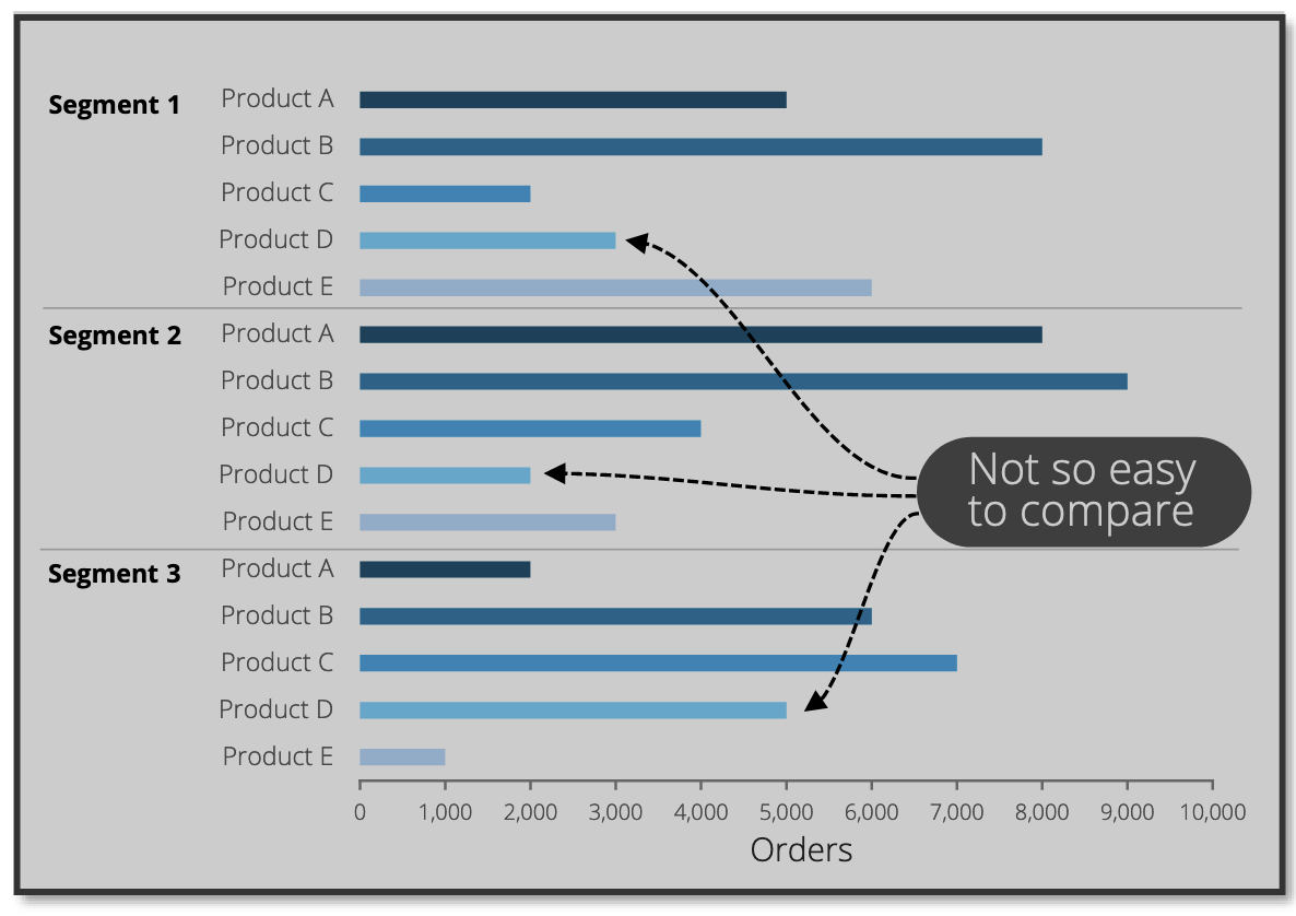 Figure 9A. A comparison across products for each segment
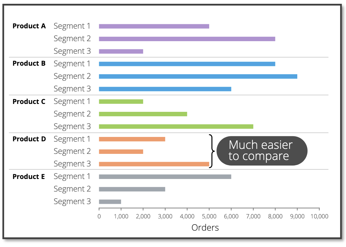 Figure 9B. A comparison across segments for each product
3. Focusing the attention of the audience
The audience pays attention to what stands out in a chart. Highlighting the key points distills the signal from the noise, allowing the audience to garner insights from charts quickly.
As an example, the sparing use of colors (Fig 10B) and text (Fig 10C) can drastically improve a cluttered chart (Fig Figure 10A).
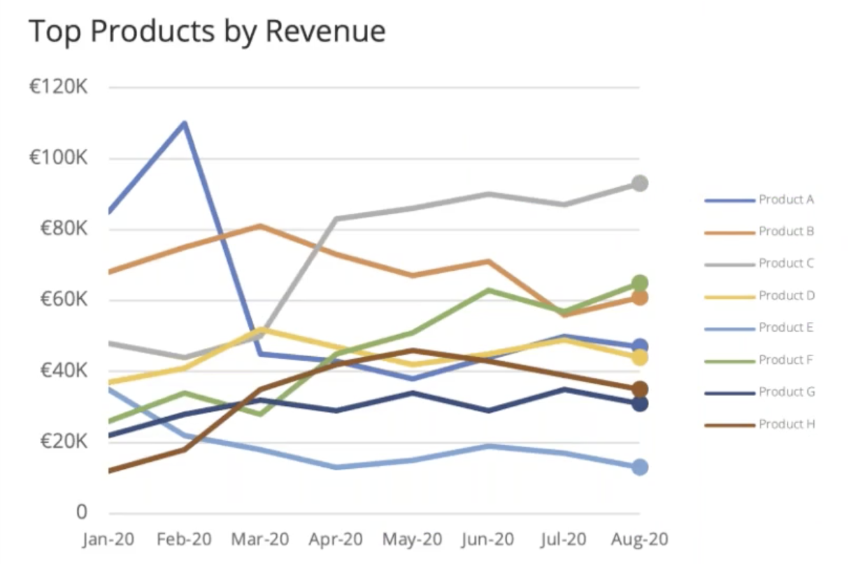 Figure 10A
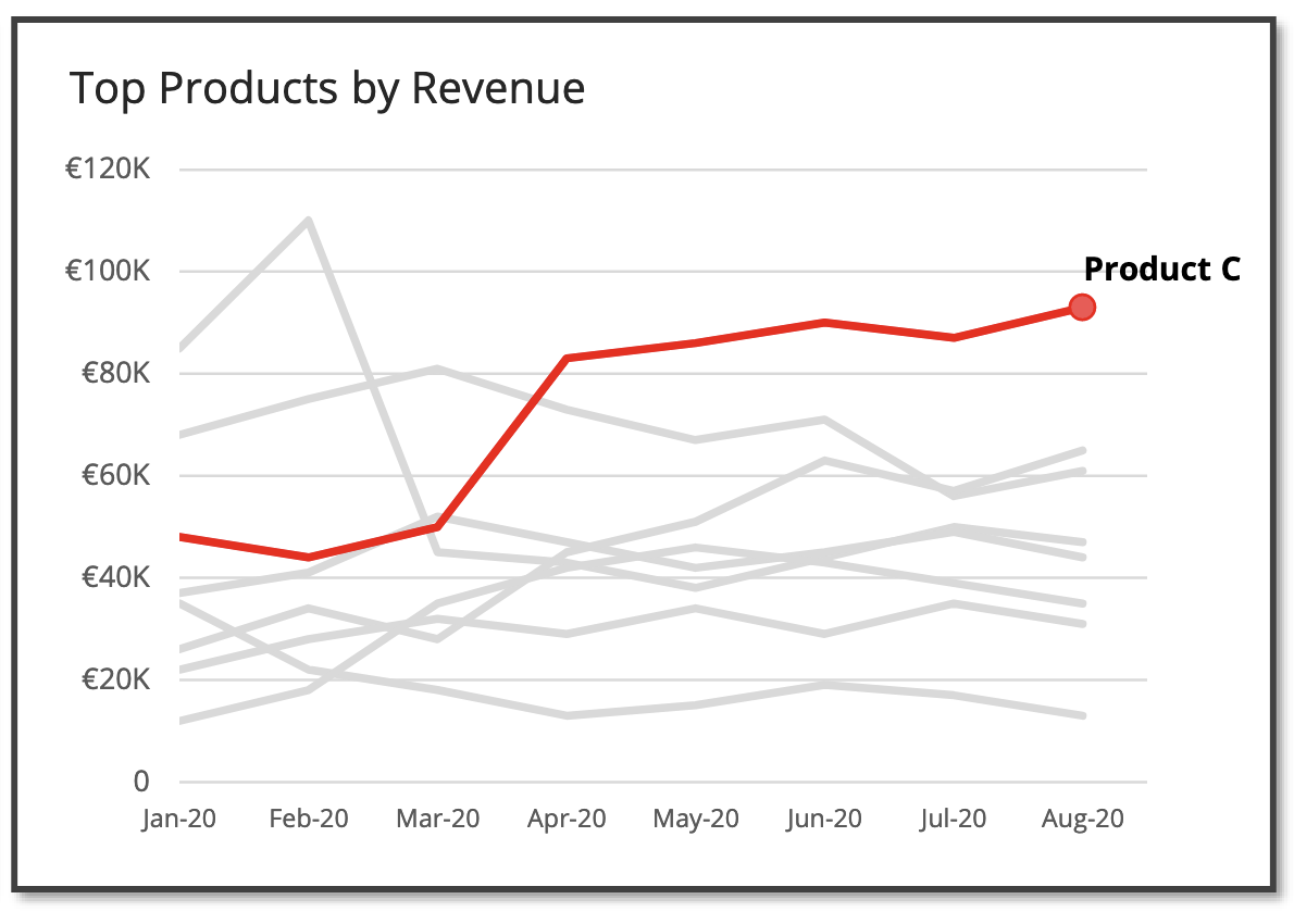 Figure 10B
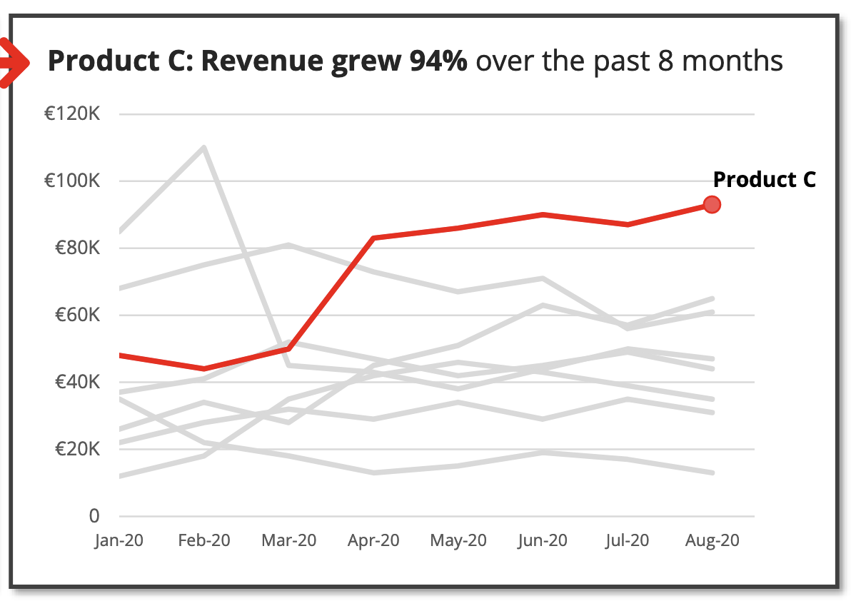 Figure 10C
Another technique to focus the attention of the audience is to reveal the insights in stages using animations. In the following example (Figure 11), the audience is able to visualize the impact of a significant decline in profit at the start of Covid-19.
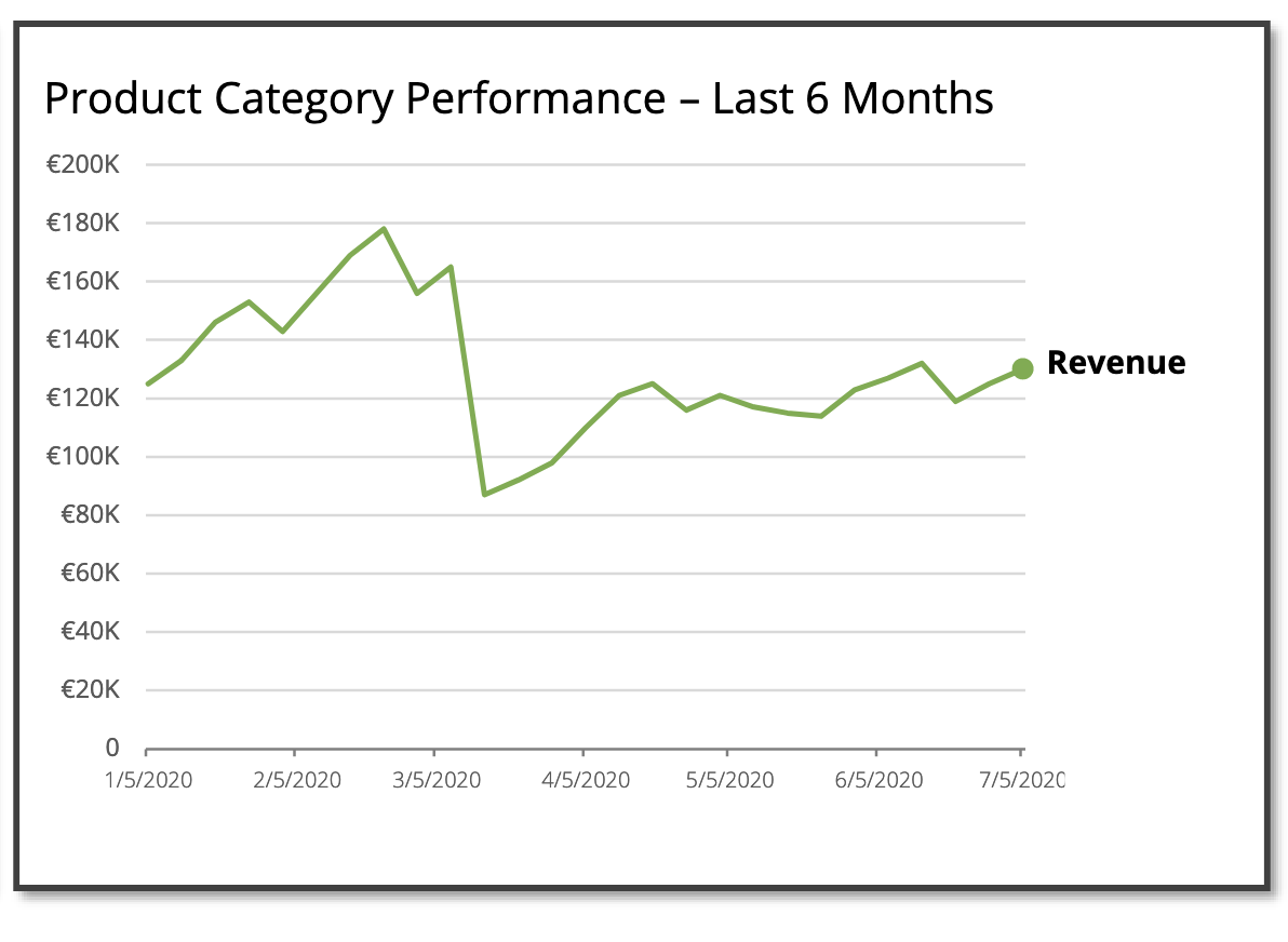

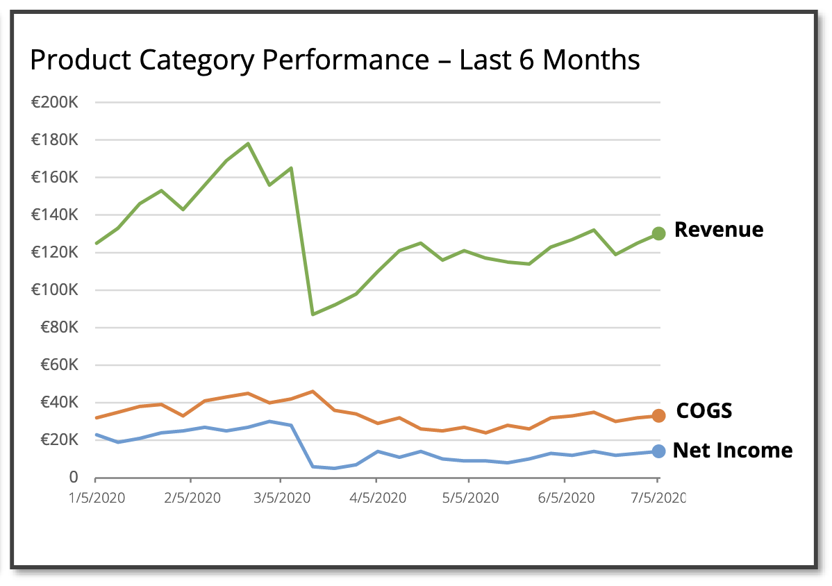
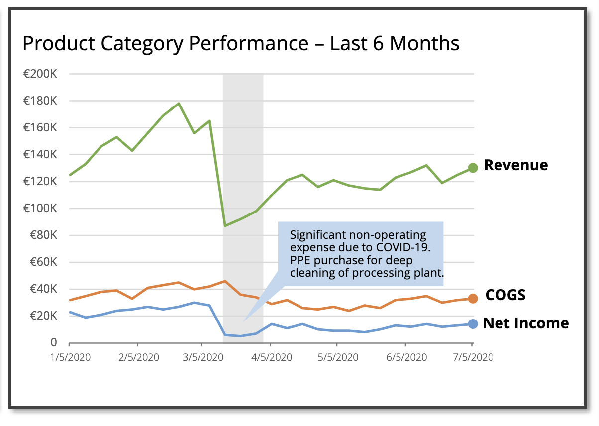 Fig 11: Revealing insights in stages
Conclusion
“Many bold, incredible insights will suffer a similar fate if they are not successfully molded into data stories,” Brent wrote. As such, the skill sets of data storytelling will continue to grow in importance as companies amass more data.
Whether you are new or a veteran in data storytelling, the webinar “Effective Data Storytelling: How to Turn Insights into Action” by Brent offers valuable frameworks and practical tips for data storytellers of all levels.


11 Data Visualization Techniques for Every Use-Case with Examples

Javier Canales Luna
16 min
Top 32 AWS Interview Questions and Answers For 2024

Zoumana Keita
15 min
Data Storytelling and Visualization with Lea Pica from Present Beyond Measure

Richie Cotton
71 min

Avoiding Burnout for Data Professionals with Jen Fisher, Human Sustainability Leader at Deloitte

Adel Nehme
44 min

Becoming Remarkable with Guy Kawasaki, Author and Chief Evangelist at Canva
Richie Cotton
55 min
Types of Data Plots and How to Create Them in Python

Elena Kosourova
21 min