Course
Analyzing Data in Tableau
8 hr
45.3K
The creation of new variables or fields is very important when extracting insights from data.. Oftentimes, a dataset doesn’t contain all the necessary information to extract insights, , but it’s possible to derive new features from existing ones, such as averages, ratios, bins, and categorical variables. Most of the time, there is a need for new fields to obtain clearer analyses and visualizations.
In this tutorial, we’ll walk you through creating fields with Tableau. We’ll go step by step, starting from simple to more complex examples, and at the end, we’ll give further tips and resources to master this extremely useful feature in Tableau.
Calculated Fields are one of the most powerful features of Tableau. They provide a way to create new data from existing data. For example, let’s suppose we want to predict the price of an apartment in New York based on its characteristics, like the number of bedrooms, number of bathrooms, and so on.
It may be useful to how far away the apartment is from a subway station, but this information isn’t available directly from the dataset. Then, we need to derive it from existing fields, like the address. You can easily learn about this Tableau feature from our course.
Given the popularity of Tableau for creating data visualizations, why is it crucial to create Calculation Fields? There are several reasons:
Sometimes, it’s hard to apply a filter when there is missing data or many conditions to meet. Building a calculation field can save you time when there are a lot of conditions to consider. Suppose you are working at a software company and are trying to group your users into segments based on the time since they registered, the amount of time they spent on your platform, which features they have used, and how much they pay you. The logic for dealing with so many variables can get very complicated, and in this case, it becomes easier to create a calculated field rather than use the filter tools.
In some cases, there is the need to create categorical features from a numeric feature, particularly when creating data visualizations. This is known as "binning" or "discretizing" the numeric data. A common example is that rather than reporting on the exact ages of people, you group them into age bins, like 16 to 25, 26 to 35, 36 to 45, and so on. This can help preserve the privacy of the people in the dataset.
Another key advantage of creating calculation fields is to transform data at the row level based on one or more variables. Changing the unit of a variable is a common example. You may wish to standardize the value of international sales in US dollars or convert imperial units to metric.
While those row-wise calculations will return a value for every row of the dataset, you can also calculate aggregated measures, also known as summary statistics, to return a single value such as average, variance, minimum, and maximum.
Let’s try some practical examples using the Airbnb open listings summary data of Lisbon in Portugal. The data comes from Inside Airbnb. Each row corresponds to a different Airbnb listing.
The features included are the hostname, the neighborhood, the room type, and so on. After installing Tableau Public on your local PC, you just open the listing.csv file as a text file, and then, you can begin to create new fields.
For each of the following six examples, we recommend you start with a new sheet since we will work with different fields each time.
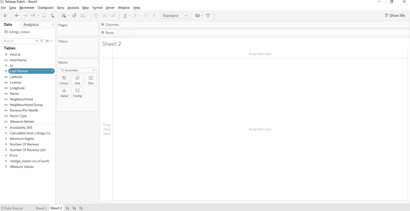
Let’s suppose that we want to visualize the number of reviews by month, but there is only the [Last Review] available with the full date. (In this case, [Reviews Per Month] is an existing field, and we'll use this to check our answer.) So, we would like to extract the month from that field.
To do this operation, we require the following steps:
[Last Review] DAY, MONTH, and YEAR. For further information, check the Tableau documentation.MONTH([Last Review]) into the calculation editorMonth of Last Review to Dimension by right-clicking the measure in the Data pane and selecting Convert to Dimension.Congratulations! You have learned to create your first Tableau calculated field while working with date functions, which are very useful with temporal data. Moreover, you understood how to create pivot tables using the row headers and filter by a field.
Another field could be created to study the price depending on the reviews written during the week or on the weekend. We surely expect to observe higher prices on the weekend compared to the rest of the week, but we should also consider that some clients don’t write the reviews on the same day they do the check-out.
This field can be obtained through IF-THEN statements, which are part of the available logical functions of Tableau. Depending on the condition imposed, it returns a specific value.
These are the following steps:
1. Create a new sheet
2. Right-click on Last Review.
3. Press Create > Create a calculated field.
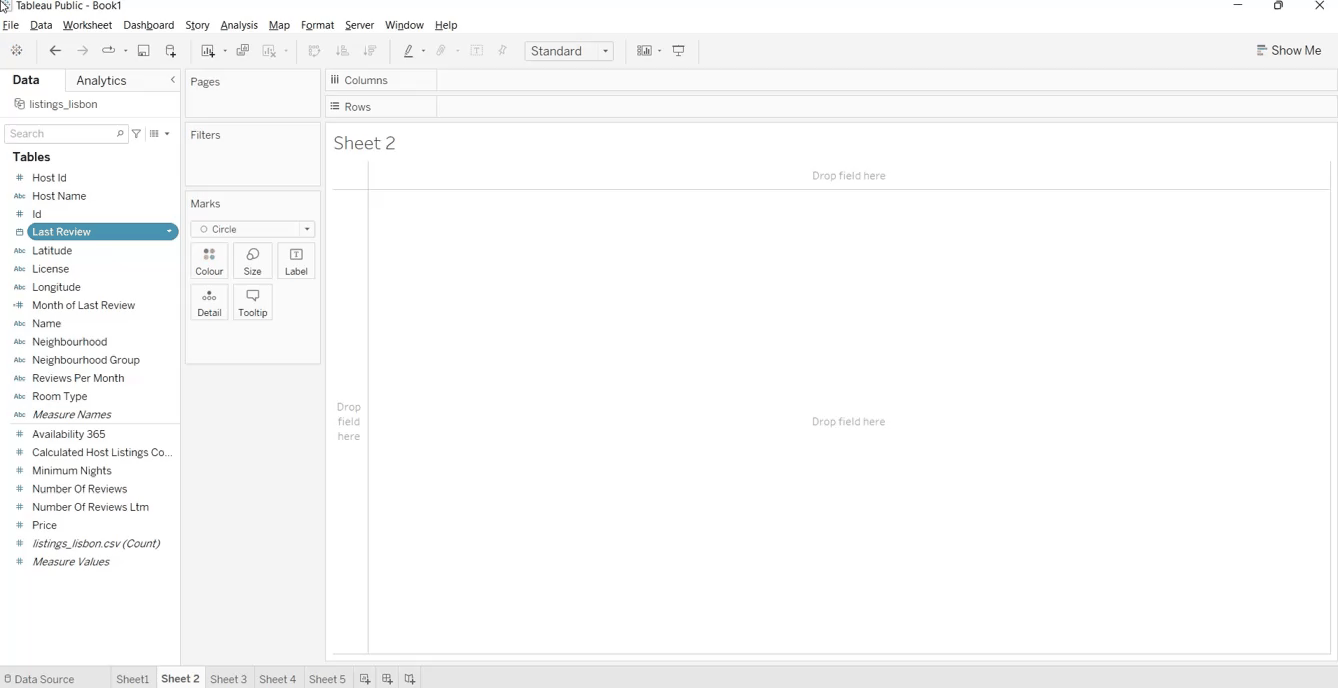
4. Into the empty box, we write the formula with if-else statements. This time, we need to extract the weekday from the Last Review field, where 1 and 7 correspond respectively to Sunday and Saturday. So, we create a new variable, called Weekend day, returns ‘Weekend day’ if the weekday is Saturday or Sunday, and ‘Working day’ otherwise.
If DATEPART('weekday',[Last Review]) IN (1, 7) THEN 'Weekend day'

ELSE 'Working day'

END
5. We click the OK button once it’s done
6. We again convert weekend days to Dimension.
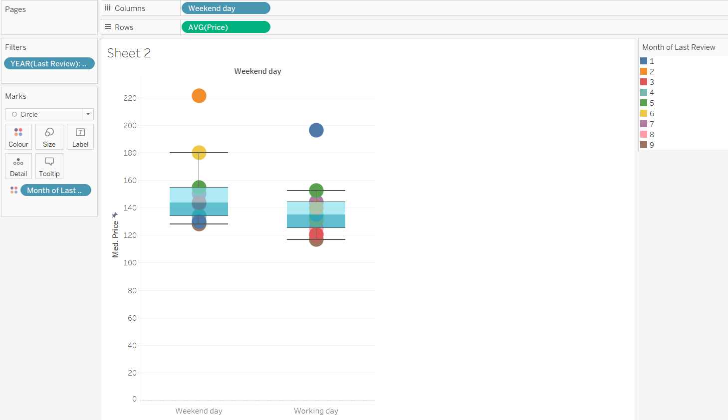
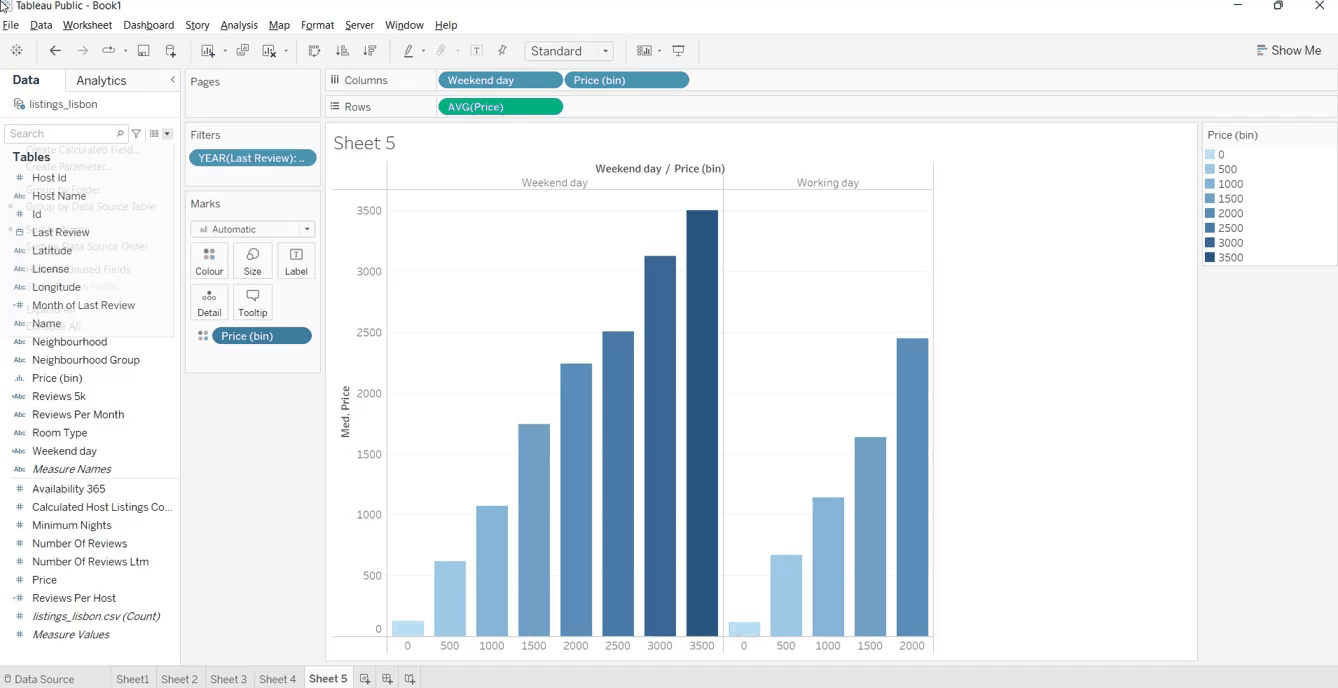
In this case, we would like to observe the average price on the weekend vs the average price during the weeks of 2022:
From the boxplots, we can easily visualize the price distribution during the week and on the weekend. In 2022, the average price on the weekend seems higher compared to the rest of the week. This information can be deduced by looking at the minimum, the first quartile, the median, the third quartile, and the maximum.
Regarding the month of the last review, we can observe the highest average prices in February and June on the weekend, while during the week, the most expensive months seem January and May.
In Airbnb, the trust of customers has a crucial role. The more a host has reviews, the more the customers are inclined to trust them and their listings. So, we would like to find the sum of reviews for each host.
The results can be achieved by exploiting FIXED as an expression. It computes a value for each dimension considered. This case can be split into different steps:
1. Create a new sheet
2. Click Analysis from the menu and press the "Create Calculated Field..." option.
3. Name the field “Reviews Per Host” and write the formula, shown below. The expression FIXED is used to group the data. It’s equivalent to GROUP BY in SQL.
{FIXED [Host Id],[Host Name]:SUM([Number Of Reviews])}4. Select OK once you have written the right formula.
Great! We have created the Reviews Per Host field. Now it’s time to create a new sheet and visualize the new field with stacked bars.
So, we need to add the sum of this new field in the rows box, while Host Id and Host Name are inserted into Columns. After we select the icon to sort the number of reviews and click once to have the number of reviews in decreasing order.
From these stacked bars, we can visualize the top 14 hosts that reached the highest number of reviews and, consequently, are the most trusted by the customers in Lisbon.
The data visualization created in the previous example is quite messy. It would be better to observe directly the hosts with the highest reviews. For this reason, we will create a field for hosts with more than 5k reviews.
1. Create a new sheet
2. Right-Click on Reviews Per Host, the field created previously.
3. Press Create > Create a calculated field.
4. Call the field “Reviews 5k” and write the formula, specified above. IIF is a logical function that checks if a condition is met. In this case, the condition consists in controlling if the number of reviews per host is higher than 5,000. If that condition is respected, the modality is ‘Apply Filter.’ Another value is ‘No filter’ in the opposite case.
IIF([Reviews Per Host]>5000,'Apply Filter','No Filter')5. Press OK
Once the field is added to the dataset, we can reproduce the same plot shown when we have built Reviews Per Host. In addition, we add Reviews 5k in the filter box, and we click the modality ‘Apply Filter.’ In this way, we’ll observe the hosts that had more than 5,000 reviews.
We can observe the top three hosts that reached more than 7,000 reviews. The most popular host is Pedro, with 9,000 reviews.
Here comes the last part: we divide the average price into different groups of equal size, called bins. Bins are very useful for organizing the values of a measure into different groups.
For example, if we are studying the average price during the week and on the weekend, it would be insightful to compare these two distributions by distinguishing different ranges of price.
The procedure to build bins is very easy and intuitive.
So, we want to investigate again on the average price during the week and on the weekend, using the weekend day field, created in the second example. From the previous analysis, the average price in 2022 seemed higher on the weekend than during the week. Let’s check again by adding the price divided into different intervals:
From the two histograms, we can notice that the average price during the week is at a maximum between 200 and 2500, while the weekend has intervals containing higher values of the average price. This aspect surely has an impact on the two distributions and confirms the observations of the second example that the average price is higher on the weekend that on the rest of the week.
Another functionality that could be useful when working with bins is the possibility to modify the size of bins from the plot legend.
These are the steps to create our dynamic parameter to change the size of bins:
After this parameter is created, we also need to edit the Price (bins) field. Instead of a step size equal to 500, we substitute it with the Price Bins Control parameter. This operation is done by:
Later, right-click on Price Bins Control, and select Show Parameter. Then, we can control the size of the bins through this parameter. This is possible by clicking two arrows under the parameter at the top right: the left arrow to decrease the size of bins and the right arrow to increase the value.
You will notice that the histograms will change as soon as you increase the size of the bins.
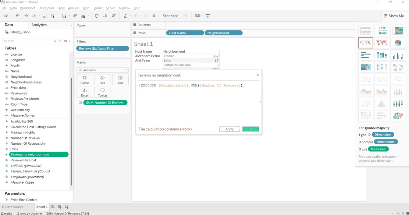
EXCLUDE is a Tableau expression that allows you to create a field where some details are removed. In this tutorial, we can use it to observe the number of reviews by excluding the neighborhood. Indeed, it’s challenging to visualize the number of reviews grouped by each neighborhood and the total number of reviews without considering the neighborhood in the same table. Before starting, create a new sheet.
To create this field, we follow these steps:
1. Create a new sheet
2. Press Analysis from the menu and select Create Calculated Field.
3. Call the field ‘Reviews no neighborhood’ and write the following formula.
{EXCLUDE [Neighborhood]:SUM([Number Of Reviews])}4. Click OK.
5. Drag the new field to the pivot table between Neighborhood and Number of Reviews.
The article introduced you to Tableau Calculation Fields. It also showed six demonstrative examples that let you understand why you need to calculate fields while doing exploratory analysis.
With this guide, you can learn to create calculation fields while learning to use Tableau. Start with a simple hypothesis and make it in practice by exploiting this Tableau functionality. You can do a deeper dive into Tableau with our Data Analyst in Tableau Track and find some quick wins with our Tableau Cheat Sheet.
Top Tableau Courses
Course
Course
Course
Chloe Lubin
19 min
Jess Ahmet
6 min
Adel Nehme
15 min
Zoumana Keita
8 min
Chloe Lubin
7 min
Chloe Lubin
7 min