Course
Intermediate Data Visualization with ggplot2
4 hr
42.9K
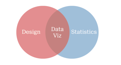
Data visualization is an essential skill for data scientists. It combines statistics and design in meaningful and appropriate ways. On the one hand, data visualization is a form of graphical data analysis, emphasizing accurate representation, and data interpretation. On the other hand, data visualization relies on good design choices to make our plots attractive and aid both the understanding and communication of results. On top of that, there is an element of creativity, since data visualization is a form of visual communication at its heart.
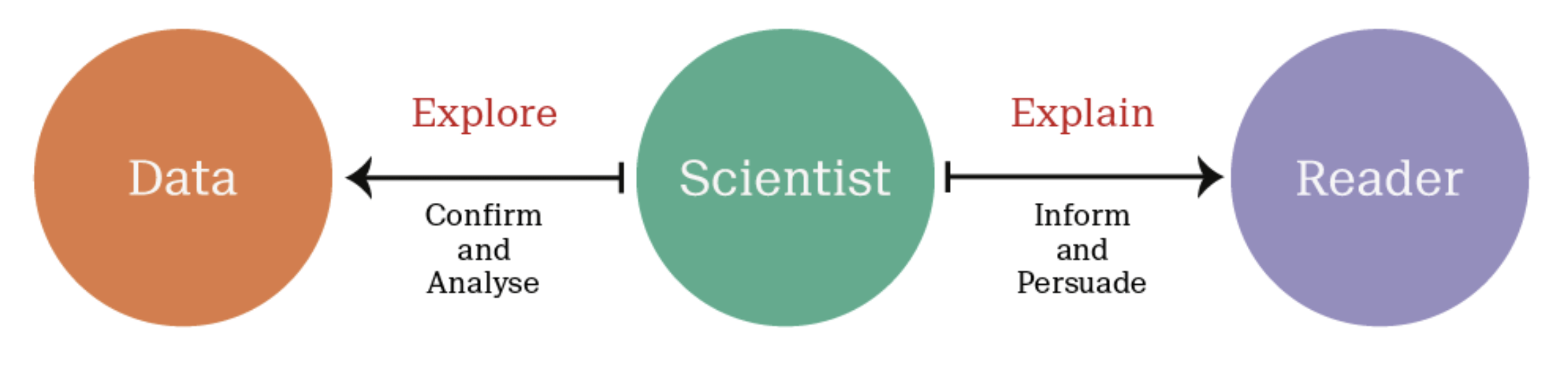
It's important to understand the distinction between exploratory and explanatory visualizations. Exploratory visualizations are easily-generated, data-heavy, and intended for a small specialist audience, such as yourself and your colleagues - their primary purpose is graphical data analysis. Explanatory visualizations are labor-intensive, data-specific, and intended for a broader audience, e.g., in publications or presentations - they are part of the communications process. As a data scientist, it's essential that you can quickly explore data, but you'll also be tasked with explaining your results to stake-holders. Good design begins with thinking about the audience - and sometimes that just means ourselves.
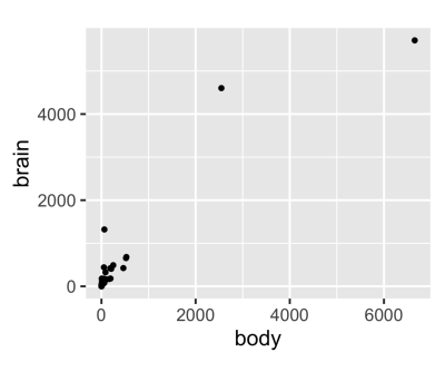
Below, we have a dataset that contains the average brain and body weights of 62 mammals.
MASS::mammals body brain
Arctic fox 3.385 44.50
Owl monkey 0.480 15.50
Mountain beaver 1.350 8.10
Cow 465.000 423.00
Grey wolf 36.330 119.50
Goat 27.660 115.00
Roe deer 14.830 98.20
...
Pig 192.000 180.00
Echidna 3.000 25.00
Brazilian tapir 160.000 169.00
Tenrec 0.900 2.60
Phalanger 1.620 11.40
Tree shrew 0.104 2.50
Red fox 4.235 50.40 To understand the relationship here, the most obvious first step is to make a scatter plot, like the one shown below:
ggplot(mammals, aes(x = body, y = brain)) +
  geom_point()
Two mammals, the African and the Asian Elephants have both very large brain and body weights, leading to a positive skew on both axes.
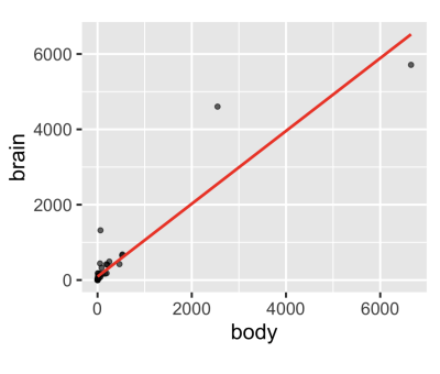
Now, if we were to apply a linear model, it would be a poor choice since a few extreme values have a large influence.
ggplot(mammals, aes(x = body, y = brain)) +
  geom_point(alpha = 0.6) +
  stat_smooth(
    method = "lm",
    color = "red",
    se = FALSE
  )
Applying a log transformation of both variables allows for a better fit.
ggplot(mammals, aes(x = body, y = brain)) +
  geom_point(alpha = 0.6) +
  coord_fixed() +
  scale_x_log10() +
  scale_y_log10() +
  stat_smooth(
    method = "lm",
    color = "#C42126",
    se = FALSE,
    size = 1
  )
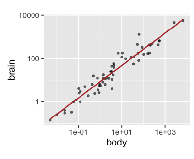
So, although we began with a rough exploratory plot, it informed us about our data and led us to a meaningful result.
When we imagine a linear model, as presented on this anonymous plot, we imagine that we are describing data that looks something like this.
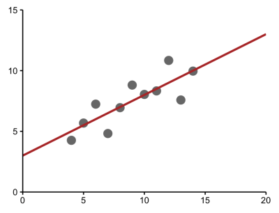
But this same model could be describing a very different set of data, such as a parabolic relationship, which calls for a different model.
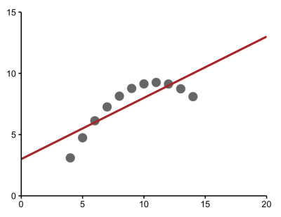
Or data in which an extreme value has a large effect. which becomes clear when the outlier is removed.
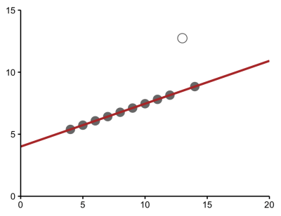
And sometimes, the model may be describing a relationship where, in fact, there is none at all because some extreme values may be incorrect.
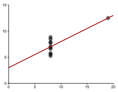
If we relied solely on the numerical output without plotting our data, we'd have missed distinct and interesting underlying trends.
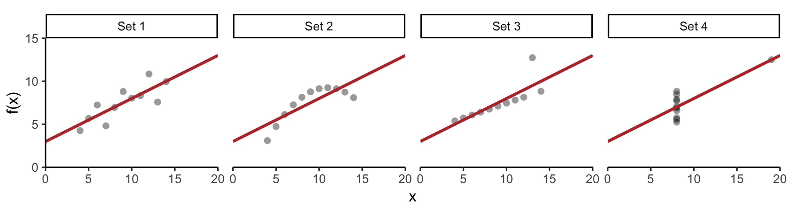
We can see that data visualization is rooted in statistics and graphical data analysis, but it's also a creative process that involves some amount of trial and error.
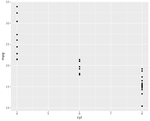
In the following example, you will first Load the ggplot2 package using library(). Then, you will use str() to explore the structure of the mtcars dataset.
Finally, you will visualize the ggplot and try to understand what ggplot does with the data.
You will use the mtcars dataset contains information on 32 cars from a 1973 issue of Motor Trend magazine. This dataset is small, intuitive, and contains a variety of continuous and categorical variables.
# Load the ggplot2 package
library(ggplot2)

# Explore the mtcars data frame with str()
str(mtcars)

# Execute the following command
p <- ggplot(mtcars, aes(cyl, mpg)) +
  geom_point()
When we run the above code, it produces the following result:
data.frame':    32 obs. of  11 variables:
 $ mpg : num  21 21 22.8 21.4 18.7 18.1 14.3 24.4 22.8 19.2 ...
 $ cyl : num  6 6 4 6 8 6 8 4 4 6 ...
 $ disp: num  160 160 108 258 360 ...
 $ hp  : num  110 110 93 110 175 105 245 62 95 123 ...
 $ drat: num  3.9 3.9 3.85 3.08 3.15 2.76 3.21 3.69 3.92 3.92 ...
 $ wt  : num  2.62 2.88 2.32 3.21 3.44 ...
 $ qsec: num  16.5 17 18.6 19.4 17 ...
 $ vs  : num  0 0 1 1 0 1 0 1 1 1 ...
 $ am  : num  1 1 1 0 0 0 0 0 0 0 ...
 $ gear: num  4 4 4 3 3 3 3 4 4 4 ...
 $ carb: num  4 4 1 1 2 1 4 2 2 4 ...
To learn more about data visualization with ggplot, please see this video from our course Introduction to Data Visualization with ggplot2.
This content is taken from DataCamp’s Introduction to Data Visualization with ggplot2 course by Rick Scavetta.
Related Courses
Course
Course
Course
Shawn Plummer
9 min
DataCamp Team
8 min
Matt Crabtree
8 min
Mark Graus
10 min
Elena Kosourova
12 min
Gary Alway
11 min