
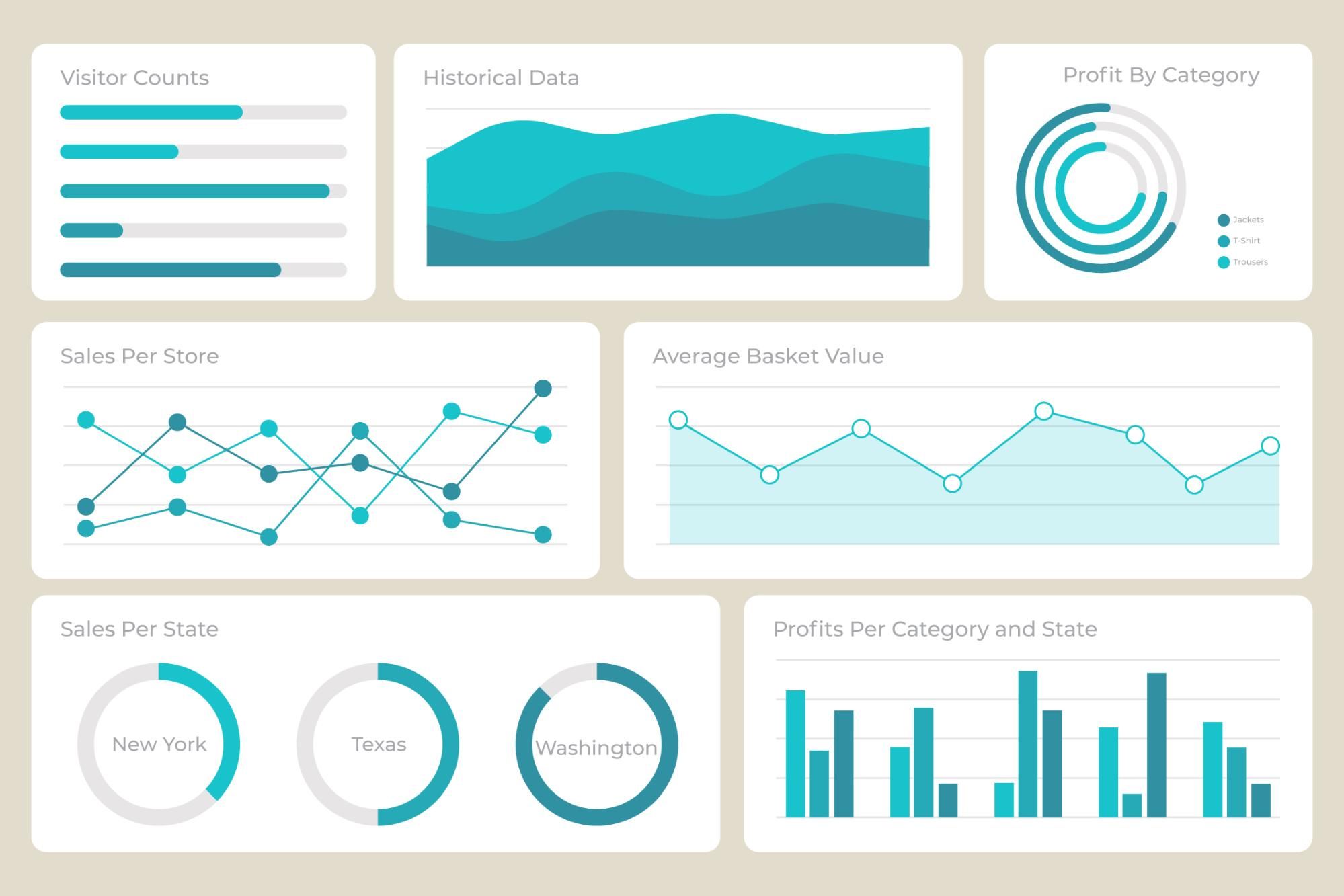
What is the Purpose of a Dashboard?
A car dashboard provides real-time information about a car's speed, fuel volume, RPM, and other engine-related indicators. Similarly, a data dashboard provides information about company historical sales, key performance indicators (KPIs), sales growth, operational indicators, and customer feedback. This information is presented in a precise manner so that managers or executives can understand the situation and make appropriate decisions.
There are hundreds of moving parts in your business and a dashboard summarizes these events into an easy-to-understand, real-time data visualization. These visualizations and charts can be used to make fast and effective decisions.
Dashboard by Freepik | edited by Author
There are several benefits of dashboard reporting:
- Usability: a typical company generates gigabytes of raw data daily. Understanding the data can help companies create value from it and make better decisions. Dashboards provide access to all key metrics on a single screen, turning raw data into valuable insights.
- Access to data: a single dashboard has access to multiple data sources to provide detailed reports of the inner workings of a company.
- Decision making: managers or executives can view anomalies, forecast sales, and review historical data to come up with business strategies. The information is available in an interactive visual form, where we can dive deep into historical data or filter out critical parameters.
- Accountability: it provides an unbiased picture of how well your company is performing. The dashboard can show you the difference in growth percentage and how you may have failed at a certain marketing campaign. Accountability is necessary to keep companies away from bankruptcy.
- Interactivity: the gamified and dynamic experience of the dashboard makes it easy to use and understand various factors of organizations. You can filter, isolate a single metric, zoom into a map or time series line plot, search for terms or even use third-party tools to generate anomaly alarms.
- Analysis: you can use these dashboards to come up with detailed analytical reports. The dashboard simplifies data analysis tasks as you are monitoring key permanence metrics and making sense of past events.
What are the Types of Dashboards?
There are several ways to customize the dashboard, and they all fall into one of three categories - iDashboards:
- Operational Dashboards: these dashboards show the real-time performance of day-to-day business operations. They are connected to multiple data sources and contain hundreds of metrics, indicating various functionalities of the business.
- Analytical Dashboards: these dashboards use historical data to identify trends. They are mainly used by data analysts to write detailed reports about a company's past performance and what steps they can use to improve current systems.
- Strategic Dashboards: these dashboards are mainly used to track current performance compared to key performance indicators and align actions with strategy.
What are the Use Cases of Dashboards?
In data science, dashboards are used for machine learning operations, data streaming, database management, and monitoring applications in production. However, in a typical business, the dashboard has a broader use case:
- Customer metrics
- Financial information
- Sales information
- DevOps
- Web analytics
- Manufacturing information
- Human resources data
- Marketing performance
- Logistics information

Dashboard Illustration by Stories
How to Create a Data Dashboard
Before we jump into creating a Tableau dashboard, we need to understand a few rules. These rules will help you build an effective dashboard that will fulfill your target audience's demands and goals.
- Know your audience and understand what they need.
- Choose relevant and relatively clean data that will meet your goals.
- Make sure your data is correct and clean.
- Select the best visualizations that represent your data.
- If you are developing a dashboard for the first time, choose a template that reduces complexity and saves time.
- Do not clutter your dashboard space with too many plots. Use simple colors and allow for space in your design to showcase the most significant parts of the data.
- Ask for feedback from the audience and use it to improve on the current design. Iterate and improve.
Now that we have the rules, it is time to learn the primary components of Tableau dashboards. A simple Tableau dashboard consists of three elements: objects, visualization, and filters. We will thoroughly review them in the next section. Tableau is an easy-to-use visual analytical tool for everyone. Learn more by reading a Tableau Introductory tutorial by Eugenia Anello.

Connection to Data Source
In this section, we are going to create a simple Tableau dashboard and publish it on a public server. The primary purpose of this tutorial is to learn the basics of creating and customizing data visualization, adding objects and filters, connecting filters, and sharing the finalized version of the dashboard with the wider public.
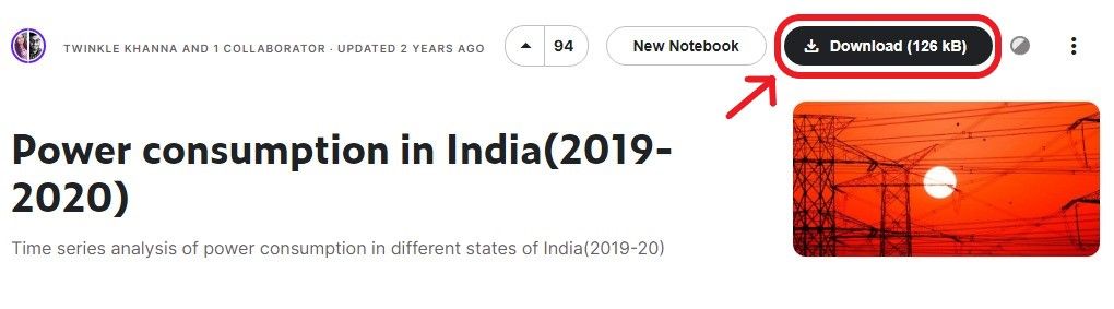
Before we connect the data source, we need to download Power consumption in India(2019-2020) from the Kaggle platform and then extract the data.
To connect the data source, we need to launch Tableau Desktop Public Edition (2022.1.1). On the main screen, it will show the multiple options to load a file or connect to a database server. Tableau supports all kinds of data connections; to access unavailable connections, download the specific drivers. For example, a MySQL connection is not available by default. We can install the drivers for the database and then connect to the SQL server. Take the Connecting Data in Tableau course to better understand connecting and managing various data sources.
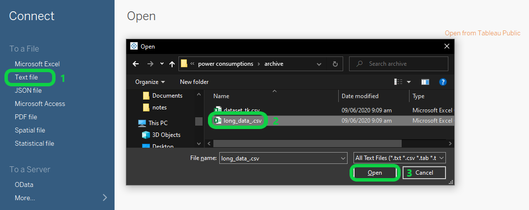
In our case, the data source is a CSV file, and it can be accessed by clicking on the “Text file” tab on the left panel. Next, select the CSV file (long_data_.csv) and press the open button.
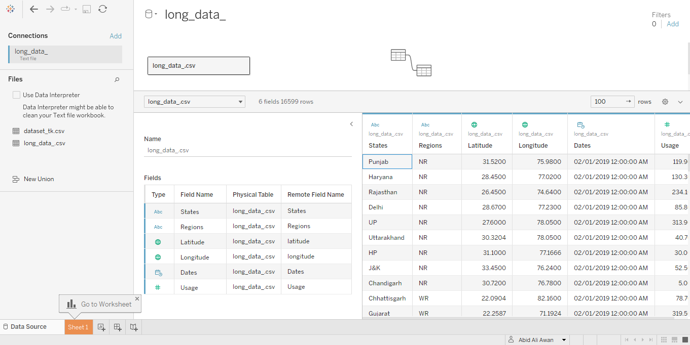
The dataset has been successfully loaded and you can explore the columns and attributes before jumping into creating a visualization.
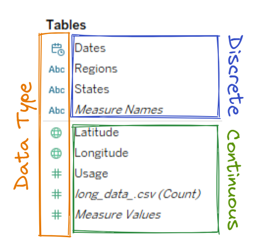
As we can observe, Tableau has automatically assigned data types to each column based on properties. This dataset consists of:
- States (String): 33 states
- Regions (String): 5 regions
- Latitude (Geography): Geolocation coordinates
- Longitude (Geography): Geolocation coordinates
- Dates (Date & Time): Jan 2, 2019 to May 23, 2020
- Usage (Decimal Numbers): Power consumption in MegaWatts
Creating Data Visualization Sheets
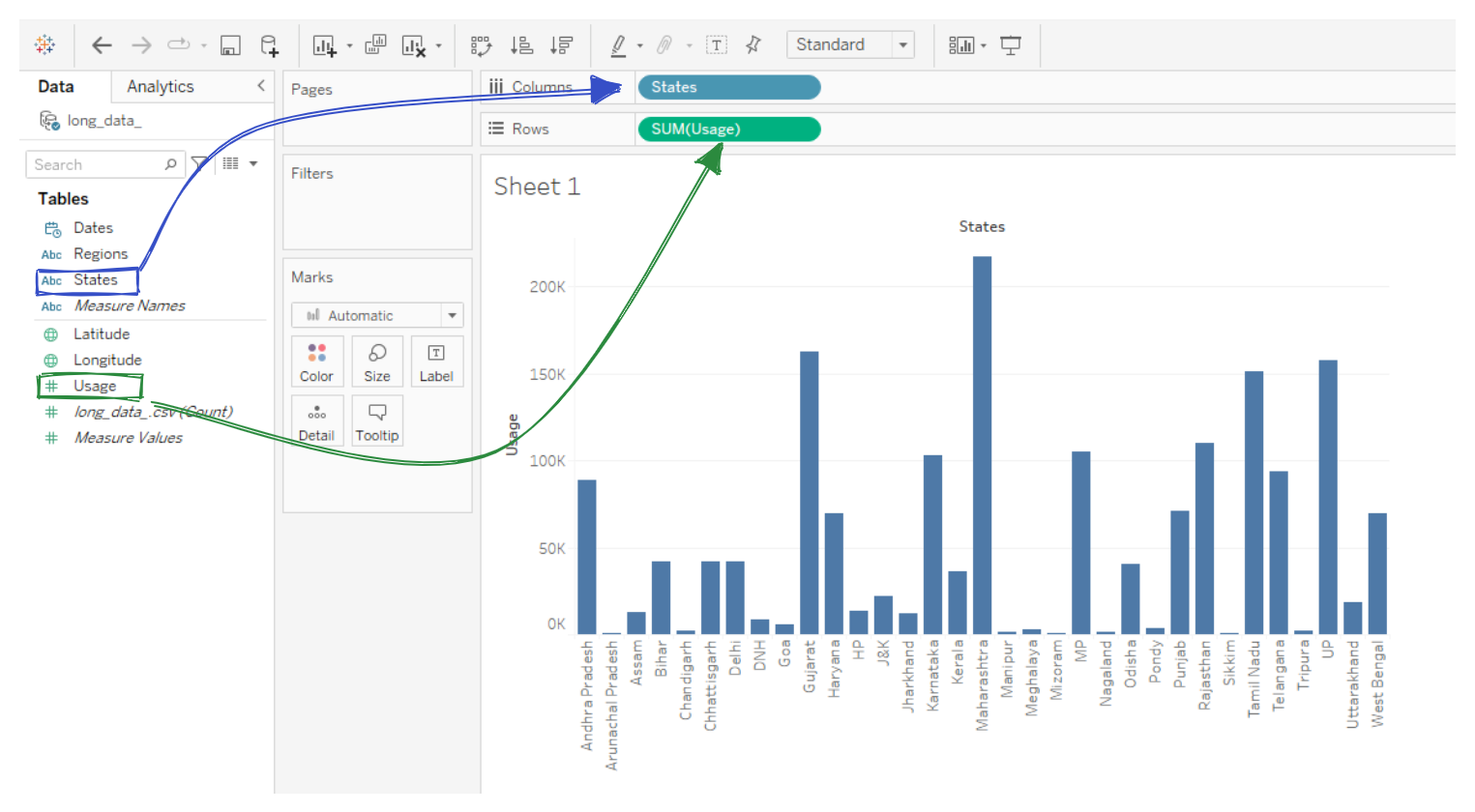
We will create the first bar chart by switching tabs from the “Data Source” to the “Sheet 1” (orange highlighted tab on the bottom left corner). Sheet 1 has multiple sections, tabs, and buttons. To make things simple, we will ignore all the sections and buttons and focus on the “Tables” section on the top left. The table consists of the data fields (columns) separated by the data types: Discrete and Continuous.
To create a bar chart of total power consumption per state, simply drag “States” to Columns and “Usage” to Rows. Tableau will automatically assemble a bar chart with labels and values, as shown below.
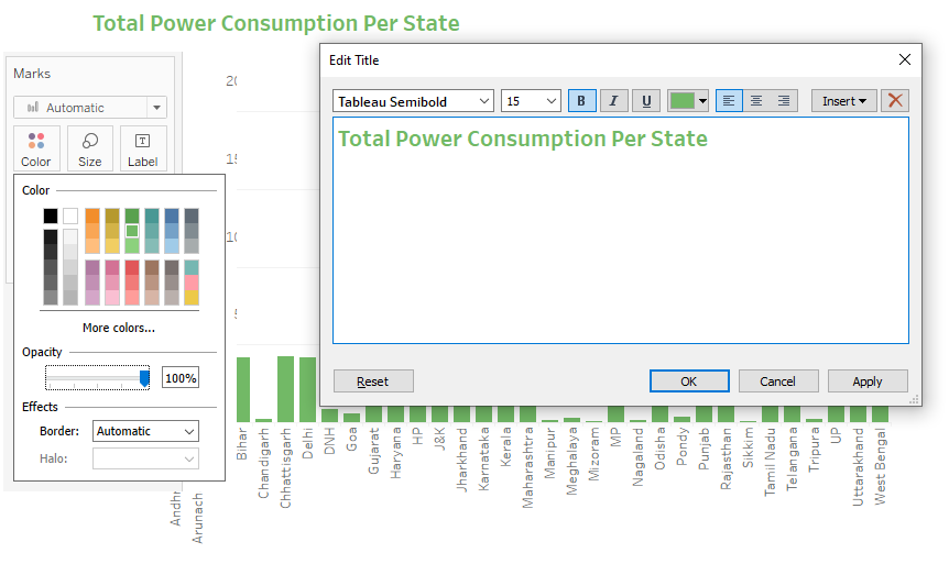
To change the color of bars to green, click on the “Color” button under the Marks section and then select the color green. We can customize the title by “double-clicking” on it and making changes to the font and color to match the theme.
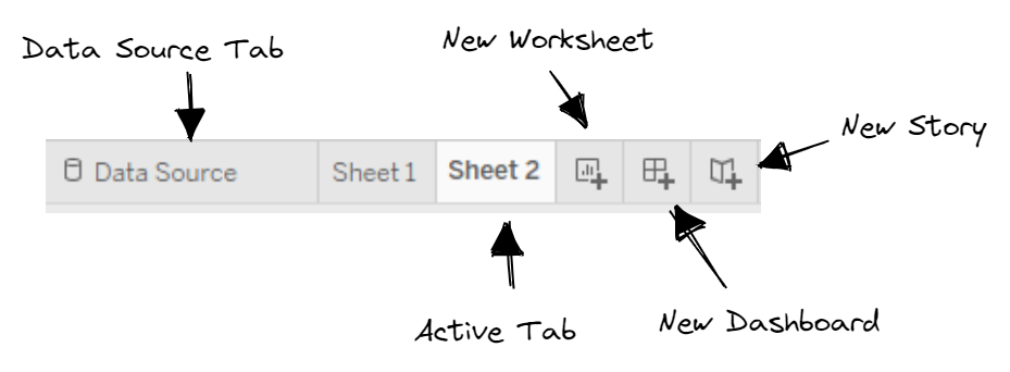
Before we create another visualization, we need to understand the bottom panel. We can create multiple Worksheets, Dashboards, and Stories by clicking on buttons with a plus (+) sign, as shown below. Similar to Google Chrome tabs, we can switch between Data Source, Worksheets, Dashboards, and Stories tabs by clicking on them. .
In our case, we will create a second worksheet by clicking on the “New Worksheet” button.
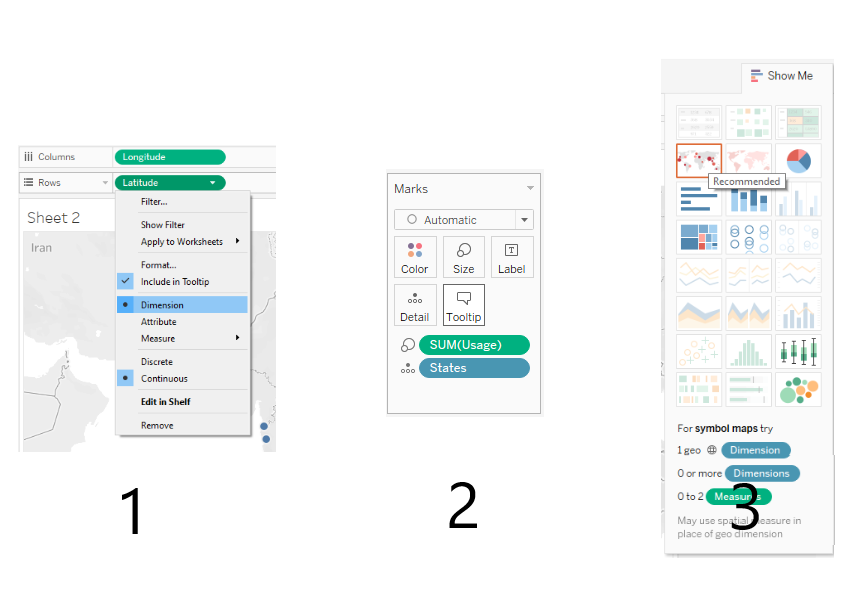
On the second worksheet, we will plot “power usage per state” on a map. First, drag and drop Longitude to Columns and Latitude to Rows. Second, change both fields to “Dimension” by clicking on the arrow and selecting the “Dimension” option. Third, double click on the Usage and States data fields, and they will automatically appear in the “Marks” section. You can also do this manually by dragging and dropping them into the “Marks” section and changing them to “Size” and “Detail” marks. Finally, click on the “Show Me” button and select symbol maps. The “Show Me” button gives you recommended visualizations based on your inputs. You can switch from one chart to another by clicking on the available options.
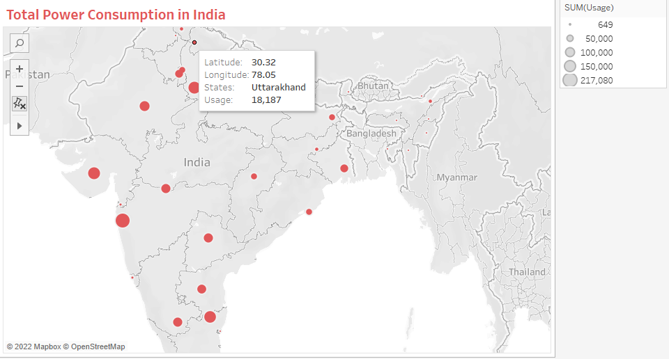
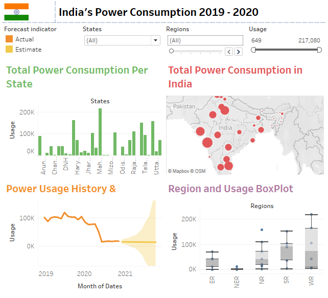
After customizing the map and title, the final version of the map looks clean. On the top right, you can see filters based on the size of the circle. The circle represents the states in India, and the size of the circle is based on power usage. You can zoom in and interact with the map by clicking on any red circle and reading tooltips (Coordinates, States, Usage).
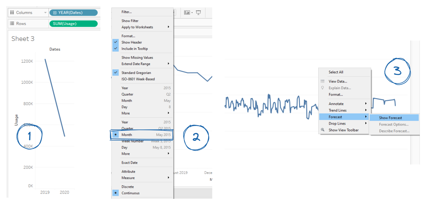
In the subsequent worksheet, we are going to plot a historical time series line chart with predictions. Move “Usage” to Rows and “Dates'' to Columns. Then, change the “Dates'' from “Year” to “Month”, as shown below. Finally, we are going to plot the forecast for the next 11 months by right-clicking on the plot and selecting Forecast > Snow Forecast. Tableau will automatically plot forecasts with a 90% confidence highlighted area.
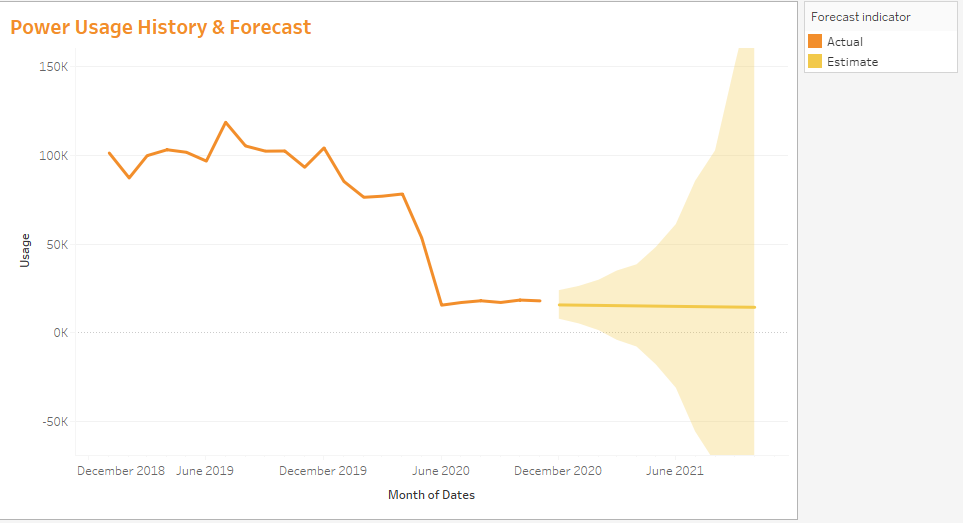
After setting up the title and colors, we can see two distinct graphs:
Actual: Due to the Covid19 lockdown, the power consumption dropped because the majority of industries were closed.
Estimated: The forecast chart is a constant line, and it is not reliable due to missing values in historical data. The 90% confidence area is also too wide for us to take this prediction seriously.
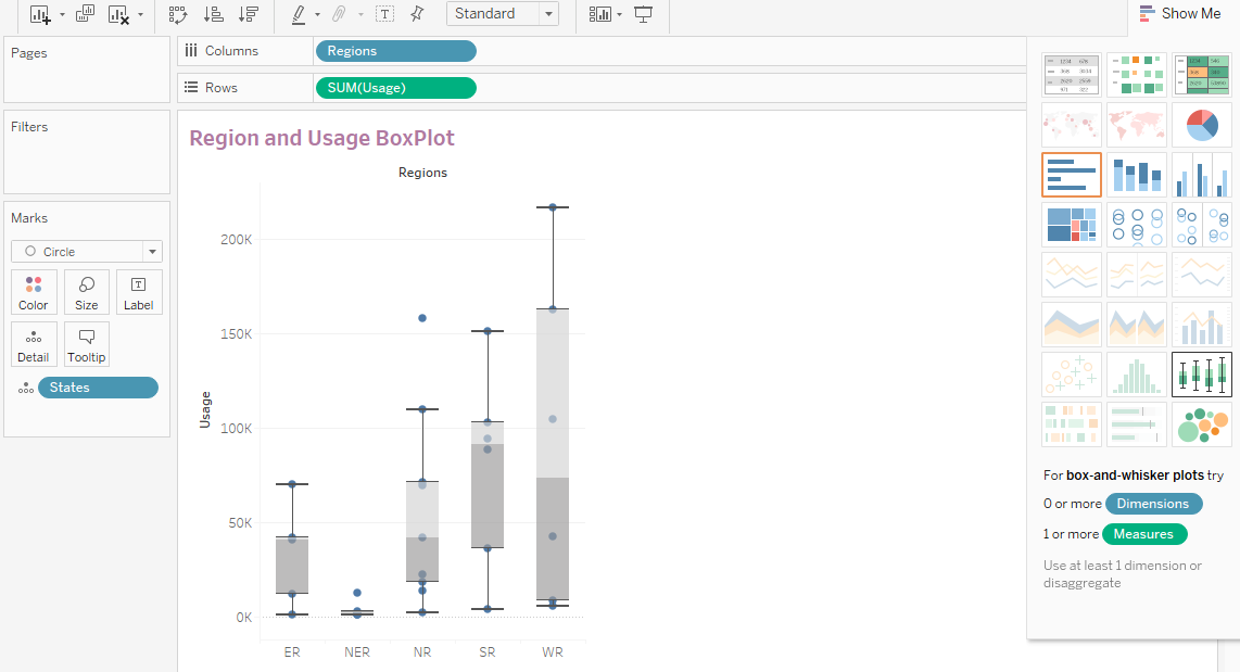
For the fourth worksheet, we will be creating a Region versus Usage BoxPlot. We can do this by clicking on “box-and-whisker plots” in the “Show Me” section, as shown below. After customizing the visualization, all four sheets are ready to be added to a dashboard.
Creating a visualization on a worksheet is exciting; if you want to learn how to create interactive and functional dashboards, then check out the Analyzing Data in Tableau course. This course will help bring you one step closer to becoming a certified Tableau Desktop Specialist.
Building a Dashboard
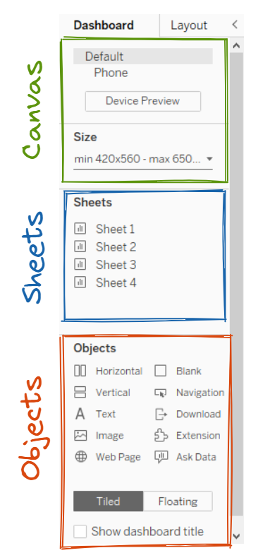
To create a dashboard, we need to click on the “New Dashboard” button at the bottom. The button has a box shape with a plus sign. The Dashboard window has a dashboard panel on the left side that consists of three sections:
- Canvas: to set the size of the dashboard based on various devices (Mobile, Tablet, etc).
- Sheets: for adding and removing worksheets on canvas.
- Objects: for adding text, images, extensions, webpage, and buttons to canvas.
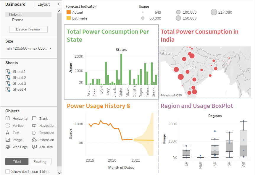
Now, we will double-click on all sheets one by one to add them to the dashboard canvas with related filters. We can adjust the locations of visualizations and filters and adjust the size to give it a clean look.
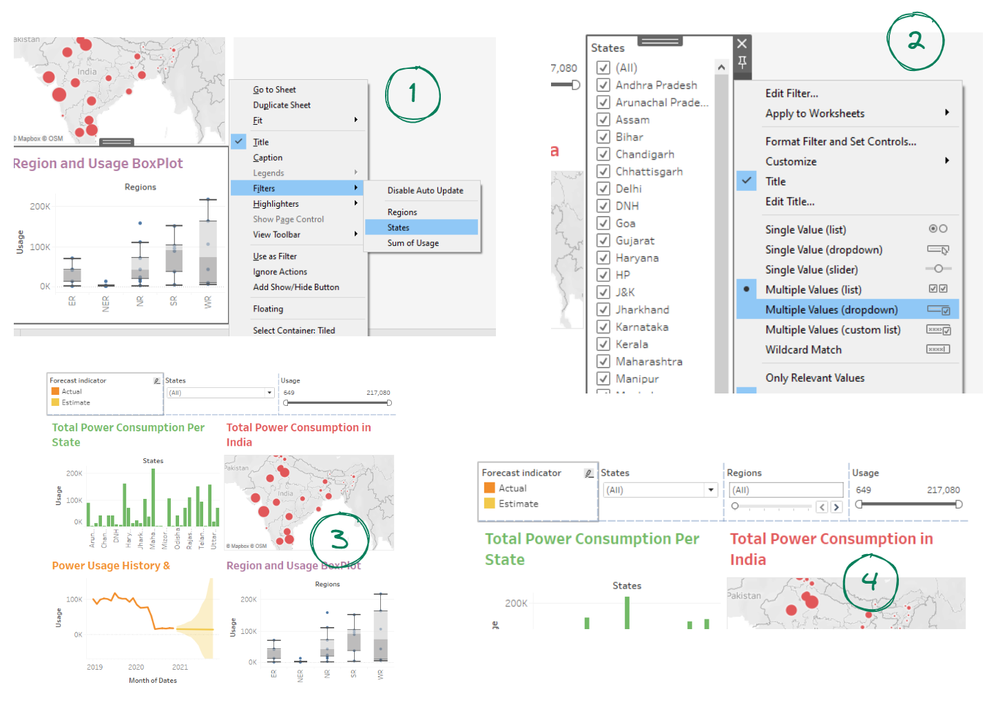
Adding Filters
Next, we are going to add relevant filters and remove the previous filter.
- Remove the “Usage” size filter by clicking on X.
- Select the map visualization, and click on the down arrow to select Filters > Sum of Usage.
- The filter will appear in the top right corner.
- Move the filter towards the right, so that it looks like part of the dashboard.
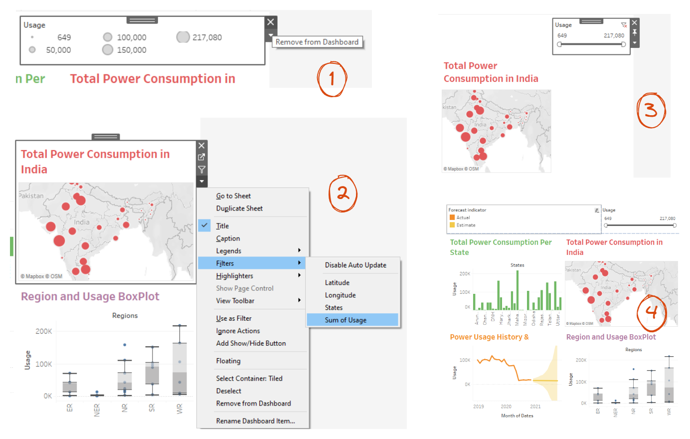
Similarly, we are going to add filters for “States” and “Regions”.
- Select the Boxplot visualization and add the “States” filter.
- Go to the filter and click on the down arrow to access the options and select Multiple Values (dropdown). It will change the filter from a list to a dropdown.
- Move the filter so that it shows in the middle of the “Forecast indicator” and “Usage”. Tableau will adjust the filter automatically if you pick and hover over the filter in the center.
- In the same way, add a “Regions” filter and adjust it between the “States and “Usage” filters.
Adding Objects
We are now going to add a title object by dragging the "Text" and placing it at the top of the dashboard canvas. A window prompt will then ask us to type the text. In our case, we will write the title of the dashboard.
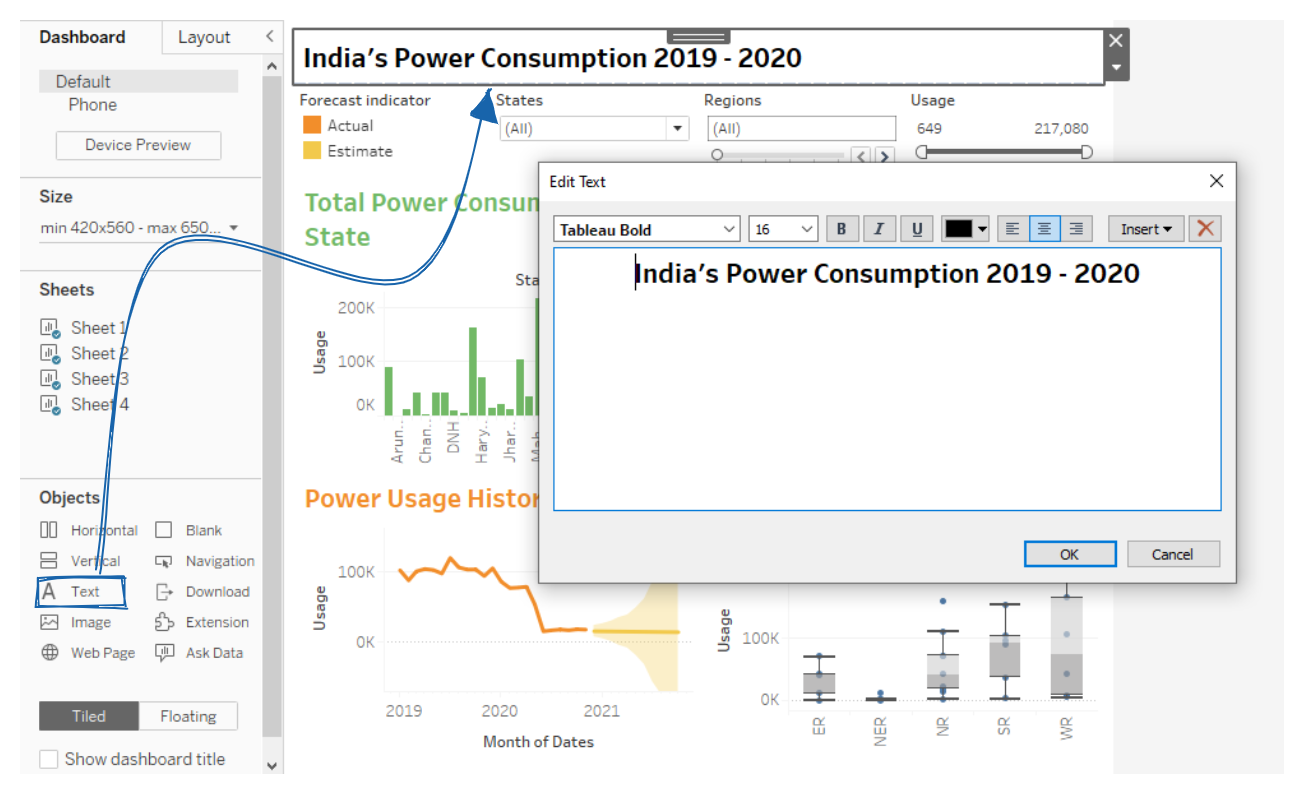
Next, we are going to add an Image object to the top left section and then select the Indian national flag JPEG file.
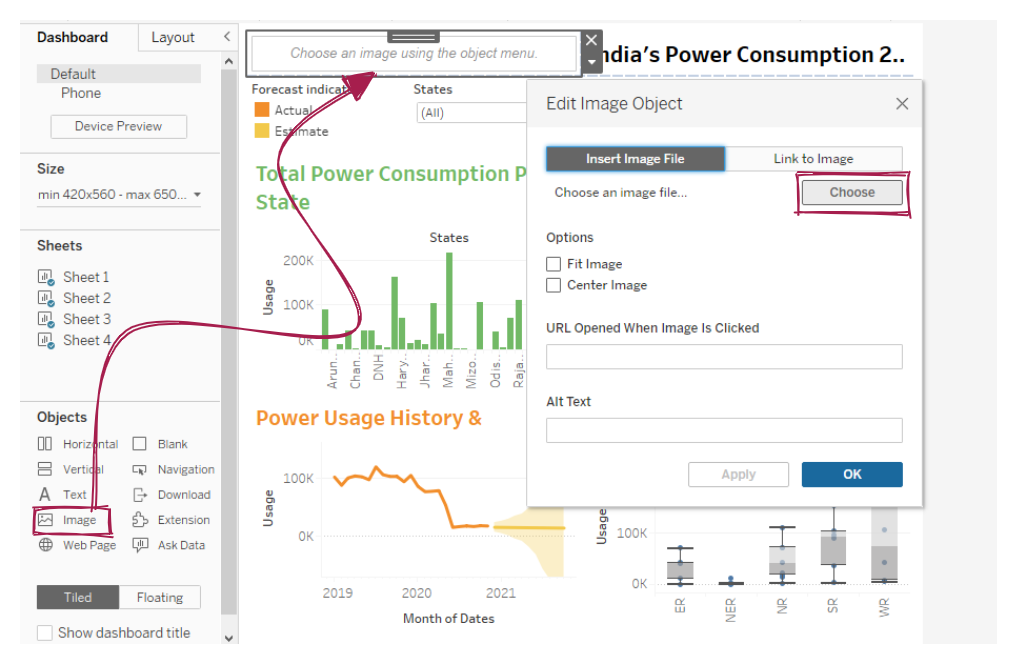
After adjusting the position and size of the flag and title, our dashboard is almost complete. Now, we just need to connect filters and visualization so that they are in sync.
Connecting Filters
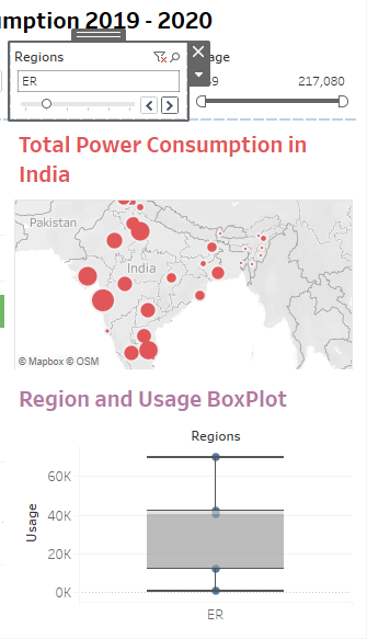
The filters that we have just added are unconnected and only affect a single visualization. For example, if you change Regions from “(All)” to “ER”, the filter will only be applied to the Boxplot, as shown below.
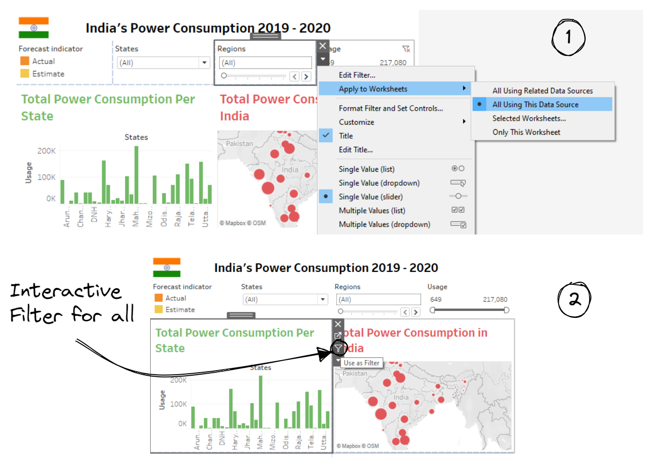
To make the “Regions” filter global, we will change the option from “Only This Worksheet” to “All Using This Data Source”. You can access this option by selecting the filter and clicking the down arrow > Apply to Worksheets > All Using This Data Source. We are also going to connect the “States” filter so that if we make changes, they will be applied to all four worksheets.
To increase interactivity, we can also use the worksheet visualization as a filter. We can achieve this by selecting the worksheet and clicking on the funnel button “Use as Filter”. Repeat this step for all visualizations, and the dashboard will become dynamic and fully connected.
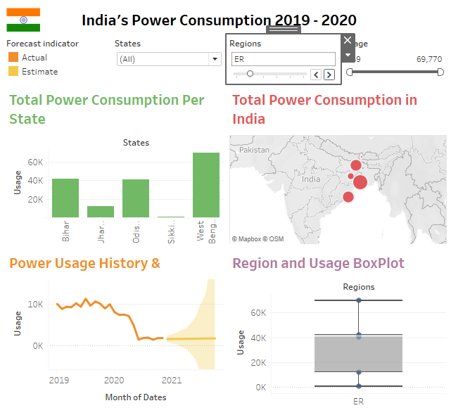
Now, if we change the Regions to “ER”, the filter is applied to all four workspace visualizations. Our dashboard is now complete. If you enjoyed creating this dashboard and want to learn more about it, then have a look at the Creating Dashboards in Tableau course. It is a 4 hour long mini-course, consisting of 34 exercises and 12 video tutorials to help you understand all the basics of Tableau dashboarding.
Publishing
To publish the dashboard and share it with a broader audience, we can simply click on File > Save to Tableau Public and then write a workbook title to save it. Uploading the changes to the public server takes a few seconds. We will then be redirected to an online version of the dashboard. Make sure you are logged into your public account.
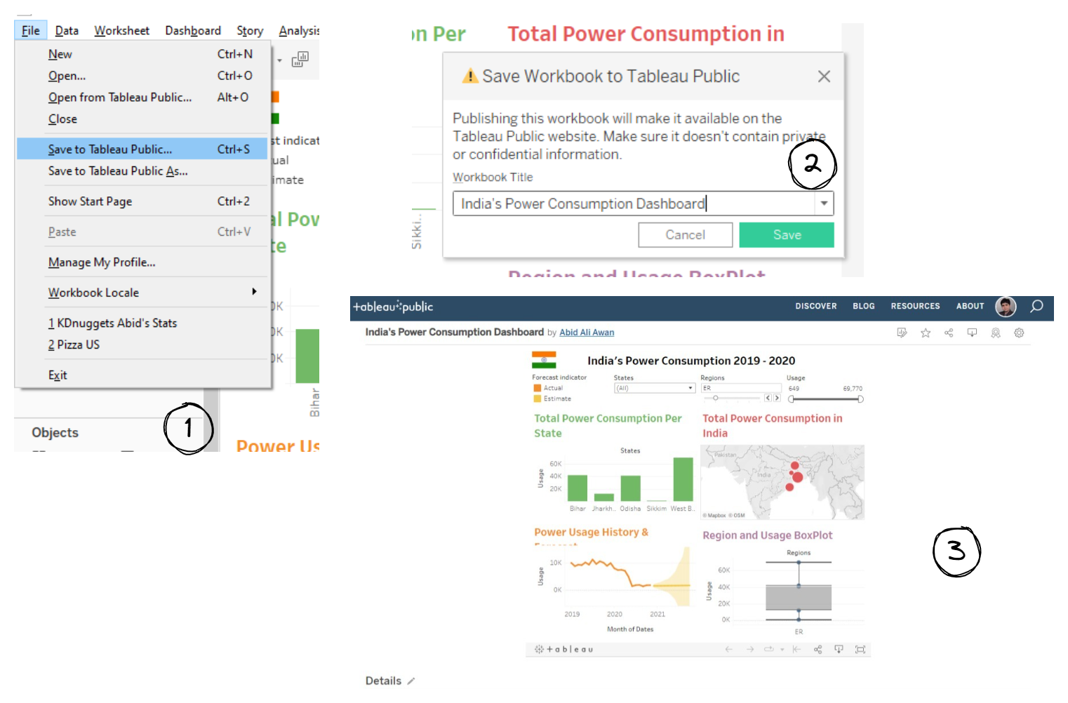
Publishing a Dashboard to Tableau Public: Link
If you are using another version of Tableau, then publish the dashboard via Server > Publish Workbook.
Conclusion
In this tutorial, we have learned how important a dashboard is for visually and interactively communicating key performance indicators. We have also learned how to create a Tableau dashboard from scratch using India’s power consumption dataset. This step-by-step guide includes creating and customizing visualization, creating and customizing a dashboard with filters and objects, and publishing it on Tableau public server. The published version is displayed under your profile and can be accessed by anyone with a link. A public profile is the best way to showcase your portfolio projects.
Tableau is a powerful visual business intelligence tool. You can do a lot more with the dashboard by connecting it to SQL databases, using functions to aggregate or modify data fields, running Python or R scripts, integrating it with third-party APIs, and using the presentation mode. The Tableau platform is for everyone and if you are interested in learning more, then check out our full set of resources for learning Tableau. Or, you can unlock lucrative new career possibilities with DataCamp's Tableau Fundamentals Skills Track.
How do I create a dashboard in Tableau?
How do I forecast in Tableau?
How do I share a Tableau dashboard?
How do I add a filter to the Tableau dashboard?
How do I embed a Tableau dashboard in a website?
How do I publish a Tableau dashboard to the public?
How do I download data from the Tableau dashboard?
How do I make a Tableau dashboard bigger?
How do I export a Tableau dashboard as a pdf?
How do I share the Tableau dashboard with non-Tableau users?
6 Tableau Projects to Help Develop Your Skills

Jess Ahmet
6 min


11 Data Visualization Techniques for Every Use-Case with Examples

Javier Canales Luna
16 min

Tableau Certifications Guide: Certification Levels, Costs & How to Pass

Adel Nehme
15 min

Data Storytelling and Visualization with Lea Pica from Present Beyond Measure

Richie Cotton
71 min
Visualizing Data in Excel
Jess Ahmet
12 min
Types of Data Plots and How to Create Them in Python

Elena Kosourova
21 min