Certification available
Course
Introduction to Python
4 hr
5.4M
![]()
TabPy Tools is a Python package for deploying and managing Python functions on the TabPy server.
Let’s dive deep into the functionalities of TabPy tools.
The client function will let you connect the Python API to the TabPy server using URL and PORT.
rom tabpy.tabpy_tools.client import Client

client = Client('http://localhost:9004/')
We can use the object “client” to set authentication and manage Python functions on the server.
You can set your username and password using the “set_credentials” functions. It is necessary to set credentials to deploy a model on the server.
Note: only run this function if you have enabled the authentication on the TabPy server. Read server configuration documentation to learn more.
client.set_credentials('username', 'password')Create a function and publish it using the `client.deploy()` function. It requires three arguments: function name, Python function, and description.
The addition function is adding two data fields and returning the list. Later, the “add” function will be accessed in Tableau.
client.deploy('add', addition, 'Adds two numbers x and y')When you have trained a machine learning model and deployed the model inference function, Tableau will automatically save the model and functions definition using cloudpickle. It remains in the server memory to provide a faster response time.
Simply put, you don’t have to re-train your model whenever something changes in Tableau. We will learn more about deploying models in upcoming sections.
To remove a function or model, use the `remove` function. It just requires a function name.
client.remove('add')>>> For more advanced features, check out TabPy/tabpy repository on GitHub.
Similar to part one, we will be creating a Pearson Correlation Coefficient function. Instead of writing the function in Tableau, we will deploy it to the server using Python API and then access the function using Tableau calculation.
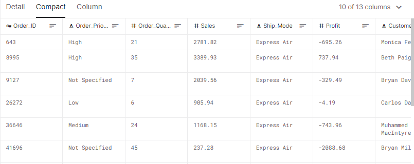
In this section, we will use the Sales Store Product dataset from Kaggle to calculate the correlation between sales and profit data fields.
Kaggle Dataset Sales Store Product
Before we jump into writing Python code, make sure you have the latest TabPy package.
pip install -U tabpyRun the server locally using a terminal.
tabpyIf you are familiar with Python, this part is quite simple for you to understand. You can learn all about Python functions by taking the introduction to Python course.
from tabpy.tabpy_tools.client import Client
import numpy as np


client = Client('http://localhost:9004/')


def pearson_correlation_coefficient(x,y):
    return np.corrcoef(x,y)[0,1]

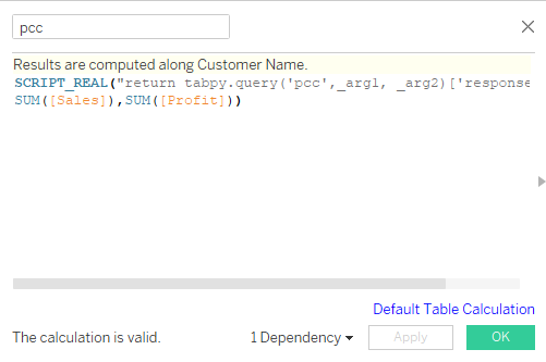
client.deploy('pcc', pearson_correlation_coefficient, 'correlation coefficient is extracted of x and y')We will now invoke this function in Tableau using tabpy.query(). It requires Python function names and argument placeholders such as _arg1 and _arg2.
Pearson correlation coefficient calculated field
You can review the first part of the tutorial to understand Tableau script.
SCRIPT_REAL("return tabpy.query('pcc',_arg1, _arg2)['response']",
SUM([Sales]),SUM([Profit]))We will now create a visualization displaying the correlation categorized by product category and customer segmentation.
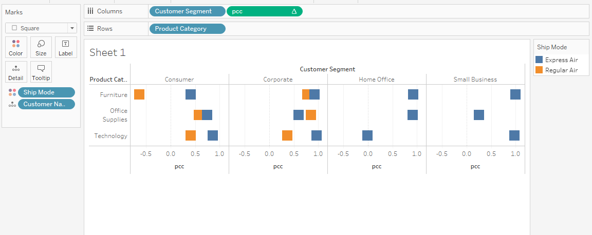
Displaying correlation coefficient bar chart
In most cases, the Corporate sector has a high correlation between sales and profit. Overall, you can use correlation coefficients and make data-driven decisions to boost the company's profit.
Read our Python details on correlation tutorial to learn about other correlation coefficients, calculating correlation in Python, and the relation between correlation and causation.
In this section, we will learn to deploy the Facebook Prophet forecast model and learn to modify date data fields. We will train the time series model on Apple Stock Prices from the year 2015 to 2020.
Kaggle Dataset Apple Stock Prices (2015-2020)
Before we jump into writing scripts and creating forecast visualization on Tableau, we need to test Python code and evaluate the forecasting model in Jupyter Notebook.
Facebook Prophet is an open-source library for automatic forecasting of univariate time series data. It works best with yearly, weekly, and daily seasonality effects.
It is good at dealing with missing data, trend shifting, and outliners.
You can install the Prophet Python package using the command below in the terminal.
pip install pystan==2.19.1.1
pip install prophet
Or if you are using Anaconda Python environment, use the command below.
conda install -c conda-forge prophetimport pandas as pd
from prophet import Prophet
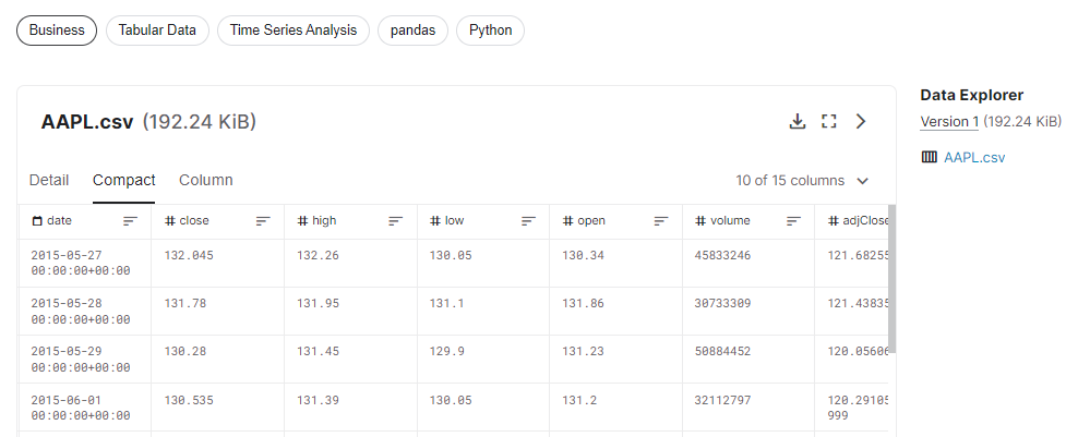
data = pd.read_csv("AAPL.csv")
X = data.loc[:, ['date','high']]
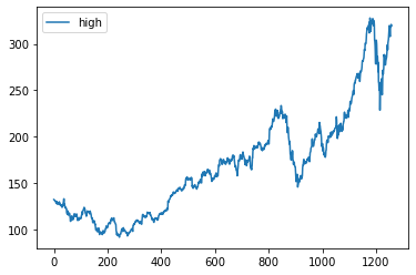
print(X.shape)
X.plot();Output
(1258, 2)Apple stock is increasing with time. It has had two dips, but it has recovered to steady growth.
Follow the Python time series analysis tutorial by Hugo Bowne-Anderson to get in-depth knowledge. You can also take a short course by DataCamp on time series analysis in Python to get hands-on experience.
In this part, we will prepare the data for the Prophet model and train it on default hyperparameters.
X.columns = ['ds', 'y']
X['ds']= pd.to_datetime(X['ds'], format='%Y-%m-%d').dt.date

model = Prophet()
# fit the model
model.fit(X)To evaluate, we have to add future dates to the dataset. We can achieve it by using make_future_dataframe.
We will set:
future = model.make_future_dataframe(periods=365,
                                    freq='D',
                                    include_history=False
                                    )
future.tail()
Output
As we can see, the future dataset ends with the year 2021.
        ds
360 2021-05-18
361 2021-05-19
362 2021-05-20
363 2021-05-21
364 2021-05-22
The next step is to use this data to predict the Apple stock's high values. After that we will display 'ds', 'yhat', 'yhat_lower', and 'yhat_upper'.
The yhat_lower and yhat_upper define the acceptable range of variance. Simply put, the stock price can go up to 485.3 and drop to 365.4. This information can help day traders assess the risk.
forecast = model.predict(future)
forecast[['ds', 'yhat', 'yhat_lower', 'yhat_upper']].tail
Output
ds yhat yhat_lower yhat_upper
360 2021-05-18 423.757736 365.415878 485.293438
361 2021-05-19 423.862811 365.527086 482.751097
362 2021-05-20 423.918642 365.233839 482.501335
363 2021-05-21 423.842872 364.454184 483.672508
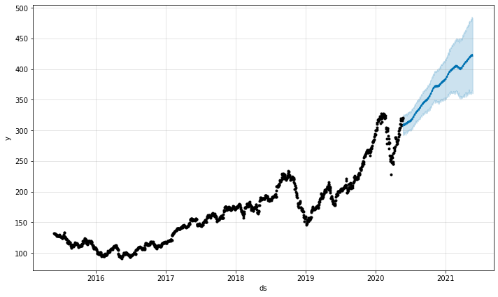
364 2021-05-22 421.187822 360.181717 481.024524Let’s visualize forecast data using plot() function. It requires predictive values to display the dot and line chart with the acceptable range in blue color.
model.plot(forecast)The visualization below shows that the Apple stocks will grow in value without dip.
You can improve the forecast by adjusting hyperparameters related to saturating forecasts, trend changepoints, seasonality, holiday effects, and regressors, multiplicative seasonality, uncertainty intervals, and outliers. You can also adjust them automatically by using hyperparameter tuning. Learn more about Facebook Prophet by reading documentation.
Time series forecasting is a vast field, and you can learn everything about time series forecasting by following our time series forecasting tutorial by Moez Ali. The tutorial covers time series analysis, statistical models, Python frameworks, and AutoML.
You can also take our visualizing time series data in Python course, and learn all about line charts, detecting seasonality, trend, and noise, and displaying multiple time series.
In this section, we will deploy model inference. This will allow us to store model and function definition in the TabPy server to provide a faster response time.
We will first connect the Client using URL and PORT. Then we will define the prophet_forecasting function.
Finally, we will package and deploy it to the TabPy server using client.deploy(). We will set the function name “prophet”. The override argument will help us create the versions of the model and function. This is necessary at the initial stage where we are debugging code.
from tabpy.tabpy_tools.client import Client

client = Client('http://localhost:9004/')

def prophet_forecasting(n):

    future = model.make_future_dataframe(periods=365*n,include_history=False)
    prediction = model.predict(future)
    prediction.rename(columns={"yhat":"y"}, inplace=True)

    return pd.concat([X,prediction[['ds','y']]])['y'].to_list()[365*n:]

client.deploy('prophet',
              prophet_forecasting,
'forecast time series data using prophet',override=True)To control the number of years within Tableau, we have to create a Years parameter. It will be used in prophet function.
We can create a Years parameter by right-clicking in the Data section and selecting the Create Parameter option. Change the Data type to Integer, Current value to 1, and click on Range to add Minimum 1 and Maximum 5 values.
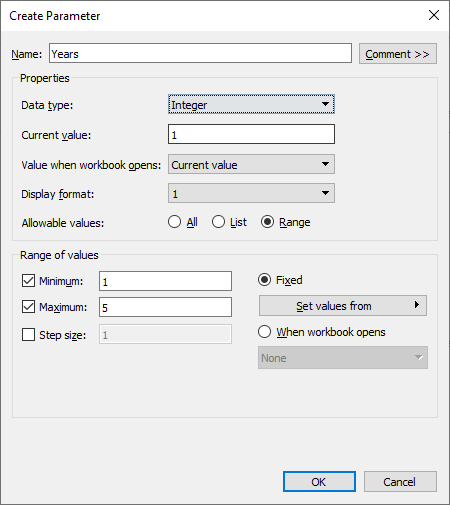
Creating Years Parameter
After that, we will create a Forecast_date calculated field. We will use the Date data field and shift the values by number of Years.
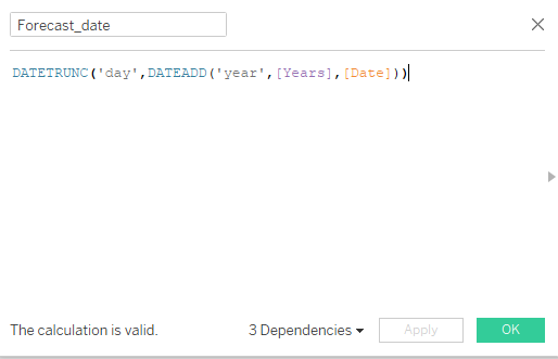
Forecast_date calculated field
The DATEADD function will add Years to Date data field and then truncate into day.
DATETRUNC('day',DATEADD('year',[Years],[Date])))In the next part, we will create a forecast calculated field and access the deployed model using tabpy.query(). The query function consists of two parts, the first part is the name of the Python function and the second part is the list of placeholders for arguments.
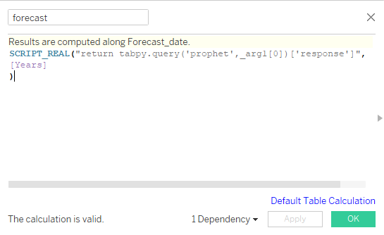
forecast calculated field
In our case, it is just one argument, so we will add _arg1. We will wrap the query in a Tableau function called SCRIPT_REAL and provide the Years parameter as an input. Before you press the OK button, make sure the results are calculated along Forecast_date. You can change it by clicking on blue text (Default Table Calculation).
SCRIPT_REAL("return tabpy.query('prophet',_arg1[0])['response']",
[Years]
)
After that we will create an Actual calculated field using High data field and Years parameters.
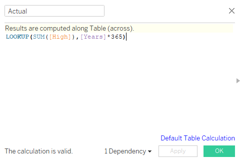
Actual calculated field
LOOKUP will help us offset the High values by Years*365. For example, if the Years parameter is 2, then it will offset the values by 730.
LOOKUP(SUM([High]),[Years]*365)We have finally reached the end. To plot the line chart of Actual vs. Forecast, we will follow the simple steps:
After following all the steps, you will see Actual and forecast in different colors.
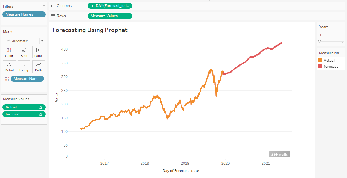
Actual vs. Forecast line plot
The line chart above is far from perfect and requires hyperparameter tuning, cross-validation, imputing missing values and dates, and improving date function.
In this tutorial, we have learned to build and deploy a machine learning model on the TabPy server and access it using Tableau script. We have also learned the basics of tabpy_tools and how we can use it to deploy functions or models.
Learn more about financial forecasting by taking the DataCamp course. You will learn to understand income statements, balance sheet and forecast ratios, formatting raw data, managing dates and financial periods, and assumptions and variances in forecasts.
The time series forecasting is the baseline; we improve our predictions by training the data on other machine learning algorithms such as:
If you are new to Tableau and want to learn all about data visualization and statistical computation, take the Tableau fundamentals skill track.
This is the final part of the series. In the first part of this TabPy tutorial, we learned everything about TabPy and executed a Python script within Tableau to create various clusters of Airbnb Amsterdam listings.
Courses for Python
Course
Course
Course
Mark Graus
10 min
Adel Nehme
5 min
Joleen Bothma
9 min
Amina Edmunds
7 min
Satyam Tripathi
9 min
Natassha Selvaraj
9 min