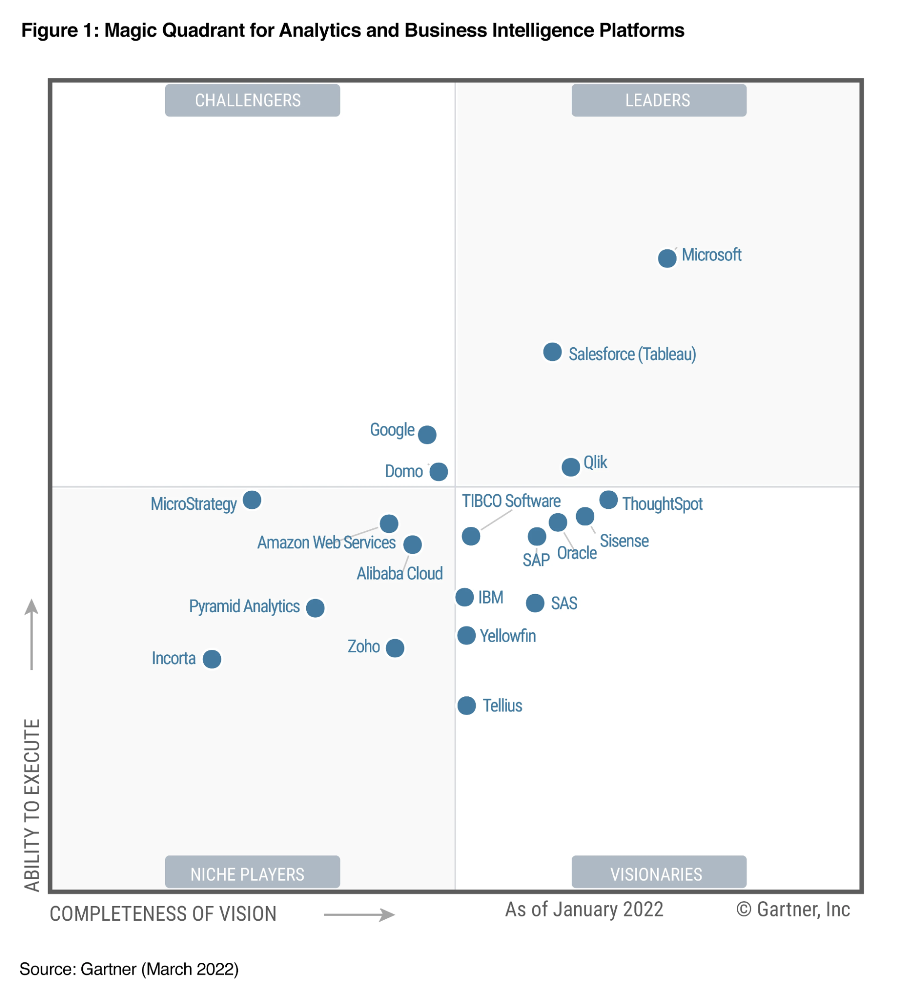
For ten consecutive years, Tableau has been identified as a leading business intelligence tool in Gartner's Magic Quadrant, making it the instrument of choice for data visualization. Gartner recognizes Tableau as a product that executes well against its current vision and one that's positioned to retain its competitive edge by keeping up with changing market trends.
Its popularity means that companies will continue to seek top talent with a strong mastery of Tableau. Understanding the types of Tableau interview questions that may be asked is a good way to set yourself up for success in passing a technical screening with the hiring manager.
In this article, we'll go over common Tableau interview questions by looking at beginner, intermediate, and advanced questions. Finally, we'll take a look at scenario-based interview questions, which are a great way to assess a candidate's level of experience.
Beginner Tableau Interview Questions
For entry-level positions requiring the use of Tableau, you may be asked simple questions about the tool. The goal is to understand whether you have a reasonable knowledge of core concepts. Questions can vary from comparing the product to other BI tools to explaining the different JOIN types. If you need a refresher on Tableau, be sure to check out our Introduction to Tableau course.
Let's take a look at some beginner interview questions.
Why Tableau?
This question may seem highly subjective; however, it strikes at the core idea that Tableau is more than a tool to "make pretty charts" but one that serves the purpose of deriving insights from raw data. The point of a business intelligence tool is, after all, to provide business intelligence!
How does Tableau compare to other BI tools?
Even if you don't have extensive knowledge of other BI tools, you may still be able to chat about the differences between Tableau and Excel charts. If you have experience with PowerBI, you can learn more about the comparative advantages and disadvantages by reading our PowerBI v. Tableau: Which Should You Choose in 2023? article.
A few of the advantages of Tableau over other BI tools include:
- a user-friendly interface: the drag-and-drop feature allows an inexperienced user to ramp up fairly easily and start building charts in minutes;
- the wide range of data sources that are supported by the application: from relational databases to flat files to web sources, there are many ways to connect your data using Tableau;
- design flexibility: Tableau's flexibility allows users to design custom visualizations; and
- a supportive user community: the large and active community of users makes it easy to get your Tableau questions answered.
One of the downsides of Tableau is its pricing model. At $70/user/month, that's an $840 license per user on an annual basis (before any sales discount is applied). It's not cheap!
What data sources can you connect to?
Tableau can connect to a wide range of data sources, including:
- relational databases: Microsoft SQL Server, Oracle, MySQL, PostgreSQL, etc.
- NoSQL databases: MongoDB, Cassandra, and Cloudera Impala
- cloud-based warehouses: BigQuery, Azure, Snowflake, etc.
- flat files: Excel spreadsheets, CSV files, and text files
- web data: Google Analytics, web APIs, and HTML tables
- Hadoop: Tableau has native support for Hadoop and can connect to Hadoop Distributed File System (HDFS), Apache Hive, and Apache Spark
- other data sources: SAP, Teradata, IBM DB2, and Informatica, etc.
In addition to these data sources, Tableau also has a data connector SDK that allows third-party developers to create custom connectors for other data sources.
How do you connect to them?
The list of data connectors will appear in the Connect pane on the Start page. If you previously opened a worksheet and need to connect a new data source, you can navigate back to the Connect pane by clicking on Data Source at the bottom right of the page and selecting Add next to Connections, or by clicking on the Tableau logo in the top left corner.
What are the join types in Tableau?
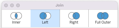
In general, Tableau supports the following join types:
- inner join: An inner join returns only the rows that have matching values in both tables.
- left join: A left join returns all the rows from the left table, and the matching rows from the right table. If there is no match in the right table, it returns NULL values.
- right join: A right join returns all the rows from the right table and the matching rows from the left table. If there is no match in the left table, it returns NULL values.
- full outer join: A full outer join returns all the rows from both tables. It includes the matching rows from both tables and the non-matching rows with NULL values for the missing columns.
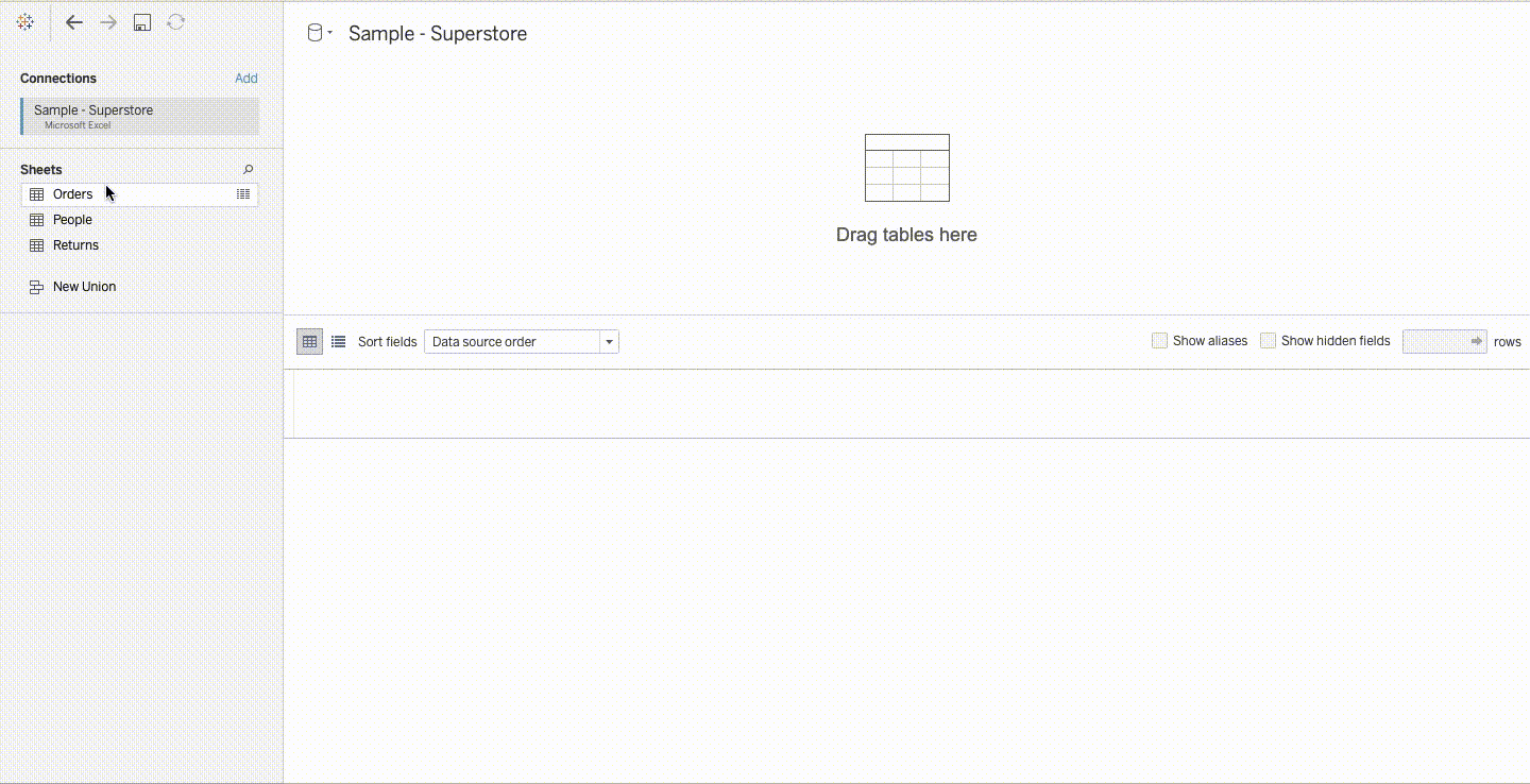
How to join data in Tableau?
In Tableau, you can perform joins by dragging and dropping tables from different data sources in the Data Source tab > "Drag tables here" area. After you've dropped the first table, right click on the table > Open. You'll see the join dialog box pop up. Drag your second data source in the area and select the join type you need. Exit out of the dialog box by clicking on x in the top left corner.
What is the difference between joining and blending?
Joining and blending are two ways to combine data from multiple sources in Tableau, but they differ in how they integrate the data.
Joining combines data from different tables within the same data source by linking them together based on a common field. Joining creates a new, flattened table by combining the data from the linked tables.
Blending, on the other hand, combines data from different data sources by linking them on a common field, but it does not combine the data into a single, flattened table. Instead, blending maintains the separate data sources and queries them independently. Blending is useful when working with large data sets or when maintaining the granularity of individual data sources is necessary.
What is the difference between a live and an extract?
In Tableau, there are two ways to connect to data: live connection and extract connection. The main difference between these two connection types is how Tableau interacts with the data source.
A live connection means that Tableau is connected directly to the data source and queries the data source in real-time as you interact with the visualization. However, live connections can be slower and less efficient than extract connections when working with large data sets or complex queries.
An extract connection, on the other hand, means that Tableau creates a static copy of the data source and stores it in a Tableau-specific format called a "data extract." This extract contains only the data that you need for your analysis, which can improve performance and reduce the load on the data source. Extracts can be refreshed or updated on a schedule, or manually as needed.
What is a dimension vs. a measure?
In Tableau, a dimension is a categorical variable that describes data, while a measure is a numerical value that can be aggregated or computed in some way. Dimensions are typically used to group and slice data, while measures are used to calculate and analyze data.
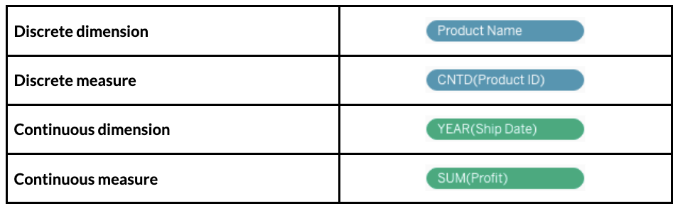
What is a discrete vs. a continuous value?
In Tableau, a discrete value is a distinct value that can be counted (number of dogs in the park, number of rainbow colors, etc.), while a continuous value is a numeric value that can take on any value within a range (150.38 lbs, 6 ½ hours, etc.). Discrete values (in blue) are typically used for categorical data, while continuous values (in green) are used for numerical data.
Intermediate Tableau Interview Questions
For mid-level to senior positions, you can expect to be questioned on more advanced topics in Tableau. If the role requires a strong knowledge of the tool, you will be expected to hit the ground running by providing guidance on dashboard design best practices and implementing relatively advanced concepts. Let's look at a few examples of questions you may be asked.
Best practices for designing dashboards
A fairly common question that comes up during Tableau interviews is about dashboard design. Make sure to discuss key points, like designing with the audience in mind, eliminating clutter, using colors and shapes strategically, as well as using the right kind of chart for the information you're looking to convey.
Another important aspect is the ability to control user flow in a dashboard. The user shouldn't feel "stuck" at any point of using the dashboard. Instead, the dashboard should be designed in a way that allows the user to seamlessly click into a tile, drill-down into it, expand the data into a new view, and return back to the home page.
For more design tips, check out our blog post on Best Practices for Designing Dashboards.
What is the Order of Operations?
The order of operations, also called the query pipeline, is the order in which actions, or operations, are executed in Tableau. As you add filters to your dashboard, they will execute in the order determined by the order of operations. You'll notice that some operations can conflict with each other, leading to unexpected results.
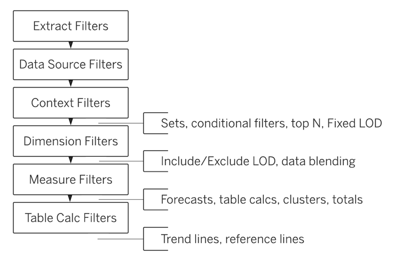
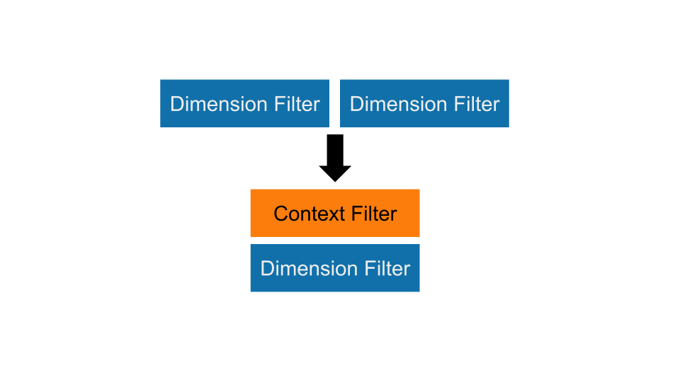
In the Superstore dataset, let's say we're interested in the top 10 customers by sales volume in New York City only. After applying the city and customer filters, we'll get a different list of top customers than what originally returned. That's because both filters are dimension filters so they get executed "at the same time." The idea is to set another filter level, in this case, the context filter, so the filters get applied in the correct order. To do that, right click on the City:New York City filter and select Add to Context. Your problem is now resolved.
What are parameters, sets, and groups?
Parameters, sets, and groups are features that allow users to "slice and dice" the data in different ways.
- Parameters: Parameters are user-defined values that allow users to customize their visualizations by changing values such as filters, calculations, and reference lines. Parameters provide flexibility and interactivity to visualizations by allowing users to dynamically adjust the data being displayed in a visualization. Users can also create parameter actions to further enhance the interactivity of their visualizations.
- Sets: Sets are custom fields that group together similar data points based on a common condition. Sets can be used for filtering and for creating custom calculations based on the members of the set. Sets are created using a logical expression that defines the criteria for inclusion in the set. Once created, sets can be used in calculations, filters, and visualizations.
- Groups: Groups allow users to group data points together based on a specific field. Groups are created by selecting individual values from a field and grouping them together under a single label. Groups are useful for creating hierarchical views of data and for simplifying complex visualizations. Groups can also be used for filtering and for creating custom calculations.
While all three features allow users to customize their visualizations, their functions and application differ. Parameters provide flexibility and interactivity, sets allow for grouping of similar data points, and groups provide a way to group data points together based on a specific field.
What is a calculated field?
A calculated field in Tableau is a field that is created by performing calculations on existing fields in a data source. Calculated fields can be used in the same way as any other field in a Tableau visualization, including being used as dimensions or measures, or for filtering or grouping data.
Let's say we want to return a list of emails for the Superstore sales people. We can easily create a new dimension based on the standard corporate email format. We can use the following calculated field to return the information:
LOWER(LEFT([Person],1)) + '.' + LOWER(RIGHT([Person], LEN([Person]) - (find([Person], ' ', 1)))) + '@superstore.com'What is a dual axis?
A dual axis in Tableau is a technique used to combine two separate visualizations on a single axis. It allows users to compare two measures or sets of data with different scales or units of measurement.
Start by adding 2 different measures in the same row, either the Rows or the Columns section. Right-click into the second measure and select Dual Axis. You'll now see the measures plotted on the same chart but with two different axes.
Advanced Tableau Interview Questions
For jobs requiring an advanced knowledge of Tableau, like Tableau Developer roles, you need to be able to demonstrate proficiency in using advanced features, like Level of Detail (LOD) expressions, increasing the performance of a workbook, and meeting security needs of the company. Let's look at a few examples of questions you may be asked during the interview.
What are LOD expressions?
LOD expressions are used to perform aggregations that are more granular than the view's original level of aggregation. There are three types of LOD expressions: FIXED, INCLUDE, and EXCLUDE:
- A
FIXED LODcomputes a value for a fixed level of dimensions, regardless of the view's other dimensions. - An
INCLUDE LODcomputes a value for a specified level of dimensions while also including other dimensions in the view. - Finally, an
EXCLUDE LODcomputes a value for a specified level of dimensions while excluding other dimensions from the view.
For example, let's say we have a visualization that shows the total sales volume by region by month, but we also want to return the total sales volume by region only without aggregating at the month-level. We can use an LOD to perform the calculation. Create a calculated field and add the formula below:
{FIXED [Region] : SUM([Sales])}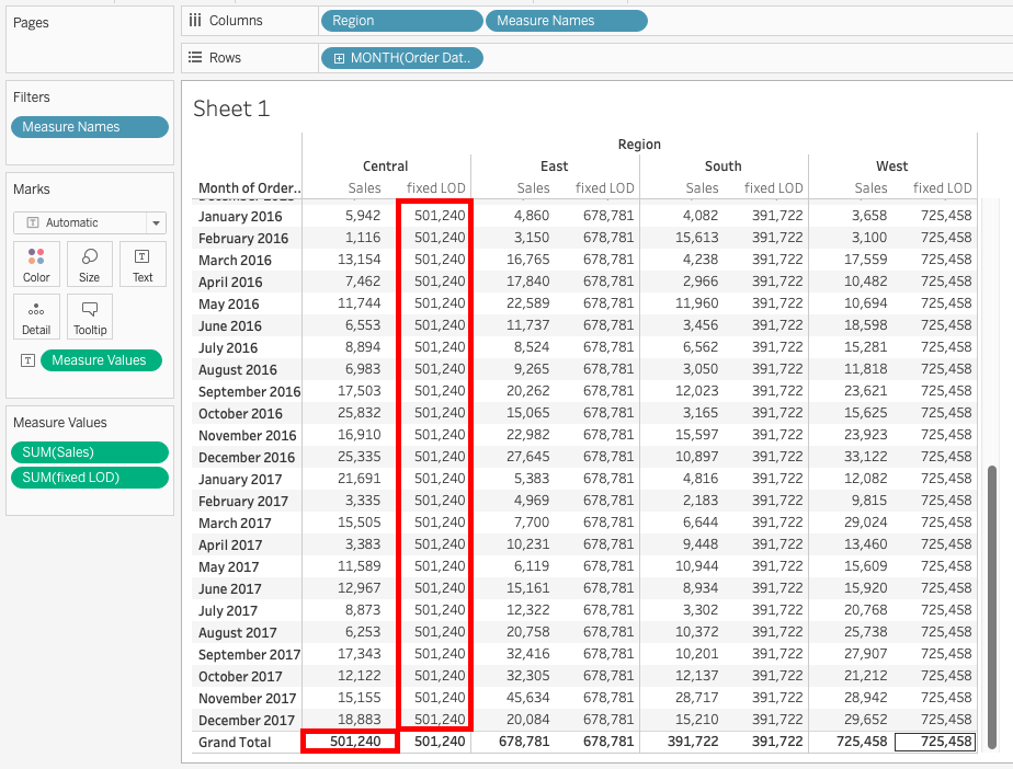
What are actions?
In Tableau, actions refer to a set of interactive behaviors that allow users to navigate and interact with data visualizations. There are several types of actions in Tableau, including:
- Filter: applies the same filter from one view to another;
- Highlight: marks important information while muting others;
- Go to URL: redirects the user to an external resource, which can include another Tableau workbook, a file, or a web page;
- Go to Sheet: helps navigate between sheets, dashboards, and stories within a Tableau workbook;
- Change Parameter: allows users to dynamically update the visualization by changing the parameter values; and
- Change Set Values: allows users to dynamically update the visualization by selecting a subset of elements to include in the analysis.
How do you restrict access to the data?
Tableau provides several ways to restrict data access to users, including user-level security, row-level security, and column-level security. Here is a brief overview of each approach:
- User-level security: User-level security is used to restrict access to Tableau content based on user login credentials. With user-level security, you can define which users can access specific workbooks, views, and data sources within Tableau.
- Row-level security: Row-level security is used to restrict access to specific rows of data within a dataset based on the user's login credentials.
- Column-level security: Column-level security is used to restrict access to specific columns of data within a dataset based on the user's login credentials.
By using user-level, row-level, and column-level security, you can ensure that only authorized users have access to specific data within your Tableau environment. This can help you to maintain data privacy, confidentiality, and security.
How do you increase the performance of a slow workbook?
If you are experiencing slow workbook performance in Tableau, there are several strategies you can use to improve performance.
- Optimize data sources: One of the main reasons for slow workbook performance in Tableau is a poorly optimized data source. To improve performance, you should ensure that your data source is properly optimized by removing unnecessary joins, filtering out unused fields, and aggregating data at the appropriate level.
- Optimize your workbook: Another way to improve performance is to optimize your workbook by simplifying the layout, removing unused fields and sheets, and minimizing the use of complex calculations and visualizations. You should also consider reducing the number of dashboard elements and filters to improve performance.
- Use data extracts: Data extracts are pre-aggregated subsets of data that can be used to speed up workbook performance. By using data extracts, you can reduce the amount of data that Tableau needs to process, which can improve performance.
- Use filters: Filters can be used to reduce the amount of data that Tableau needs to process, which can improve performance. You can use filters to restrict the data that is displayed in your visualization, or to remove unnecessary data from the view.
Scenario-Based Tableau Interview Questions
In some cases, you may be given a visualization assessment, either as a take-home assignment or a time-based one. Let's take a look at some examples of scenario-based interview questions.
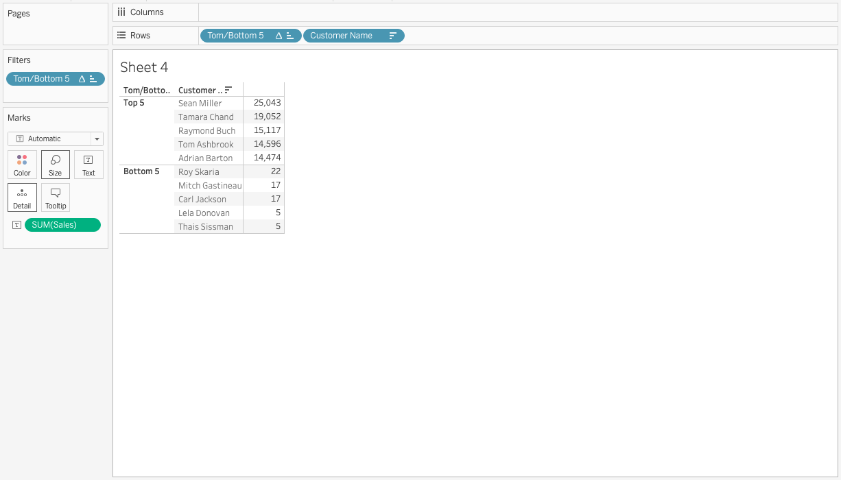
Build a chart showing the top five and bottom five sales by customer
Let's first build a calculated field by entering the following expression:
IF RANK(SUM([Sales]), 'desc') <= 5
    THEN 'Top 5'
    ELSEIF RANK(SUM([Sales]), 'asc') <= 5
    THEN 'Bottom 5'
    ELSE NULL
END
Next, we'll drag the new field to the Filters shelf and select 'Top 5' and 'Bottom 5' only. Drag the field to the Rows shelf too. Now, let's add the Customer Name to the Rows shelf and the Sales field over the Text label. You're done!
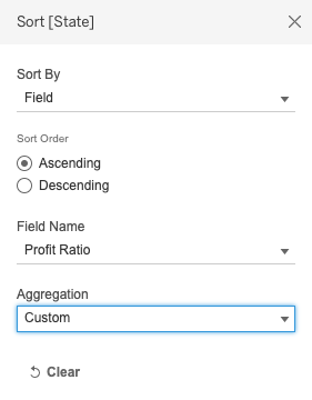
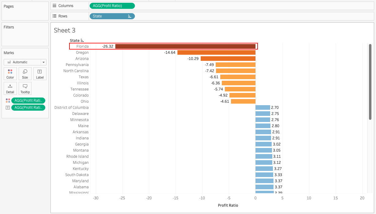
Find the state with the lowest profit ratio
First, we'll create a calculated field and enter the following formula:
SUM([Sales]) / SUM([Profit])Next, drag the state field to the Rows shelf and the new calculation to the Columns shelf and over the Text label icon. Finally, sort the chart in ascending order. Your answer is the first state in the list.
Conclusion
Now that you're ready to be quizzed on your knowledge of Tableau, it's time to practice! Join the Data Analyst in Tableau track, or check out the Tableau cheat sheet to hone your data visualization skills. Hands-on practice will give you a fair bit of experience and the confidence to ace your next technical interview.


blog
Top 25 Excel Interview Questions For All Levels

Chloe Lubin
17 min

blog
25 Essential Power BI Interview Questions For Every Level

Joleen Bothma
15 min
blog
Top 32 AWS Interview Questions and Answers For 2024

Zoumana Keita
15 min

blog
The 80 Top SQL Interview Questions and Answers for Beginners & Intermediate Practitioners

Elena Kosourova
12 min
blog
Top 30 SQL Server Interview Questions (2024)
Kevin Babitz
14 min
blog
6 Tableau Projects to Help Develop Your Skills

Jess Ahmet
6 min