Reporting on important business metrics on a regular cadence is a core responsibility of many analysts. Doing this consistently and without mistakes is tremendously valuable to your organization to support business decisions, but at what cost? Too often, you need to go through a bunch of manual steps to collect the data, build the report with key performance indicators and share it out with stakeholders. This workflow is both time intensive and error-prone.
Luckily, there’s a better way: you can leverage the scheduling capabilities of DataCamp Workspace to automatically report on business metrics with insightful visualizations, saving you time and minimizes the likelihood of errors in your reporting process.
In this article, we’ll showcase the workflow by running a report on stock market data (because there’s new data almost every day) on a recurring schedule so the notebook always reflects the latest events happening in the market.
Prefer to watch this article in video format? DataCamp hosted a code along on the same topic, setting up automated reporting on bicycle sales data stored in a Microsoft SQL Server database. You can replay this code along by visiting this link.
Building the report
To start, we need to build a new data project in Workspace (called a workspace) that does the operations that we want to automate in the next step. For the purposes of this tutorial, we’ll work with stock market data, because this data is publicly available and updates regularly. That way, our report changes over time.
It’s most convenient to create a copy from a workspace that already has all the code. If you want to go through every step yourself, create a new workspace from scratch and add a Python code cell that imports stock market data and visualize it:
import pandas as pd
import plotly.express as px
import yfinance as yf
# Define how many stock I own of each ticker
holdings = {
'AAPL': 16,
'TSLA': 15,
'TEAM': 7,
}
# Get the data
tickers = list(holdings.keys())
data = yf.download(tickers, start="2023-01-01")
# Wrangle the data
adj_close = data['Adj Close'].reset_index()
adj_close_long = pd.melt(
adj_close,
id_vars='Date',
value_vars=tickers,
var_name='ticker',
value_name='adj_close'
)
adj_close_long['total_value'] = adj_close_long['adj_close'] * adj_close_long['ticker'].map(holdings)
adj_close_long
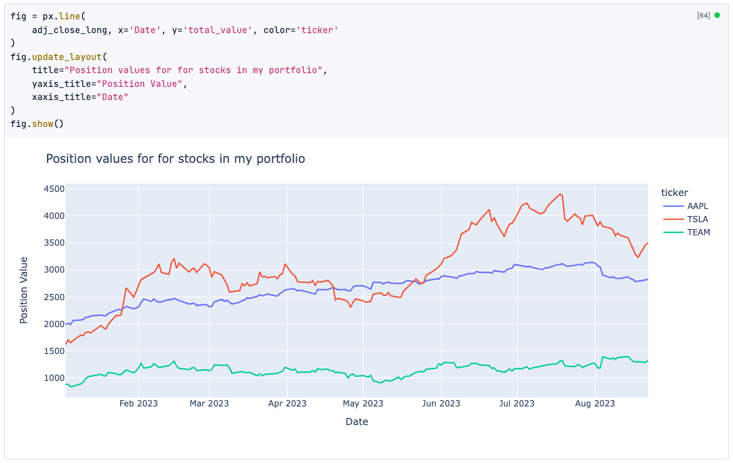
# Show the position values for stocks in my portfolio
fig = px.line(
adj_close_long, x='Date', y='total_value', color='ticker'
)
fig.update_layout(
title="Position values for for stocks in my portfolio",
yaxis_title="Position Value",
xaxis_title="Date"
)
fig.show()A detailed explanation of this code is beyond the scope of this article; we just want to get some Python code up and running so we can schedule it in the next step! You can verify that the code in your workspace notebook runs fine by clicking the “Run” button at the top. You should see a beautiful plotly plot appear:
Automating the report
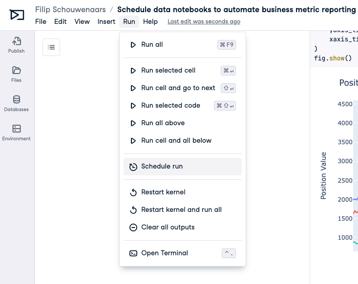
Now that we have a workspace with some Python code, let’s go ahead and configure it so it runs on a recurring schedule! Head over to the “Run” menu and select “Schedule run”:
In the modal, you can schedule notebook runs by choosing between daily or weekly frequency and specifying the execution time. Additionally, you have the option to receive email notifications for both successful and unsuccessful runs.
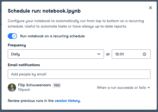
For the sake of experimentation, set your notebook to run on a daily schedule, at a time just a couple of minutes in the future, so you can see the scheduling in action!
See the magic happen
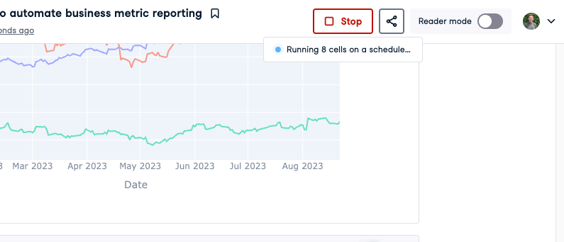
If you’ve configured the notebook to run a couple of minutes in the future, wait for a minute for the scheduled run to kick in. At the time you set, you’ll see that a “Running X cells on a schedule” message appears below the Run button. All the code is being executed again from top to bottom, updating the outputs in case new data is available compared to the last time this ran.
If you’ve configured the workspace to send you an email on a successful run, you’ll also have received an email in your inbox:
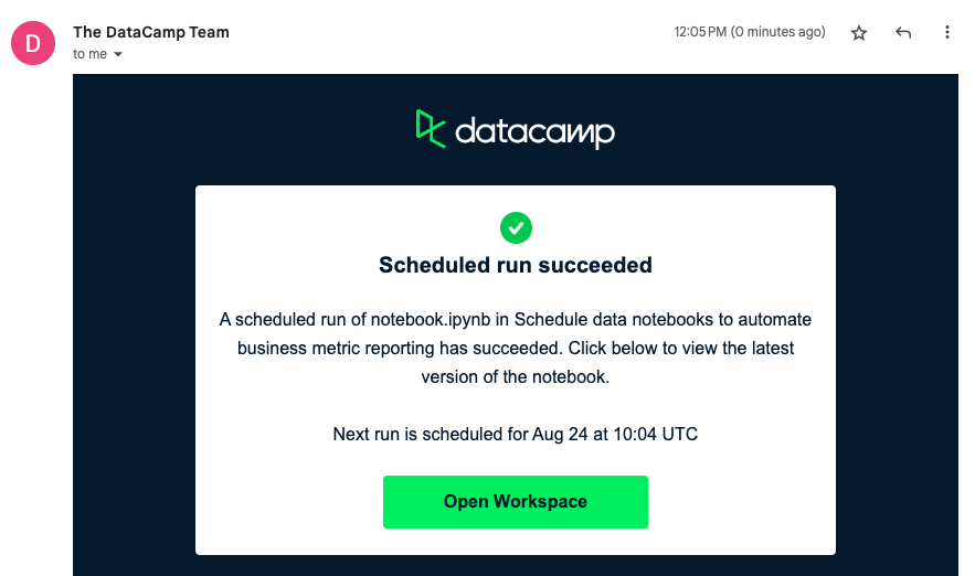
That’s it! Your notebook will now run every day or every week, depending on how you configured it, so when you visit the workspace, it will always have the latest data. In this example with stock market data, this means you’re always in the know about the total value of your stock portfolio.
In a business context, you could use this feature in combination with one of Workspace’s native data connectors to connect to e.g. a PostgreSQL database, a Snowflake data warehouses or a Redshift cluster to pull in the latest data on your company and build insightful reports to share with stakeholders.
Since its launch, Workspace users have used this feature for various purposes, including:
- running data validation checks during migrations to ensure data consistency between different sources,
- scraping data from regularly updated public policy pages to create datasets and monitor civic appointments' fairness, and
- automating data collection and sending personalized weekly email digests to SaaS application users by integrating it with solutions like Customer.io.
Python’s flexibility with Workspace’s fully-configured notebook environment make for a powerful combination; we’re excited to learn what you cook up with this new Workspace feature!
blog
DataCamp's new workspace product lets you start your own data analysis in seconds

Jonathan Cornelissen
6 min


blog
How I Saved Months Automating My Reporting with DataLab

Rhys Phillips
6 min
blog
Introducing DataLab

Filip Schouwenaars
3 min
blog
10 Ways to Speed Up Your Analysis With the DataLab AI Assistant

Justin Saddlemyer
11 min
code-along
Automate Business Metric Reporting with Datalab
Filip Schouwenaars
code-along
Using DataLab in Data Academies
Filip Schouwenaars