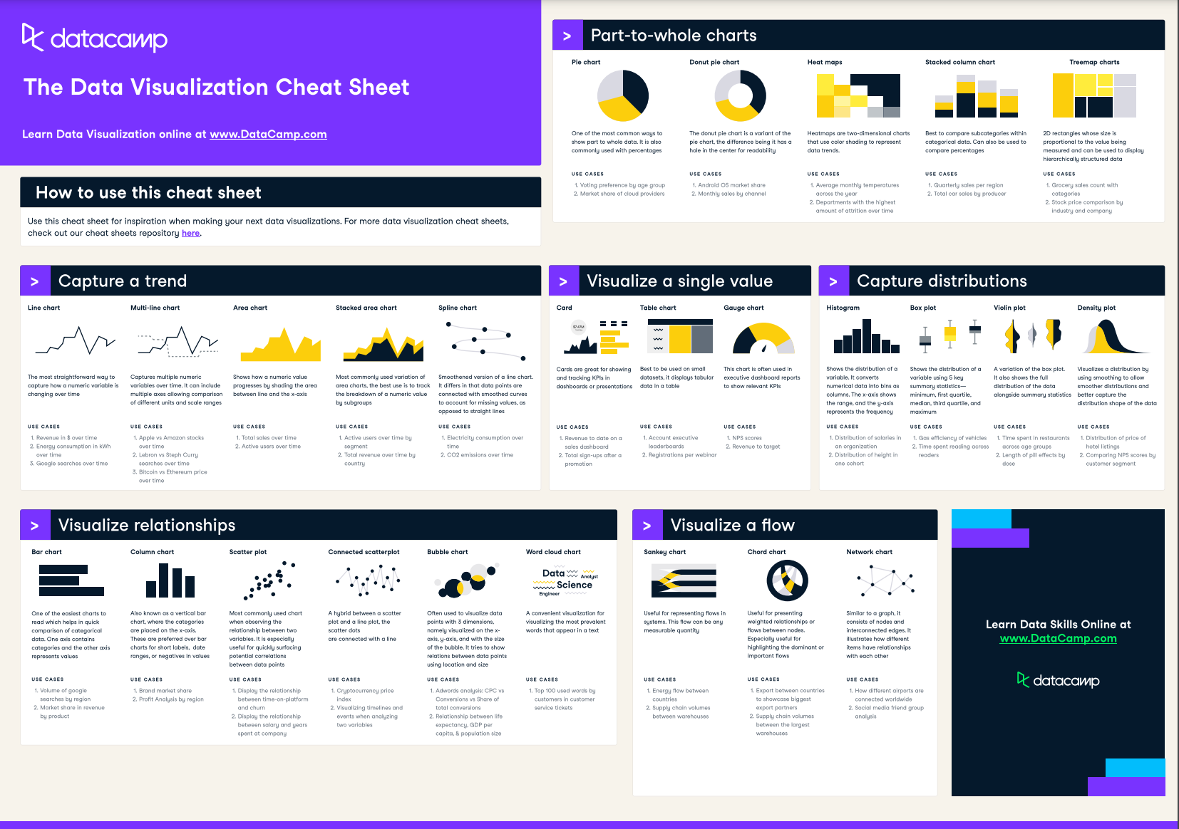
Data Visualization Cheat Sheet
Data visualization is one of the most widely-used data skills—and is often called the "gateway drug" into data science. In this data visualization cheat sheet, you'll learn about the most common data visualizations to employ, when to use them, and their most common use-cases.
Have this cheat sheet at your fingertips
Download PDFHow to Capture a Trend
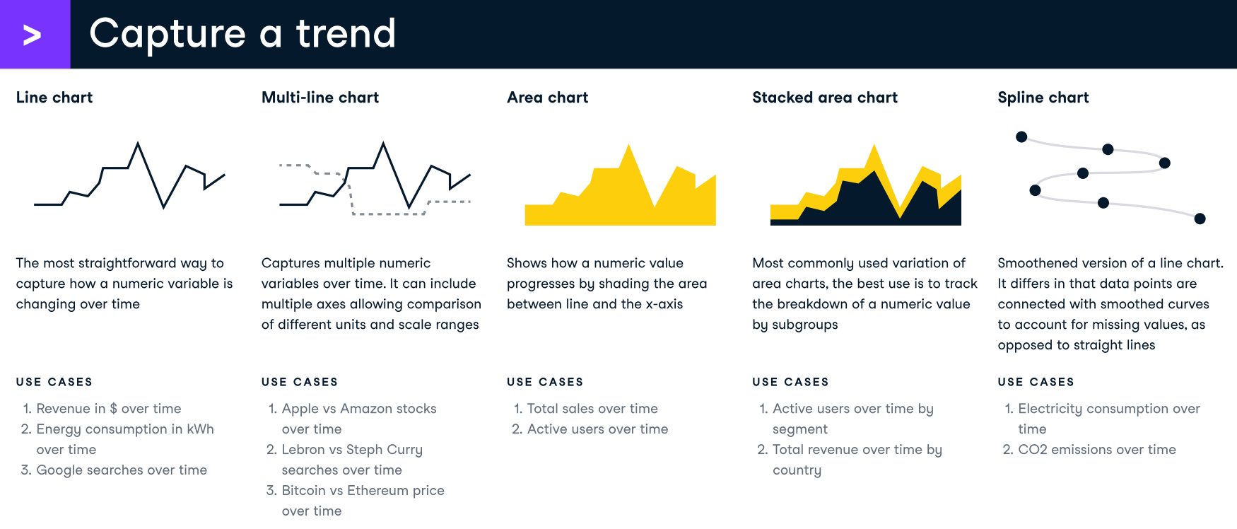
These data visualizations allow you to display a trend over time. Here's a breakdown of these charts:
- Line chart: The most straightforward way to capture how a numeric variable is changing over time
- Multi-line chart: Captures multiple numeric variables over time. It can include multiple axes allowing comparison of different units and scale ranges
- Area chart: Shows how a numeric value progresses by shading the area between line and the x-axis
- Stacked area chart: Most commonly used variation of area charts, the best use is to track the breakdown of a numeric value by subgroups
- Spline chart: Smoothened version of a line chart. It differs in that data points are connected with smooth curves to account for missing values, as opposed to straight lines
How to Visualize Relationships
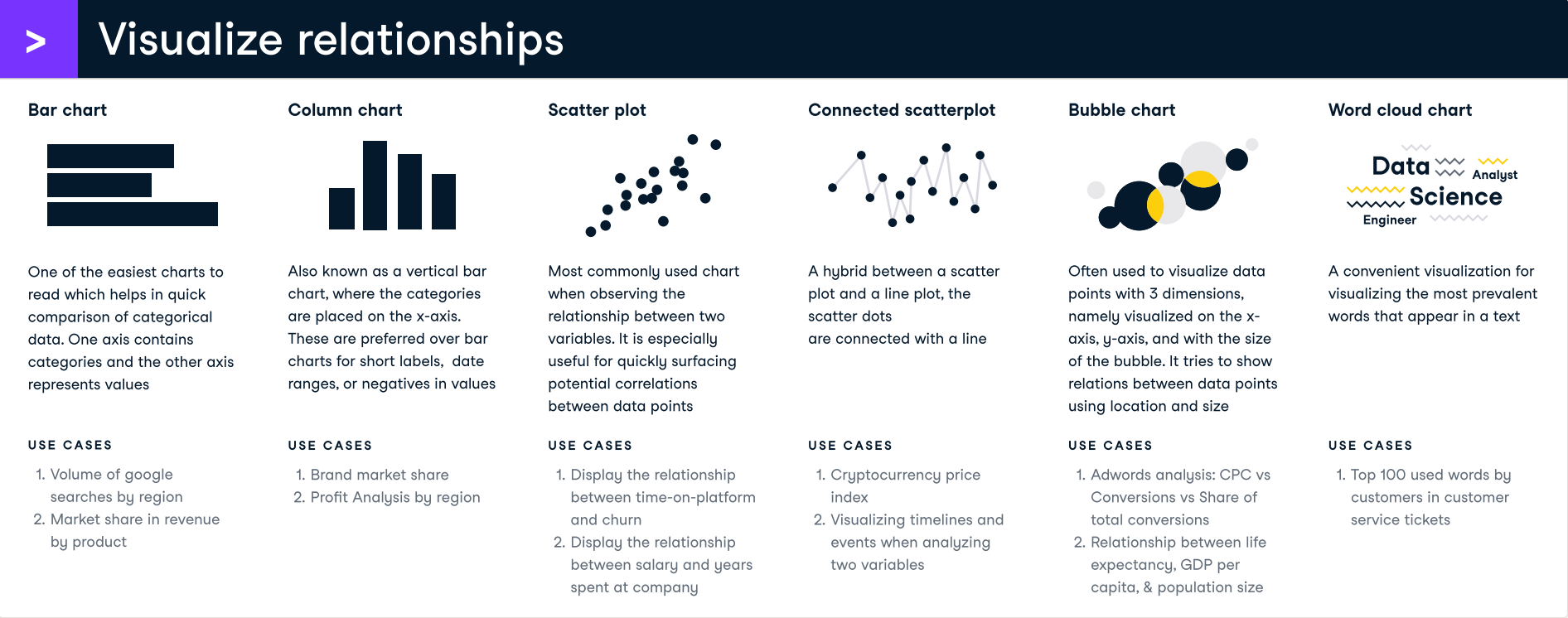
These data visualizations allow you to display relationships between data points. Here's a breakdown of these charts:
- Bar chart: One of the easiest charts to read which helps in quick comparison of categorical data. One axis contains categories and the other axis represents values.
- Column chart: Also known as a vertical bar chart, where the categories are placed on the x-axis. These are preferred over bar charts for short labels, date ranges, or negatives in values.
- Scatter plot: Most commonly used chart when observing the relationship between two variables. It is especially useful for quickly surfacing potential correlations between data points.
- Connected scatterplot: A hybrid between a scatter plot and a line plot, the scatter dots are connected with a line
- Bubble charts: Often used to visualize data points with 3 dimensions, namely visualized on the x-axis, y-axis, and with the size of the bubble. It tries to show relations between data points using location and size
- World cloud chart: A convenient visualization for visualizing the most prevalent words that appear in a text. This can be used to visualize the relationship between different words that appear together or capture a trend on the most commonly prevalent words.
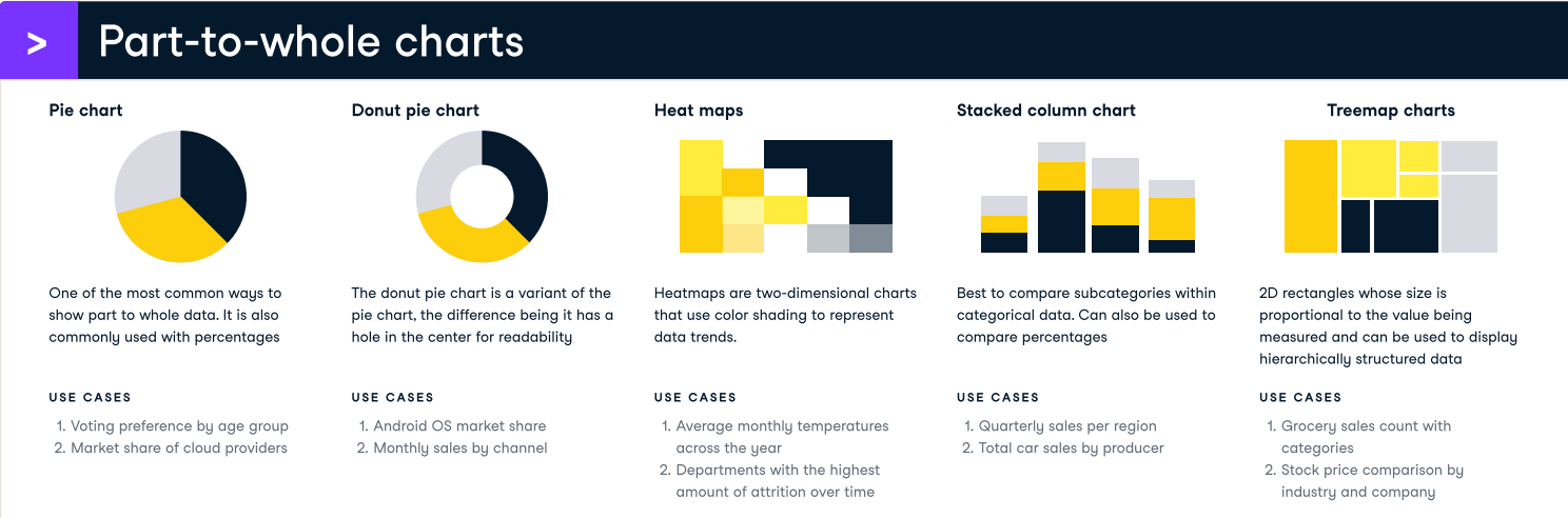
Part-to-whole Charts
These data visualizations allow you to show sub-categories within a large category
- Pie chart: One of the most common ways to show part to whole data. It is also commonly used with percentages
- Donut pie chart: The donut pie chart is a variant of the pie chart, the difference being it has a hole in the center for readability
- Heat maps: Heatmaps are two-dimensional charts that use color shading to represent data trends
- Stacked column chart: Best to compare subcategories within categorical data. Can also be used to compare percentages
- Treemap charts: 2D rectangles whose size is proportional to the value being measured and can be used to display hierarchically structured data
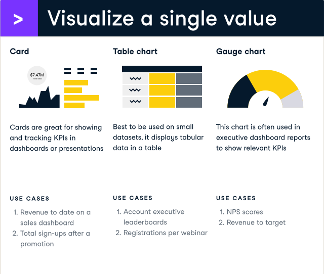
How to Visualize a Single Value
These data visualizations allow you to visualize a single data point
- Card: Cards are great for showing and tracking KPIs in dashboards or presentations
- Table chart: Best to be used on small datasets, it displays tabular data in a table
- Gauge chart: This chart is often used in executive dashboard reports to show relevant KPIs
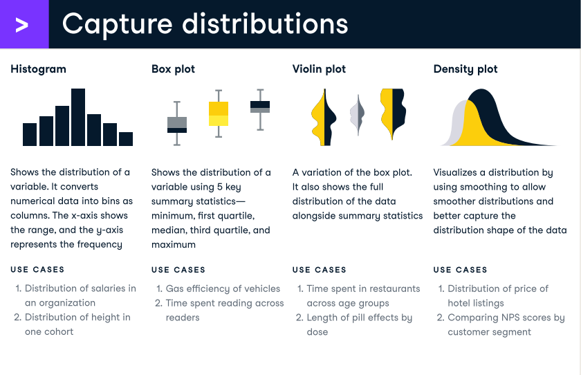
How to Capture Distributions
These data visualizations allow you to visualize the distribution of a variable
- Histograms: Shows the distribution of a variable. It converts numerical data into bins as columns. The x-axis shows the range, and the y-axis represents the frequency
- Box plot: Shows the distribution of a variable using 5 key summary statistics—minimum, first quartile, median, third quartile, and maximum
- Violin plot: A variation of the box plot. It also shows the full distribution of the data alongside summary statistics
- Density plot: Visualizes a distribution by using smoothing to allow smoother distributions and better capture the distribution shape of the data
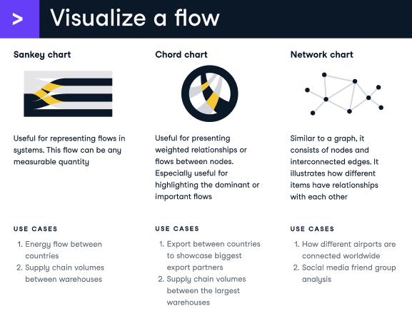
Visualize a flow
These data visualizations allow you to visualize how data points flow into eachother
- Sankey chart: Useful for representing flows in systems. This flow can be any measurable quantity
- Chord chart: Useful for presenting weighted relationships or flows between nodes. Especially useful for highlighting the dominant or important flows
- Network chart: Similar to a graph, it consists of nodes and interconnected edges. It illustrates how different items have relationships with each other


blog
11 Data Visualization Techniques for Every Use-Case with Examples

Javier Canales Luna
16 min
blog
[Infographic] Dashboard Design Checklist
DataCamp Team
cheat sheet
Descriptive Statistics Cheat Sheet

Richie Cotton
5 min
cheat sheet
Data Storytelling & Communication Cheat Sheet
Richie Cotton
6 min
cheat sheet
Tableau Cheat Sheet
Richie Cotton
8 min
cheat sheet
Power BI Cheat Sheet
Richie Cotton
8 min