HomeCheat sheetsData Visualization

Data Storytelling & Communication Cheat Sheet

In this data storytelling and communication cheat sheet, you'll learn about best practices for crafting data stories.
Sep 2022  · 6 min read

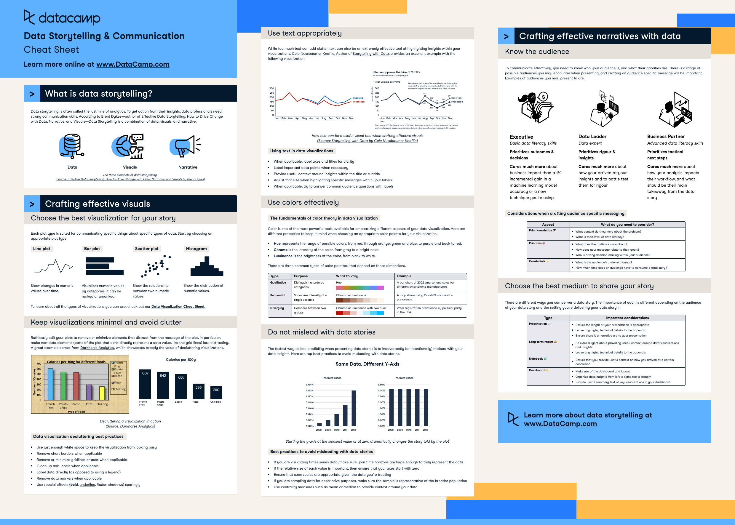
Data storytelling is often called the last mile of analytics. Sound communication skills allow data professionals to drive action out of their insights. According to Brent Dykes, Author of Effective Data Storytelling: How to Drive Change with Data, Narrative, and Visuals—Data Storytelling is a combination of data, visuals, and narrative. In this cheat sheet, we outline best practices for delivering data stories to a wide variety of audiences.

https://images.datacamp.com/image/upload/v1662633286/Marketing/Blog/Data_Storytelling_Cheat_Sheet.pdf

Have this cheat sheet at your fingertips

Download PDF

Crafting effective visuals

Choose the best visualization for your story

Each plot type is suited for communicating specific things about specific types of data. Start by choosing an appropriate plot type. 

  • Line plot: Show changes in numeric values over time.
  • Bar plot: Visualizes numeric values by categories. It can be ranked or unranked.
  • Scatter plot: Show the relationship between two numeric values.
  • Histogram: Show the distribution of numeric values.

To learn about all the types of visualizations you can use, check out our Data Visualization Cheat Sheet.

Keep visualizations minimal and avoid clutter

Ruthlessly edit your plots to remove or minimize elements that distract from the message of the plot. In particular, make non-data elements (parts of the plot that don't directly represent a data value, like the grid lines) less distracting. A great example comes from Darkhorse Analytics, which showcases exactly the value of decluttering visualizations.

Data visualization decluttering best practices

  • Use just enough white space to keep the visualization from looking busy 
  • Remove chart borders when applicable 
  • Remove or minimize grid lines or axes when applicable 
  • Clean up axis labels when applicable 
  • Label data directly (as opposed to using a legend) 
  • Remove data markers when applicable 
  • Use special effects (bold, underline, italics, shadows) sparingly

Use text appropriately

While too much text can add clutter, text can also be an extremely effective tool at highlighting insights within your visualizations. Cole Nussbaumer Knaflic, Author of Storytelling with Data, provides an excellent example with the following visualization. 

Using text in data visualizations

  • When applicable, label axes and titles for clarity 
  • Label important data points when necessary 
  • Provide useful context around insights within the title or subtitle 
  • Adjust font size when highlighting specific messages within your labels 
  • When applicable, try to answer common audience questions with labels

Use colors effectively

The fundamentals of color theory in data visualization

Color is one of the most powerful tools available for emphasizing different aspects of your data visualization. Here are different properties to keep in mind when choosing an appropriate color palette for your visualization. 

  • Hue represents the range of possible colors, from red, through orange, green and blue, to purple and back to red. 
  • Chroma is the intensity of the color, from gray to a bright color. 
  • Luminance is the brightness of the color, from black to white. 

There are three common types of color palettes that depend on these dimensions.

Type Purpose Example
Qualitative Distinguish unordered categories A bar chart of 2022 smartphone sales for different smartphone manufacturers
Sequential Showcase intensity of a single variable A map showcasing Covid-19 vaccination prevalence
Diverging Compare between two groups Voter registration prevalence by political party in the USA

Do not mislead with data stories

The fastest way to lose credibility when presenting data stories is to inadvertently (or intentionally) mislead with your data insights. Here are top best practices to avoid misleading with data stories.

Best practices to avoid misleading with data stories

  • If you are visualizing times series data, make sure your time horizons are large enough to truly represent the data 
  • If the relative size of each value is important, then ensure that your axes start with zero 
  • Ensure that axes scales are appropriate given the data you re treating 
  • If you are sampling data for descriptive purposes, make sure the sample is representative of the broader population 
  • Use centrality measures such as mean or median to provide context around your data 

Crafting effective narratives with data

Know the audience

To communicate effectively, you need to know who your audience is, and what their priorities are. There is a range of possible audiences you may encounter when presenting, and crafting an audience-specific message will be important. Examples of audiences you may present to are:

Executive 

  • Basic data literacy skills 
  • Prioritizes outcomes & decisions 
  • Cares much more about business impact than a 1% incremental gain in a machine learning model accuracy or a new technique you re using

Data Leader 

  • Data expert 
  • Prioritizes rigor & insights 
  • Cares much more about how your arrived at your insights and to battle test them for rigor

Business Partner 

  • Advanced data literacy skills 
  • Prioritizes tactical next steps 
  • Cares much more about how your analysis impacts their workflow, and what should be their main takeaway from the data story

Considerations when crafting audience specific messaging

Aspect What do you need to consider?
Prior knowledge
  • What context do they have about the problem?
  • What is their level of data literacy?
Priorities
  • What does the audience care about?
  • How does your message relate to their goals?
  • Who is driving decision-making within your audience?
Constraints
  • What is the audiences preferred format?
  • How much time does an audience have to consume a data story?

Choose the best medium to share your story

There are different ways you can deliver a data story. The importance of each is different depending on the audience of your data story and the setting you’re delivering your data story in. 

Type Important considerations
Presentations
  • Ensure the length of your presentation is appropriate
  • Leave any highly technical details to the appendix
  • Ensure there is a narrative arc to your presentation
Long-form report
  • Be extra diligent about providing useful context around data visualizations and insights
  • Leave any highly technical details to the appendix 
Notebook
  • Ensure that you provide useful context on how you arrived at a certain conclusion 
Dashboard
  • Make use of the dashboard grid layout
  • Organize data insights from left to right, top to bottom
  • Provide useful summary text of key visualizations in your dashboard

Learn more about data storytelling at www.DataCamp.com

Topics
Related

blog

Telling Effective Data Stories with Data, Narrative, and Visuals

Effective data storytelling enables data practitioners to cross the last mile of analytics, enabling them to drive action with their insights. In a recent webinar, Brent Dykes discussed how data, narrative, and visuals can drive effective data stories.
DataCamp Team's photo

DataCamp Team

5 min

blog

Seven Tricks for Better Data Storytelling: Part II

In a recent episode of DataFramed, Andy Cotgrave, technical evangelist at Tableau, shared the importance of data storytelling in driving change with analytics. In this two-part blog post, we deep dive into seven concrete tips that Andy provided on data storytelling
Travis Tang's photo

Travis Tang

4 min

blog

[Infographic] Dashboard Design Checklist

Dashboards are one of the most useful tools when communicating data stories. Here is a handy checklist to keep in mind when designing your next dashboard.
DataCamp Team's photo

DataCamp Team

cheat sheet

Data Visualization Cheat Sheet

In this data visualization cheat sheet, you'll learn about the most common data visualizations to employ, when to use them, and their most common use-cases.
Richie Cotton's photo

Richie Cotton

5 min

cheat sheet

Tableau Cheat Sheet

In this Tableau Cheat Sheet, you'll get the download on creating your first visualization, top visualizations in Tableau, creating dashboards, stories, and more.
Richie Cotton's photo

Richie Cotton

8 min

cheat sheet

Data Science Cheat Sheet for Business Leaders

This cheat sheet guides you through the basics of how data science can help your business, including building your data science team and the common steps in the data science workflow.
Joyce Chiu's photo

Joyce Chiu

6 min

See MoreSee More