HomeCheat sheetsPython

Plotly Express Cheat Sheet

Plotly is one of the most widely used data visualization packages in Python. Learn more about it in this cheat sheet.
Nov 2022  · 0 min read

What is plotly?

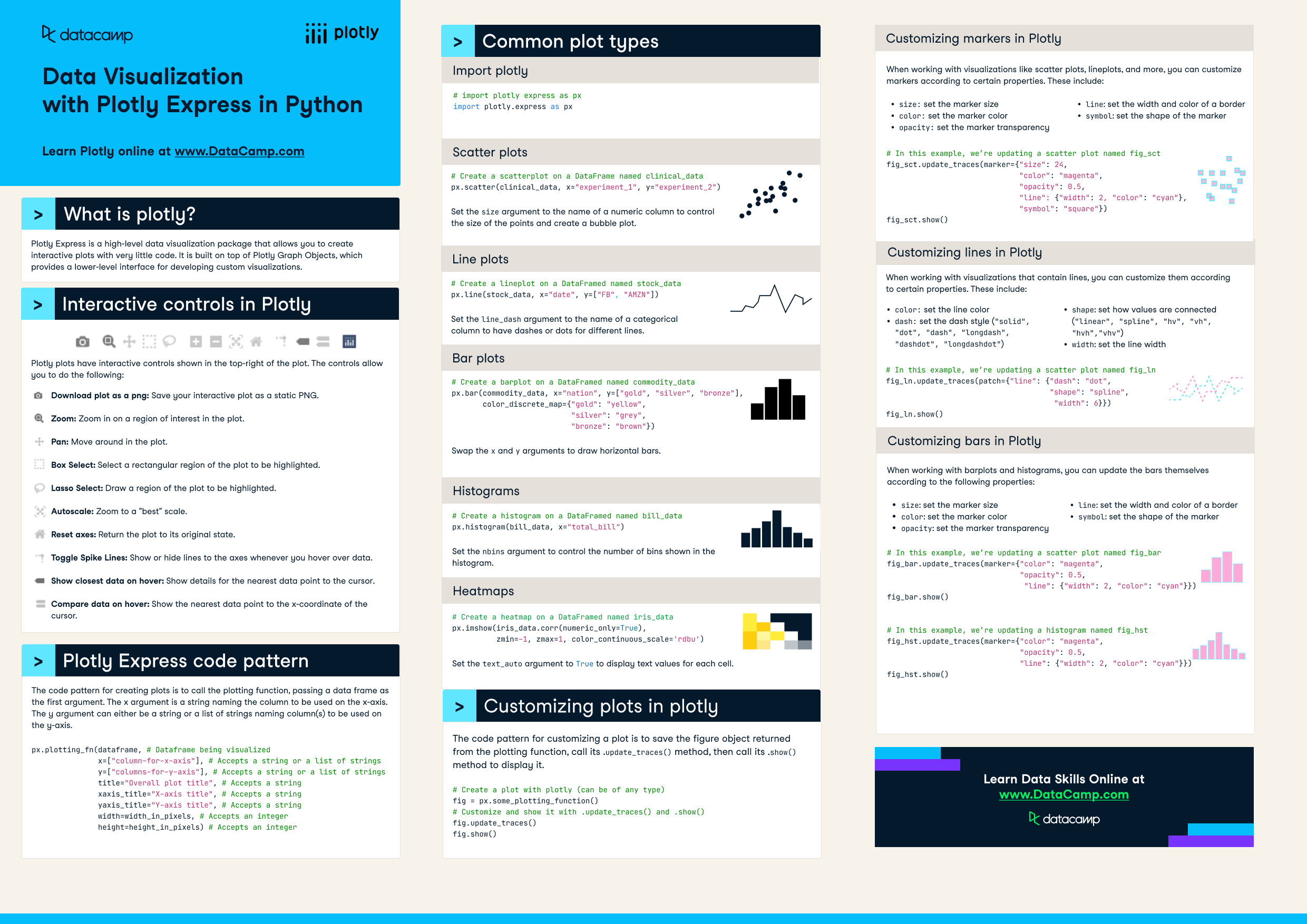
Plotly express is a high-level data visualization package that allows you to create interactive plots with very little code. It is built on top of Plotly Graph Objects, which provides a lower-level interface for developing custom visualizations. This cheat sheet covers all you need to know to get started with plotly in Python.
 

Plotly Cheat Sheet.png

Have this cheat sheet at your fingertips

Download PDF

Interactive controls in Plotly

Plotly plots have interactive controls shown in the top-right of the plot. The controls allow you to do the following:

  • Pan: Move around in the plot.
  • Box Select: Select a rectangular region of the plot to be highlighted.
  • Lasso Select: Draw a region of the plot to be highlighted.
  • Autoscale: Zoom to a "best" scale.
  • Reset axes: Return the plot to its original state.
  • Toggle Spike Lines: Show or hide lines to the axes whenever you hover over data.
  • Show closest data on hover: Show details for the nearest data point to the cursor.
  • Compare data on hover: Show the nearest data point to the x-coordinate of the cursor.

Plotly Express code pattern

The code pattern for creating plots is to call the plotting function, passing a data frame as the first argument. The x argument is a string naming the column to be used on the x-axis. The y argument can either be a string or a list of strings naming column(s) to be used on the y-axis.

px.plotting_fn(dataframe, # Dataframe being visualized
               x=["column-for-x-axis"], # Accepts a string or a list of strings
               y=["columns-for-y-axis"], # Accepts a string or a list of strings

               title="Overall plot title", # Accepts a string
               xaxis_title="X-axis title", # Accepts a string
               yaxis_title="Y-axis title", # Accepts a string
               width=width_in_pixels, # Accepts an integer
               height=height_in_pixels) # Accepts an integer

Common plot types

# First import plotly express as px
import plotly.express as px

Scatter plots

# Create a scatterplot on a DataFrame named clinical_data

px.scatter(clinical_data, x="experiment_1", y="experiment_2")

Set the size argument to the name of a numeric column to control the size of the points and create a bubble plot.

Line plots

# Create a lineplot on a DataFramed named stock_data
px.line(stock_data, x="date", y=["FB", "AMZN"])

Set the line_dash argument to the name of a categorical column to have dashes or dots for different lines.

Bar plots

# Create a barplot on a DataFramed named commodity_data
px.bar(commodity_data, x="nation", y=["gold", "silver", "bronze"],
       color_discrete_map={"gold": "yellow", 

                           "silver": "grey",
                           "bronze": "brown"})

Swap the x and y arguments to draw horizontal bars.

Histograms

# Create a histogram on a DataFramed named bill_data
px.histogram(bill_data, x="total_bill")

Set the nbins argument to control the number of bins shown in the histogram.

Heatmaps

# Create a heatmap on a DataFramed named iris_data
px.imshow(iris_data.corr(numeric_only=True),
zmin=-1, zmax=1, color_continuous_scale='rdbu')

Set the text_auto argument to True to display text values for each cell.

Customizing plots in plotly

The code pattern for customizing a plot is to save the figure object returned from the plotting function, call its .update_traces() method, then call its .show() method to display it.

# Create a plot with plotly (can be of any type)
fig = px.some_plotting_function()

# Customize and show it with .update_traces() and .show()
fig.update_traces()
fig.show()

Customizing markers in Plotly

When working with visualizations like scatter plots, lineplots, and more, you can customize markers according to certain properties. These include:

  • size: set the marker size
  • color: set the marker color
  • opacity: set the marker transparency
  • line: set the width and color of a border
  • symbol: set the shape of the marker
# In this example, we’re updating a scatter plot named fig_sct
fig_sct.update_traces(marker={ "size" : 24,
                           "color": "magenta",
                           "opacity": 0.5,
                           "line": {"width": 2, "color": "cyan"},
                           "symbol": "square"})
fig_sct.show()

Customizing lines in Plotly

When working with visualizations that contain lines, you can customize them according to certain properties. These include:

  • color: set the line color
  • dash: set the dash style ("solid", "dot", "dash", "longdash", "dashdot", "longdashdot")
  • shape: set how values are connected ("linear", "spline", "hv", "vh", "hvh","vhv")
  • width: set the line width
# In this example, we’re updating a scatter plot named fig_ln

fig_ln.update_traces(patch={"line": {"dash": "dot",
                           "shape": "spline",
                           "width": 6}})
fig_ln.show()

Customizing bars in Plotly

When working with barplots and histograms, you can update the bars themselves according to the following properties:

  • size: set the marker size
  • color: set the marker color
  • opacity: set the marker transparency
  • line: set the width and color of a border
  • symbol: set the shape of the marker
# In this example, we’re updating a scatter plot named fig_bar
fig_bar.update_traces(marker={"color": "magenta",
                              "opacity": 0.5,
                              "line": {"width": 2, "color": "cyan"}})
fig_bar.show()

# In this example, we’re updating a histogram named fig_hst
fig_hst.update_traces(marker={"color": "magenta", 
                              "opacity": 0.5,
                              "line": {"width": 2, "color": "cyan"}})
fig_hst.show()

Have this cheat sheet at your fingertips

Download PDF
Topics
Related

Exploring Matplotlib Inline: A Quick Tutorial

Learn how matplotlib inline can enable you to display your data visualizations directly in a notebook quickly and easily! In this article, we cover what matplotlib inline is, how to use it, and how to pair it with other libraries to create powerful visualizations.
Amberle McKee's photo

Amberle McKee

How to Use the NumPy linspace() Function

Learn how to use the NumPy linspace() function in this quick and easy tutorial.
Adel Nehme's photo

Adel Nehme

Python Absolute Value: A Quick Tutorial

Learn how to use Python's abs function to get a number's magnitude, ignoring its sign. This guide explains finding absolute values for both real and imaginary numbers, highlighting common errors.
Amberle McKee's photo

Amberle McKee

How to Check if a File Exists in Python

Learn how to check if a file exists in Python in this simple tutorial
Adel Nehme's photo

Adel Nehme

Writing Custom Context Managers in Python

Learn the advanced aspects of resource management in Python by mastering how to write custom context managers.
Bex Tuychiev's photo

Bex Tuychiev

How to Convert a List to a String in Python

Learn how to convert a list to a string in Python in this quick tutorial.
Adel Nehme's photo

Adel Nehme

See MoreSee More