course
Building Dashboards with Dash and Plotly
4 hours
10.8K
Plotly is not just about creating beautiful visualizations; it's about unlocking the full potential of your data and revealing insights that would have otherwise remained hidden. It is the bridge between the language of numbers and the language of stories, empowering individuals and organizations to make informed decisions and create meaningful change.
That's the language ChatGPT uses to describe Plotly. Clearly, Plotly is one of the best data visualization libraries out there.

It creates highly interactive and visually appealing charts like the one below:
Today, you will learn the fundamentals of creating awesome visuals with Plotly.
Like any other tutorial, we start by installing the library through pip (or if you prefer conda).
$ pip install --upgrade plotly
$ conda install -c conda-forge plotly
Plotly receives regular updates, so make sure the --upgrade tag is included if you already have the library installed.
The tutorial focuses on the Express API of Ploty, which was introduced in 2019, offering numerous benefits over the old ways of interacting with the core Plotly library:
.plot function)Here is an anatomy of a basic plot in Plotly Express:
import plotly.express as px

fig = px.plotting_function(
    dataframe,
    x='column-for-xaxis',
    y='column-for-yaxis',
    title='Title For the Plot',
    width=width_in_pixels,
    height=height_in_pixels
)

fig.show()
Different plots reside under their own name, like histogram or scatter under the express module, loaded as px. The first argument to any plotting function is the dataframe and the column names to be plotted for the X and Y axes.
Best practices dictate that you give your plots an informative title so that readers know what the plot is about.
Once a plotting function executes, it returns a Figure object, on top of which, you call the show method to display the plot in your dear notebook.
To start creating plots, we need a dataset. For this tutorial, we’re using a Diamonds dataset. It contains a nice combination of numeric and categorical features - perfect for the purposes of this article.
import pandas as pd

diamonds = pd.read_csv("data/diamonds.csv")

diamonds.head()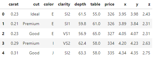
The dataset contains over 53k diamonds with 10 physical characteristics. You can explore the basic stats of the data below.
diamonds.info()
<class 'pandas.core.frame.DataFrame'>
RangeIndex: 53940 entries, 0 to 53939
Data columns (total 10 columns):
#   Column   Non-Null Count  Dtype
---  ------   --------------  -----
0   carat    53940 non-null  float64
1   cut      53940 non-null  object
2   color    53940 non-null  object
3   clarity  53940 non-null  object
4   depth    53940 non-null  float64
5   table    53940 non-null  float64
6   price    53940 non-null  int64
7   x        53940 non-null  float64
8   y        53940 non-null  float64
9   z        53940 non-null  float64
dtypes: float64(6), int64(1), object(3)
memory usage: 4.1+ MBdiamonds.describe()One of the first things to do when performing Exploratory Data Analysis (EDA) is exploring individual distributions.
Plotly offers many charts for this task: histograms, boxplots, violin plots, bar charts, etc. Let's see a few of them.
A histogram is probably the very first visual people learn.
It orders the values of a distribution and puts them into bins. Then, bars are used to represent how many values fall into each bin:
import plotly.express as px
fig = px.histogram(
diamonds,
x="price",
title="Histogram of diamond prices",
width=600,
height=400,
)
fig.show()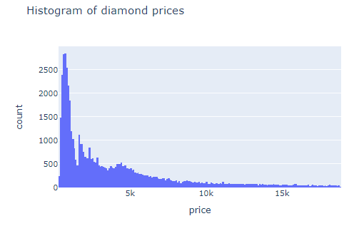
If you hover over any bar, you can see the range of its corresponding bin. Plotly automatically finds the number of bins, but if you want to set it yourself, you can use the nbins parameter.
However, it is hard to find the perfect number of bins for each individual distribution. For this reason, you can use the common practice of setting the same number of bins equal to the square root of the length of the distribution:
# Find the correct number of bins
nbins = int(len(diamonds) ** (1 / 2))
fig = px.histogram(
diamonds,
x="price",
title="Histogram of diamond prices",
nbins=nbins,
width=600,
height=400,
)
fig.show()Histograms analyze quantitative features. To analyze categorical data, we turn to bar charts. For example, passing the categorical cut column to the histogram function, we get a type of bar chart called countplot. Yes, you guessed right - it counts the number of observations in each category.
fig = px.histogram(diamonds, x="cut")
fig.show()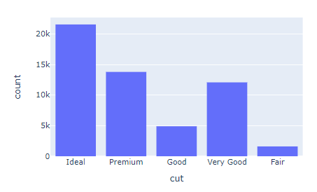
But wait, we didn't put any labels on the plot! Let's fix that using the update_layout function, which can modify many aspects of a figure after it has been created.
fig.update_layout(
  title="The number of diamonds in each diamond cut category",
  xaxis_title="",
  yaxis_title="Count",
)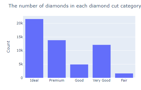
You already know what title does. The xaxis_title and yaxis_title replace the labels of both axes generated by Plotly (which are simply the column names).
Now, let's see the mean price for each diamond cut category. First, we use pandas groupby:
mean_prices = (
    diamonds.groupby("cut")["price"].mean().reset_index()
)

mean_prices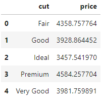
Chaining the reset_index function to the end of a groupby operation turns the output into a DataFrame and Plotly loves DataFrames. So, let's pass it to its bar function:
fig = px.bar(mean_prices, x="cut", y="price")
fig.update_layout(
title="Average diamond prices for each cut category",
xaxis_title="",
yaxis_title="Mean price ($)",
)
fig.show()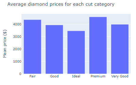
bar takes one categorical and one numeric feature, creating a single bar for every row in the passed DataFrame. The result is an easy-on-the-eye comparison of prices for each diamond type.
Another common plot for analyzing distributions is a boxplot, created with box in Plotly Express:
fig = px.box(diamonds, x="clarity", y="carat")
fig.update_layout(
title="Distribution of diamond carats for each clarity category",
xaxis_title="Clarity",
yaxis_title="Carat",
)
fig.show()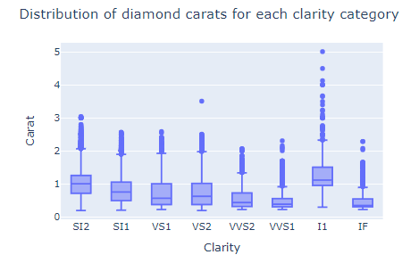
Instead of creating bars that only show the average diamond carat, the boxplot displays multiple statistics:
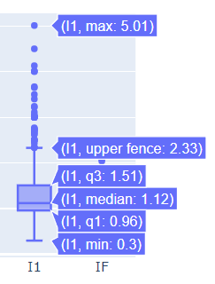
You can see:
for each diamond clarity category.
Another fun chart to explore distributions is a violin plot. Violin plots are basically box plots with a couple of extra flourishes:
fig = px.violin(diamonds, x="cut", y="price")
fig.show()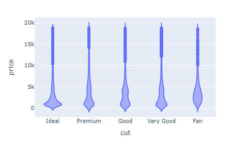
Instead of displaying a box, it shows a smooth curve denoting the density of a feature. To superimpose a box plot inside, you can set the box attribute to True:
fig = px.violin(diamonds, x="cut", y="price", box=True)
fig.show()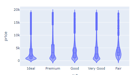
Unlike box plots which show only summary statistics, violin plots show the shape of the distribution as well.
You start to see new patterns and insights when you plot features that are closely related. For example, if we assume that the carat (weight) of the diamond is the main factor determining its price, let's explore that relationship.
We can use a scatterplot (px.scatter) which plots all diamonds in the dataset as dots. The position of the dots is determined by their corresponding price and carat values:
fig = px.scatter(diamonds, x="price", y="carat")
fig.update_layout(
title="Price vs. Carat",
xaxis_title="Price ($)",
yaxis_title="Carat",
)
fig.show()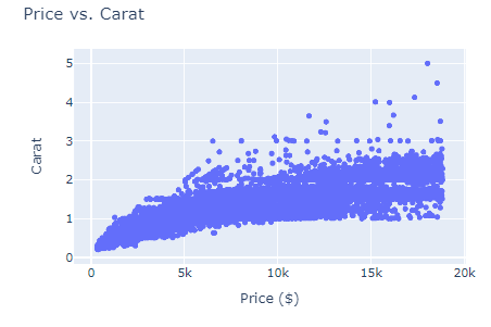
We've run into a bad case of overplotting, which happens when there is too much data to display in a single plot. Instead of showing real patterns and trends in the data, overplotting obscures them.
We can fix that by plotting only ~10% of the dataset, which will be enough to reveal any existing patterns:
fig = px.scatter(
diamonds.sample(5000), x="price", y="carat"
)
fig.update_layout(
title="Price vs. Carat",
xaxis_title="Price ($)",
yaxis_title="Carat",
)
fig.show()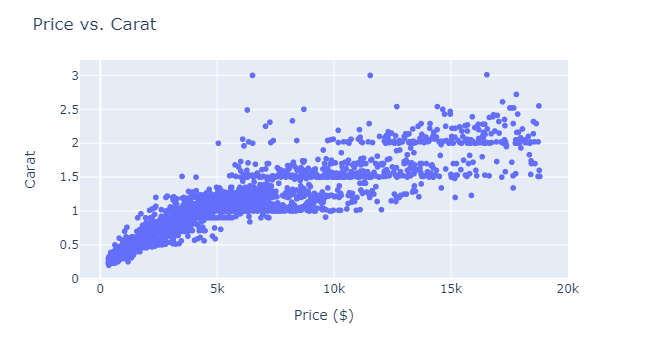
In the call to scatter, we are passing only 5000 rows (.sample(5000)), which shows a slight upwards trend in the price-carat relationship.
Heatmaps are great for visualizing complex datasets, such as a large matrix where it is difficult to see patterns from a horde of numbers in cells.
A heatmap assigns colors based on the magnitude of each cell in a matrix. One scenario this might be useful is looking at the correlation matrix of a dataset.
A correlation measures the linear relationship between numeric features. So, each cell of the correlation matrix represents the correlation between a pair of features.
You can calculate the correlation matrix of any dataset using the corr method of pandas, which returns a DataFrame. If you pass it to the imshow function of Express, you get a heatmap:
import plotly.express as px
# Create heatmap using Plotly Express
fig = px.imshow(
diamonds.corr(),
color_continuous_scale="Inferno_r",
)
# Show plot
fig.show()
The correlation ranges from -1 to 1. Values close to the range edges denote a strong positive or negative linear relationship between features.
We are choosing the reverse Inferno colormap for the color_continuous_scale parameter. You can choose other colormaps from the color scale page of the Plotly docs.
One of the greatest features of the Plotly Express API is the easy customization of plots.
The update_layout function contains many parameters you can use to modify almost any aspect of your charts.
Based on where your plots will be displayed, it is your duty to make them presentable to any audience, venue, or medium.
One of the first things to choose is the plot theme. Themes in Plotly are default chart configurations that control almost all components.
You can change it using the template parameter of any plotting function:
sample = diamonds.sample(3000)
fig = px.scatter(
sample, x="price", y="carat", template="ggplot2"
)
fig.show()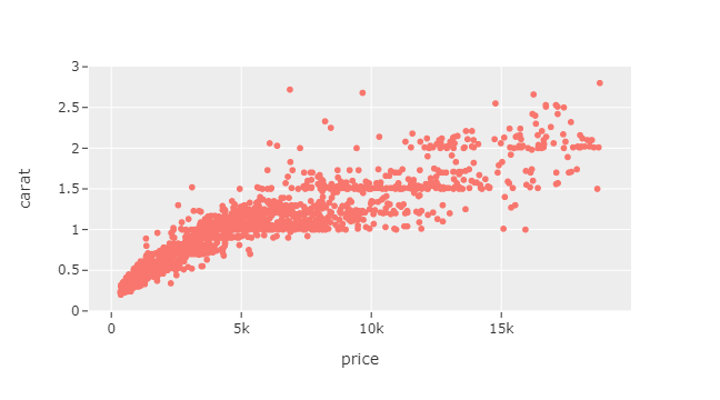
Some popular ones are ggplot2, seaborn, plotly_dark, and presentation. You can see the full list by calling plotly.io.templates.
Our scatterplots have been two-dimensional so far. But we have the option of adding extra information to it through color.
For example, we can color each dot in the plot based on which category the diamond belongs to. To do this, you only have to pass cut to color parameter:
sample = diamonds.sample(3000)
fig = px.scatter(sample, x="price", y="carat", color="cut")
fig.show()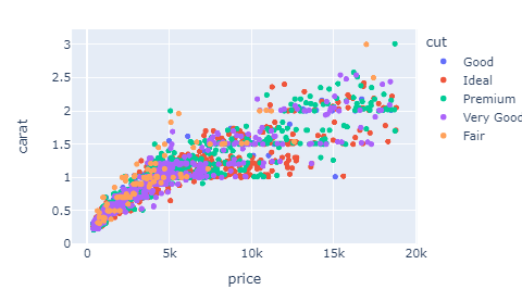
The cut parameter also forces a legend on the plot, showing the category colors.
Another approach we can take is displaying a numeric feature through the size of the dots.
By setting the size parameter to carat, we get differently sized dots based on diamond carat:
fig = px.scatter(sample, x="price", y="x", size="carat")
fig.show()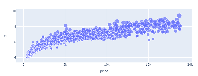
How about we use both color and size? Well, sure!
fig = px.scatter(
sample, x="price", y="x", size="carat", color="cut"
)
fig.show()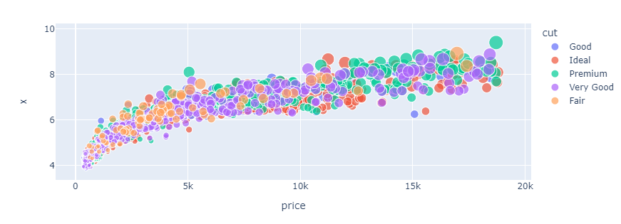
But this plot isn't very informative as it contains too much information for the naked eye to process. It is good practice not to stuff more than three features into a single plot.
Congrats on making it to the end! You've learned enough in this tutorial to continue self-learning Plotly from some of our other resources:
You can also learn about Plotly’s Graph Objects API, for more customization options, full control over interactivity and animations, and support for advanced visualization types.
Python Courses
course
course
course
cheat sheet
Richie Cotton
0 min
tutorial
Kevin Babitz
25 min
tutorial
Kurtis Pykes
12 min
tutorial
Abid Ali Awan
15 min
code-along
Justin Saddlemyer
code-along
Filip Schouwenaars