Python Seaborn Cheat Sheet
You most probably will know by now that data storytelling, accomplished by data visualization, amongst other things, is an essential skill for every data scientist: after you have turned the raw data into understanding, insights and knowledge, you also need to communicate these findings effectively to your audience.
For most beginners, the first Python data visualization library that they use is, naturally, Matplotlib. It is a Python 2D plotting library that enables users to make publication-quality figures. It is quite an extensive library where a cheat sheet will definitely come in handy when you're learning, but when you manage to use this library effectively, you'll also be able to get insights and work better with other packages, such as Pandas, that intend to build more plotting integration with Matplotlib as time goes on.
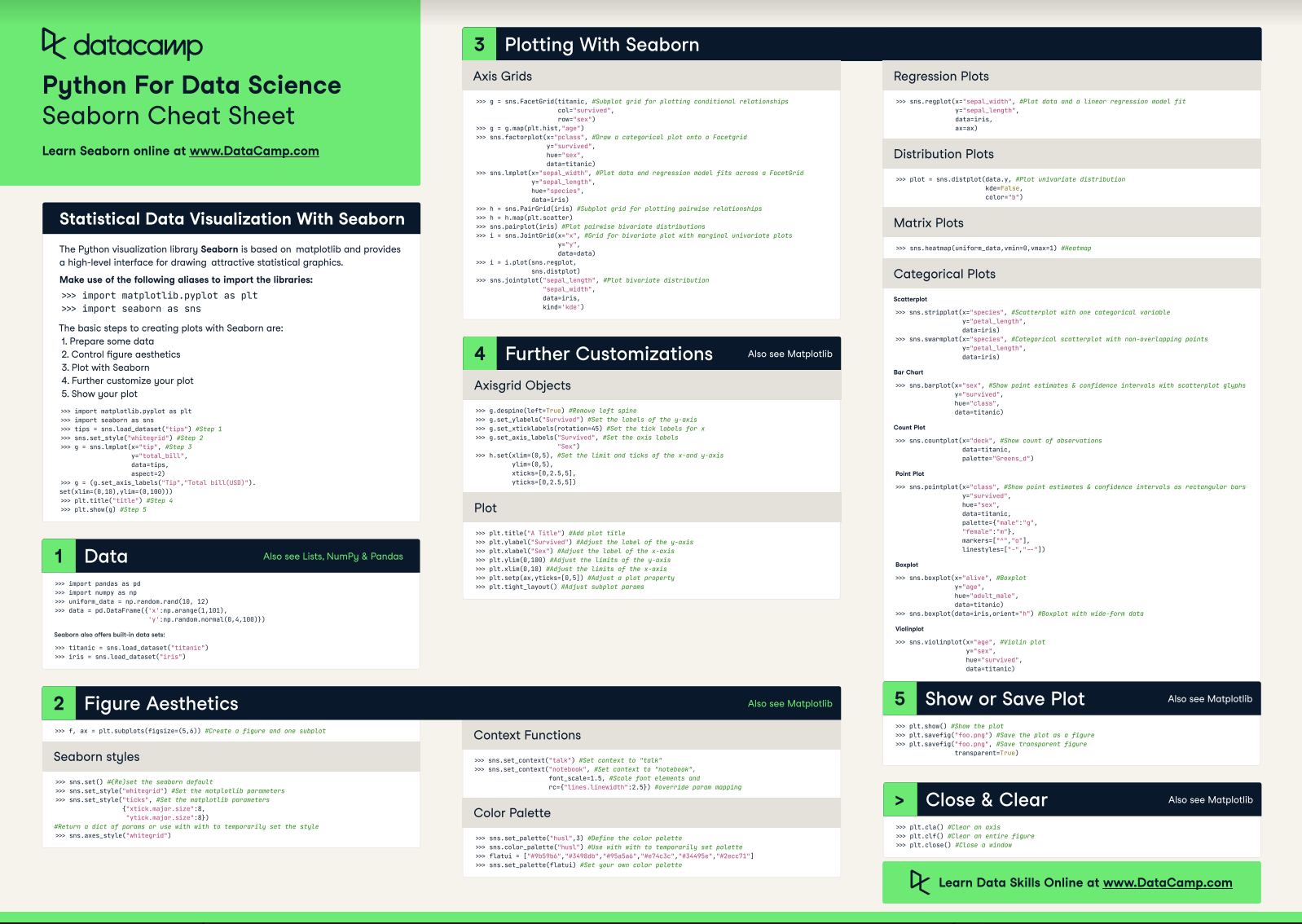
Another package that you'll be able to tackle easily is Seaborn, the statistical data visualization library of Python.
DataCamp has created a Seaborn cheat sheet for those who are ready to get started with this data visualization library with the help of a handy one-page reference. We also have a Seaborn beginners tutorial and a Seaborn line plot tutorial that can help you as you learn.
You'll see that this cheat sheet presents you with the five basic steps that you can go through to make beautiful statistical graphs in Python.
Check out the infographic by clicking on the button below:
Have this cheat sheet at your fingertips
Download PDFcheat sheet
Matplotlib Cheat Sheet: Plotting in Python

Karlijn Willems
6 min
cheat sheet
Python Data Visualization: Bokeh Cheat Sheet
Karlijn Willems
5 min
tutorial
Python Seaborn Line Plot Tutorial: Create Data Visualizations

Elena Kosourova
12 min
tutorial
Python Seaborn Tutorial For Beginners: Start Visualizing Data

Moez Ali
20 min
tutorial
Seaborn Heatmaps: A Guide to Data Visualization

Joleen Bothma
9 min
tutorial
How to Make a Seaborn Histogram: A Detailed Guide

Austin Chia
9 min