course
Introduction to Data Visualization with Seaborn
4 hours
121.1K
Heatmaps are a popular data visualization technique that uses color to represent different levels of data magnitude, allowing you to quickly identify patterns and anomalies in your dataset.
The Seaborn library allows you to easily create highly customized visualizations of your data, such as line plots, histograms, and heatmaps. You can also check out our tutorial on the different types of data plots and how to create them in Python.
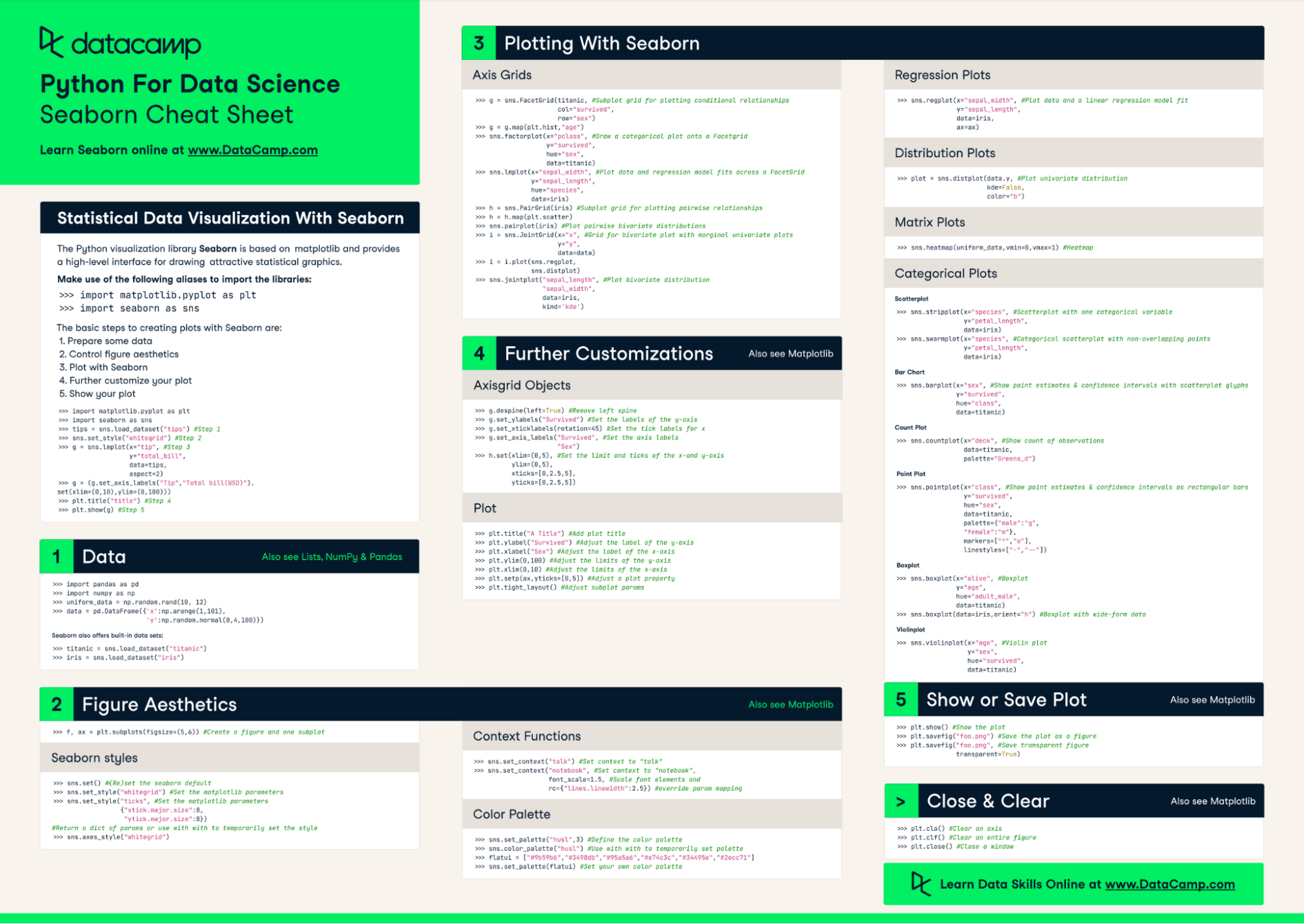
Keep our Seaborn cheat sheet on hand for a quick reference when plotting and customizing data visualizations using the Seaborn library.
In this tutorial, we'll explore what Seaborn heatmaps are, when to use them, and how to create and customize them to best suit your needs.
Heatmaps organize data in a grid, with different colors or shades indicating different levels of the data's magnitude.
The visual nature of heatmaps allows for immediate recognition of patterns, such as clusters, trends, and anomalies. This makes heatmaps an effective tool for exploratory data analysis.
Here’s an example of a Seaborn heatmap:
Choosing to use a heatmap depends on your requirements and the nature of your dataset. Generally, heatmaps are best suited for datasets where you can represent values as colors, typically continuous or discrete numerical data. However, you can also use them for categorical data that has been quantified or summarized (e.g., counts, averages).
If the dataset contains extreme outliers or is very sparse, a heatmap might not be as effective without preprocessing or normalization. Text, images, and other forms of unstructured data are also not directly suitable for heatmaps unless you first transform the data into a structured, numerical format.
Heatmaps excel at visualizing the correlation matrix between multiple variables, making it easy to identify highly correlated or inversely correlated variables at a glance.
Heatmaps are also useful for visually comparing data across two dimensions, such as different time periods or categories. For geographical data analysis, heatmaps can represent the density or intensity of events across a spatial layout, such as population density or crime hotspots in a city.
For this tutorial, we’ll use a dataset containing information about loans available on DataLab, DataCamp's AI-enabled data notebookf. The code for this tutorial is also available in a corresponding DataLab workbook.
In DataLab, all the major libraries are already conveniently installed and ready to import. To learn more, we have an article on the top Python libraries for data science.
We’ll use these libraries for this tutorial:
# Import libraries
import numpy as np
import pandas as pd
import matplotlib.pyplot as plt
import seaborn as sns
If you’re not familiar with Python and need to get up to speed quickly for this tutorial, check out our Introduction to Python course.
Alternatively, if you want to learn more about the libraries we’ll be using in this tutorial, you can check out these courses:
Ensure your data is in a matrix format, with rows and columns representing different dimensions (e.g., time periods, variables, categories). Each cell in the matrix should contain the value you want to visualize.
Before using a heatmap, you should perform two main data cleaning tasks: handling missing values and removing outliers.
When dealing with missing values, you might fill them using a statistical measure (mean, median), interpolate them, or drop them if they are not significant. As for outliers, depending on your analysis, you might remove them or decide to adjust their values.
In our loans dataset, there were no missing values, but we identified several outliers which we decided to remove. Check out the notebook on DataLab for the full code on how we did this.
If your dataset spans a wide range of values, consider scaling or normalizing it. This can allow the colors of the heatmap to represent relative differences more accurately. Common methods include min-max scaling and Z-score normalization.
For continuous data that needs categorization, consider discretization into bins or categories for more meaningful heatmap visualization.
To use seaborn.heatmap(), you typically need to pass in a matrix of data. Then, you can adjust the parameters to customize your heatmaps depending on your requirements.
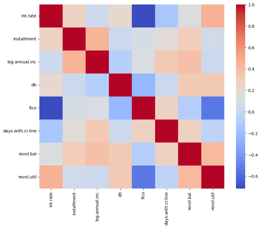
data: The dataset to visualize, which must be in a matrix form.cmap: Specifies the colormap for the heatmap. Seaborn supports various color palettes, including sequential, diverging, and qualitative schemes.annot: If set to True, the value in each cell is annotated on the heatmap.fmt: When annot is True, fmt determines the string formatting code for annotating the data. For example, 'd' for integers and '.2f' for floating-point numbers with two decimals.linewidths: Sets the width of the lines that will divide each cell. A larger value increases the separation between cells.linecolor: Specifies the color of the lines that divide each cell if linewidths is greater than 0.cbar: A boolean value that indicates whether to draw a color bar. The color bar provides a reference for mapping data values to colors.vmin and vmax: These parameters define the data range that the colormap covers.center: Sets the value at which to center the colormap when using diverging color schemes.square: If set to True, ensures that the heatmap cells are square-shaped.xticklabels and yticklabels: Control the labels displayed on the x and y axes.We will create a heatmap showing the correlation coefficient between each numeric variable in our data. We’ll keep the heatmap simple for now and customize it further in the next section.
# Calculate the correlation matrix
correlation_matrix = filtered_df.corr()

# Create the heatmap
plt.figure(figsize = (10,8))
sns.heatmap(correlation_matrix, cmap = 'coolwarm')
plt.show()
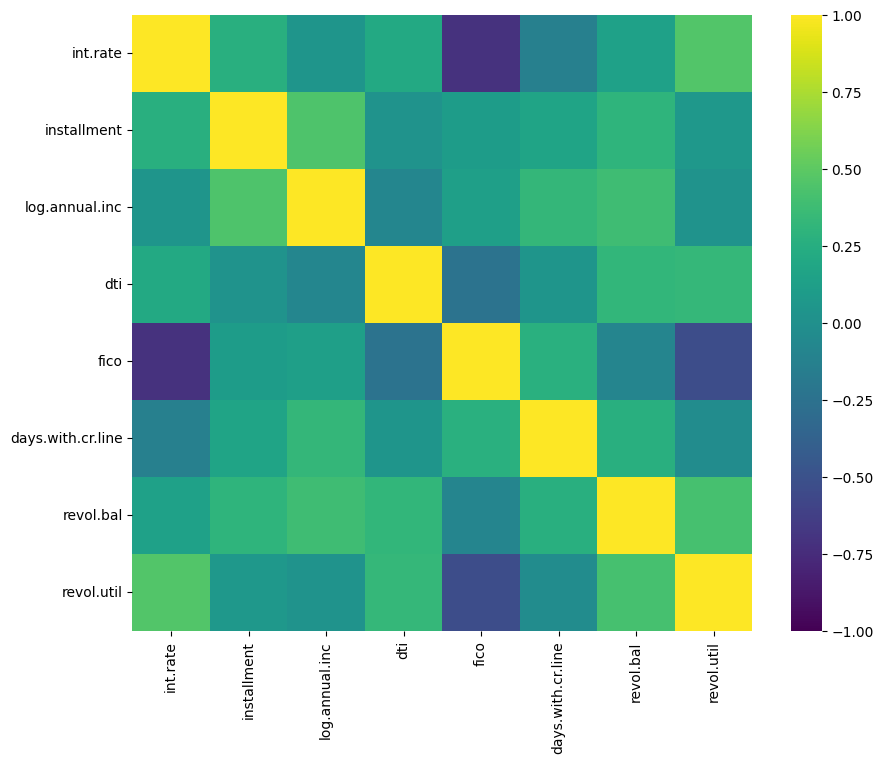
Customizing the color of your heatmap makes it easier to read and leads to more eye-catching visuals in reports and presentations.
Seaborn and Matplotlib offer a wide range of built-in colormaps. Experiment with colormaps ('Blues', 'coolwarm', 'viridis', etc.) to find one that effectively highlights your data's structure and patterns. Use sequential colormaps for data with a natural ordering from low to high, diverging colormaps for data with a critical midpoint, and qualitative colormaps for categorical data.
However, you are not limited to the default colormaps and options provided with Seaborn. You can create custom colormaps using Matplotlib and specify additional customization options like adjusting the transparency.
Setting vmin and vmax allows you to control the range of your data that the colormap covers. This can enhance contrast and focus on particular ranges of interest.
For diverging colormaps, use the center parameter to specify the midpoint value. This ensures that the color contrast is anchored around a critical value.
We will adjust the color palette of our heatmap and also anchor the colors by specifying the min, max, and center values.
# Customize heatmap colors
plt.figure(figsize = (10,8))
sns.heatmap(correlation_matrix, cmap = 'viridis', vmin = -1, vmax = 1, center = 0)
plt.show()
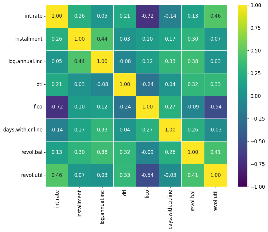
Data annotation involves adding labels within each cell which could display numerical values or some text. Annotations make it easier to read and interpret heatmaps quickly without having to figure out the values based on the legend.
To enable annotations, set the annot parameter to True. This will display the data values in each cell of the heatmap.
The fmt parameter allows you to format the text of the annotations. For example, use 'd' for integer formatting and '.2f' for floating-point numbers displayed with two decimal places.
Although Seaborn's heatmap function does not directly allow for customization of text properties like font size through the annot parameter, you can adjust these properties globally using Matplotlib's rcParams.
# Create an annotated heatmap
plt.figure(figsize = (10,8))
plt.rcParams.update({'font.size': 12})
sns.heatmap(correlation_matrix, cmap = 'viridis', vmin = -1, vmax = 1, center = 0, annot=True, fmt=".2f", square=True, linewidths=.5)
plt.show()
The annot parameter can also accept an array-like structure of the same shape as your data. This is a neat trick that lets you add annotations containing different information from what is displayed by the cell colors. Here is an example of how you could apply this:
# Example of alternative annotations
  annot_array = np.round(data*100, decimals=2)
  sns.heatmap(data, annot=annot_array, fmt='s')
Data masking is a technique used to selectively highlight or hide certain data points based on specific conditions. This can help focus attention on particular areas of interest or patterns within the dataset.
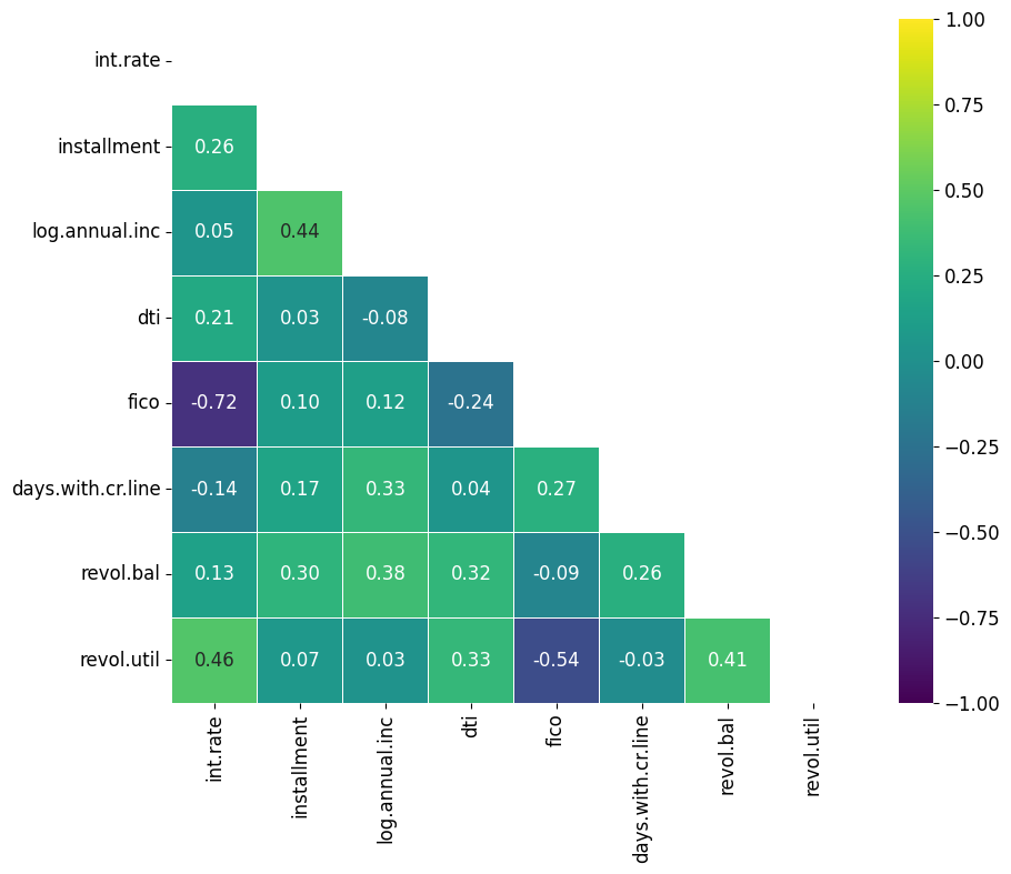
First, you need to create a boolean mask with the same shape as your data matrix. The mask should be True (or False) for the data points you want to hide (or display). Since the correlation matrix is symmetric, we can use numpy’s triu function to create a triangle mask that covers only the top portion of our heatmap.
# Create a mask using numpy's triu function
mask = np.triu(np.ones_like(correlation_matrix, dtype=bool))
Use the mask parameter of the seaborn.heatmap() function to apply your mask. Data points corresponding to True in the mask will be hidden.
# Create a masked heatmap
plt.figure(figsize = (10,8))
plt.rcParams.update({'font.size': 12})
sns.heatmap(correlation_matrix, cmap = 'viridis', vmin = -1, vmax = 1, center = 0, annot=True, fmt=".2f", square=True, linewidths=.5, mask = mask)
plt.show()
Adhering to these best practices will allow you to use Seaborn heatmaps to create eye-catching visualizations for your reports and presentations.
Here are five best practices to consider when using Seaborn heatmaps:
The color palette you choose directly affects how your data is perceived. Different color schemes can highlight or obscure patterns within your data.
Use sequential color palettes for data that progresses from low to high and diverging color palettes for data with a meaningful midpoint. Seaborn provides various options with the cmap parameter, enabling you to tailor the color scheme to your dataset.
Missing data can introduce gaps in your heatmap, potentially misleading the viewer.
Before plotting, decide on a strategy for handling missing data. Depending on their significance, you might choose to impute missing values or remove them entirely.
Alternatively, representing missing data with a distinct color or pattern can highlight its presence without misleading the viewer.
Data with large variances or outliers can skew the visualization, making it difficult to determine whether the data contains any patterns.
Normalize or scale your data to ensure that the heatmap accurately reflects differences across the dataset. Depending on the nature of your data, techniques like min-max scaling, Z-score normalization, or even log transformations can be beneficial.
While annotations can add valuable detail by displaying exact values, overcrowding your heatmap with annotations can make it hard to read, especially for large datasets.
Limit annotations to key data points or use them in smaller heatmaps.
The default aspect ratio and size may not suit your dataset, leading to squished cells or a cramped display that obscures patterns.
Customize the size and aspect ratio of your heatmap to ensure that each cell is clearly visible and the overall pattern is easy to discern.
Seaborn's heatmap function allows for eye-catching visualizations of data patterns and is especially useful for visualizing correlations between numeric variables.
However, it's important to follow best practices. These include choosing the right color palette, handling missing data thoughtfully, properly scaling data, using annotations sparingly, and adjusting heatmap dimensions.
Interested in taking a deep dive into the Seaborn library? Our Introduction to Data Visualization with Seaborn course is great for beginners, or if you’re a more advanced user, you can deepen your understanding with our Intermediate Data Visualization with Seaborn course.
Start Your Seaborn Journey Today!
course
course
course
cheat sheet
Karlijn Willems
2 min
tutorial
Moez Ali
20 min
tutorial
Austin Chia
9 min
tutorial
Elena Kosourova
12 min
tutorial
DataCamp Team
7 min
tutorial
Sejal Jaiswal
12 min