Visualization Best Practices in R
BeginnerSkill Level
4 hr
16.2K learners
In this tutorial, we will be visualizing distributions of data by plotting histograms using the R programming language. We will cover what a histogram is, how to read data in R, how to create a histogram, and how to customize the plot.
We will be using the base R programming language with no additional packages. This approach is only recommended when additional packages cannot be used or for quick exploratory analyses. In most cases, you should use ggplot2, as covered in the How to make a histogram in R in ggplot2 tutorial.
Practice how to make a histogram in R with this hands-on exercise.
A histogram is a very popular graph that is used to show frequency distributions across continuous (numeric) variables. Histograms allow us to see the count of observations in data within ranges that the variable spans.
Histograms look similar to bar charts. A key difference between the two is that bar charts have a value associated with a specific category or discrete variable, while a histogram visualizes frequencies for continuous variables.
We will be using this housing dataset which includes details about different house listings, including the size of the house, the number of rooms, the price, and location information. We can read the data using the read.csv() function, either directly from the URL or by downloading the csv file into a directory and reading it from our local storage. We can also specify that we only want to store the columns we are interested in for this tutorial; price and condition.
home_data <- read.csv("https://raw.githubusercontent.com/rashida048/Datasets/master/home_data.csv")[ ,c('price', 'condition')]Let’s look at the first few rows of data using the head() function
head(home_data, 5)
Next, we will create a histogram using the hist() function to look at the distribution of prices in our dataset.
hist(home_data$price)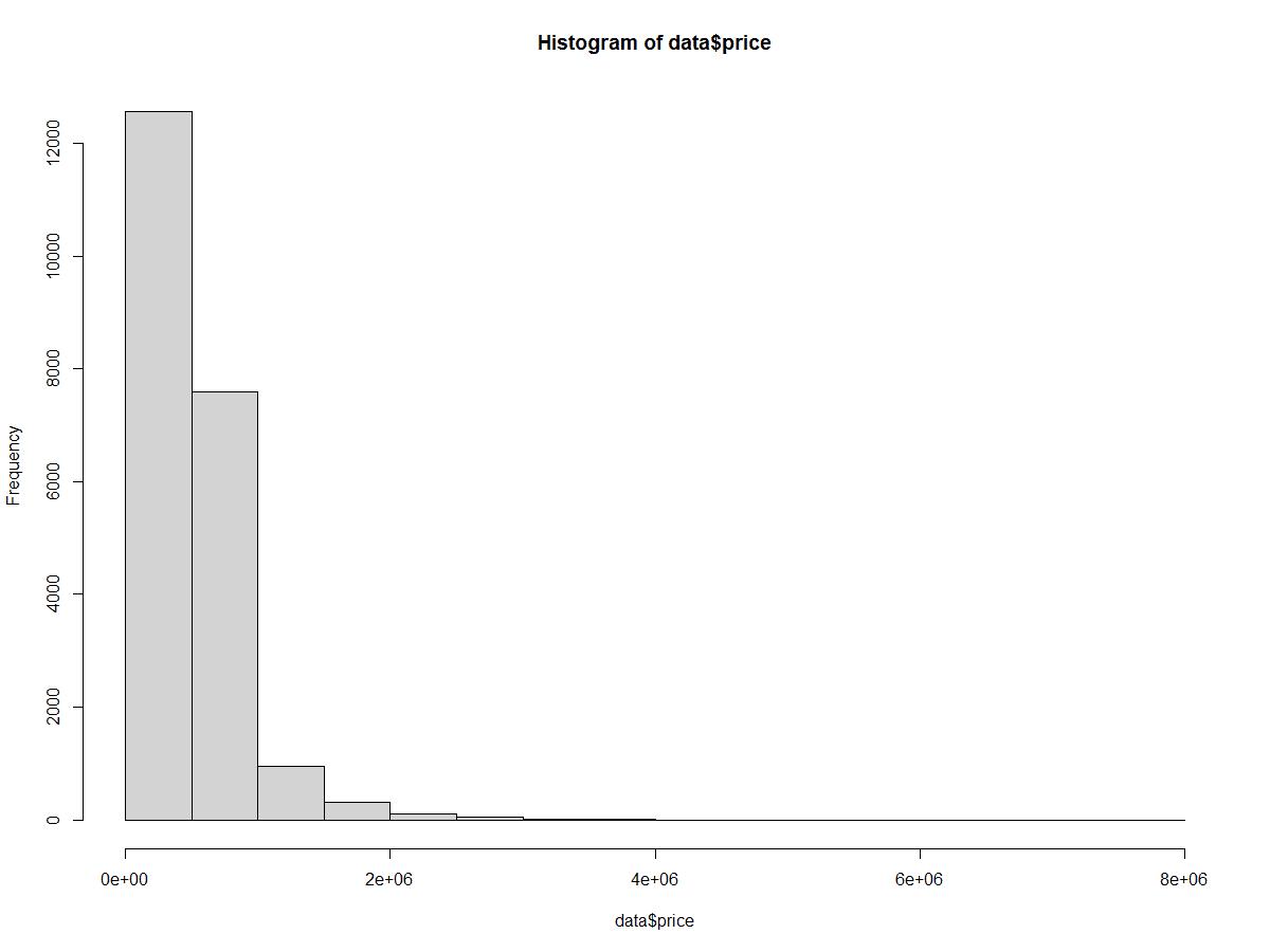
We can add descriptive statistics to the histogram using the abline() function. This adds a vertical line to the plot.
mean(). col argument set the line color, in this case to red.lwd argument sets the line width. A value of 3 increases the thickness of the line to make it easier to see.hist(home_data$price)
abline(v = mean(home_data$price), col='red', lwd = 3)To add a probability density line to the histogram, we first change the y-axis to be scaled to density. In the call to hist() , we set the probability argument to TRUE.
The probability density line is made with a combination of density(), which calculates the position of the probability density curve, and lines(), which adds the line to the existing plot.
hist(home_data$price, probability = TRUE)
abline(v = mean(home_data$price), col='red', lwd = 3)
lines(density(home_data$price), col = 'green', lwd = 3)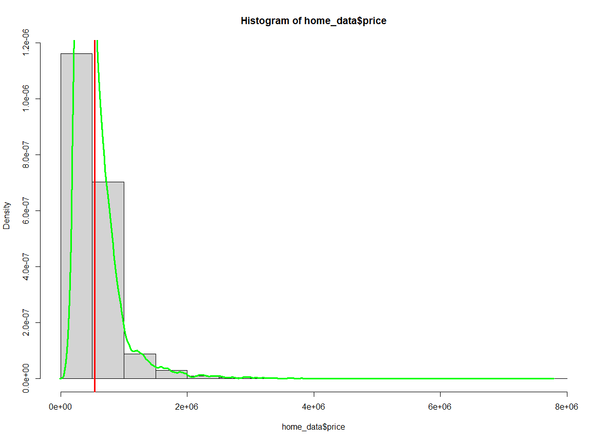
Notice that the numbers on the y-axis have changed.
We can change the colors inside of the bins on the histogram using the col parameter of the hist() function. We will change the fill to blue. We can also change the outline color of the bars using the border parameter. We will change the color of the outlines to white.
hist(home_data$price, col = 'blue', border = "white")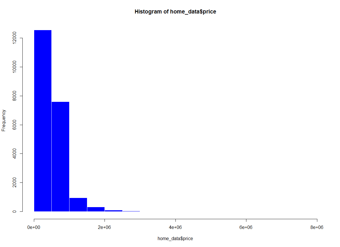
We can change the labels on the plot to make it more readable and presentable. This is useful if you share the plot with others.
xlab sets the x-axis labelylab sets the y-axis labelmain sets the plot titlehist(home_data$price, xlab = 'Price (USD)', ylab = 'Number of Listings', main = 'Distribution of House Prices')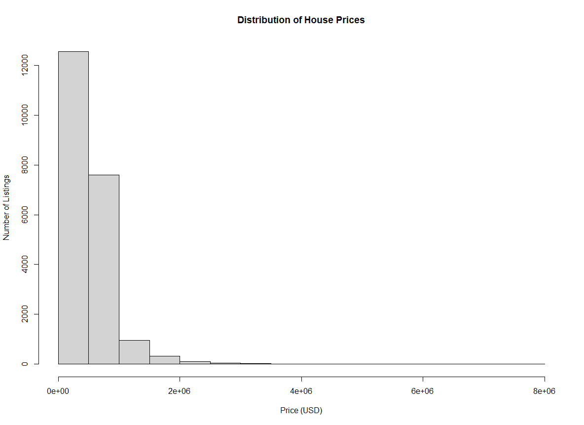
With the default arguments, it is challenging to see the full distribution of the housing prices across the range of prices. We can see they are centralized in the first few bins, but they are not very descriptive.
We can add more bins using the breaks parameter. With this argument, we can pass a vector of specific breakpoints to use, a function to compute the breakpoints, a number of breaks we would like, or a function to compute the number of cells.
For this example, we will pass the number of bins we would like. This number is context-specific based on what you are trying to show in your graph.
hist(home_data$price, breaks = 100)
With breaks set to 100, we have significantly more visibility into the distribution in the first few buckets.
We can also specify the number of breaks using the names of common calculations for calculating optimal breaks in a histogram. By default, hist() uses the “Sturges” method (this is optional to pass as an argument because it is the default).
hist(home_data$price, breaks = "Sturges")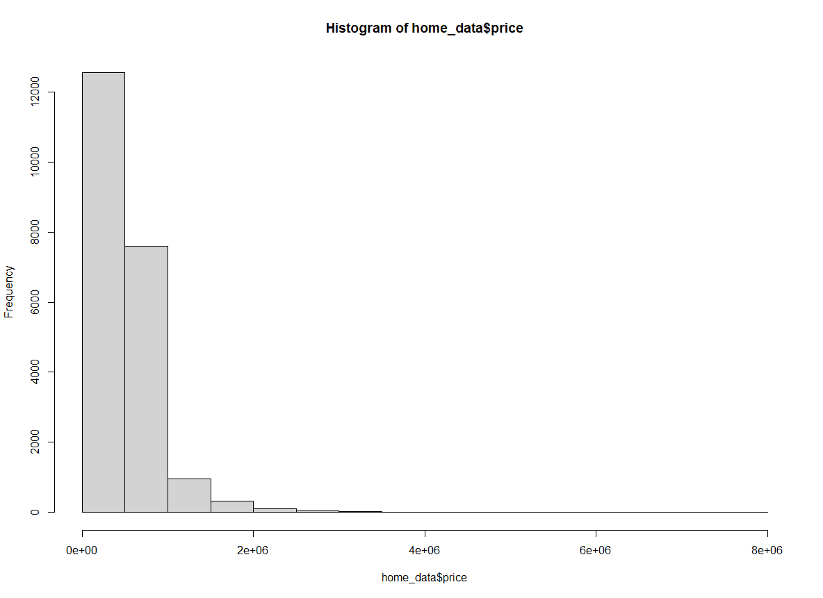
We can also pass “Scott” as an argument for the breaks attribute to use the Scott Method.
hist(home_data$price, breaks = "Scott")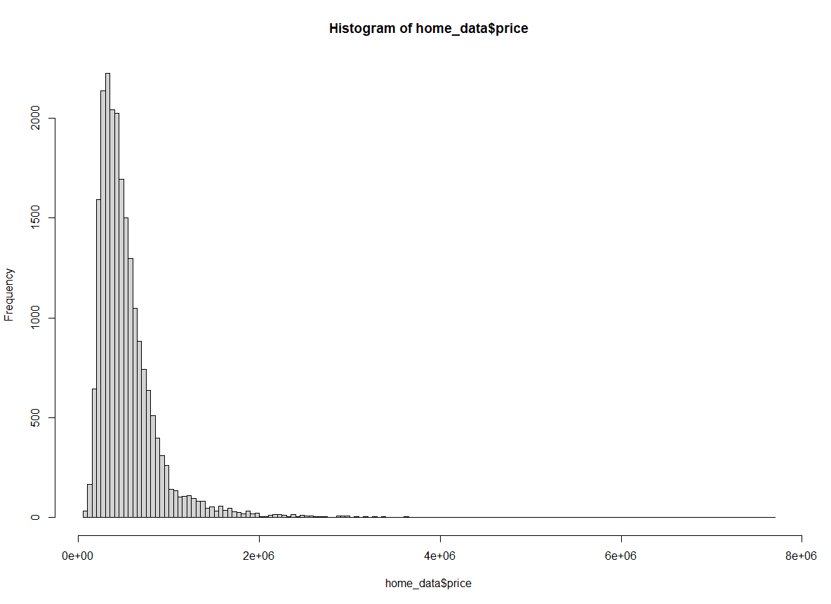
Finally, we could also use the Freedman-Diaconis (FD) method.
hist(home_data$price, breaks = "Freedman-Diaconis")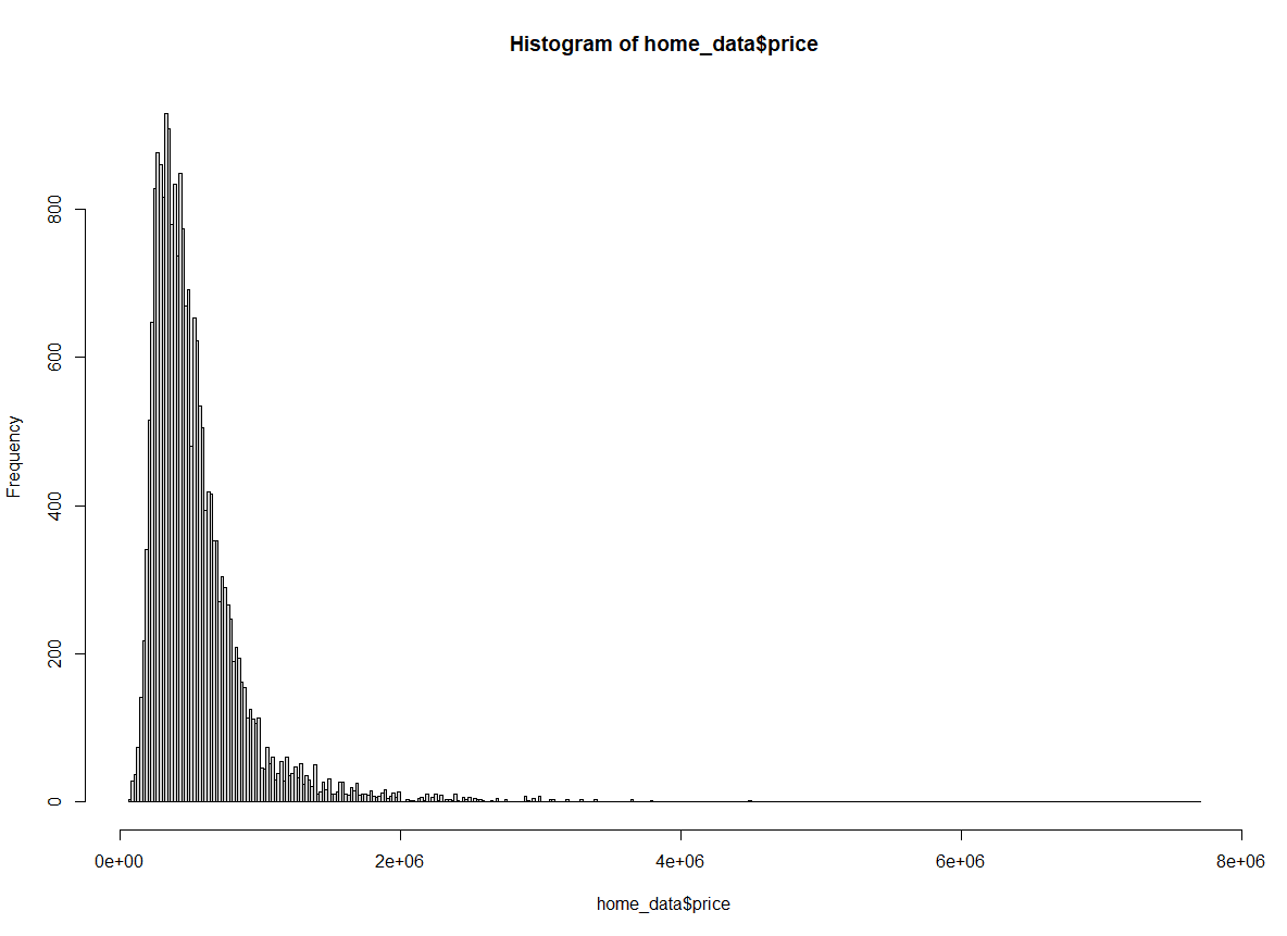
We can set the x-axis limits of our plot using the xlim argument to zoom in on the data we are interested in. For example, it is sometimes helpful to focus on the central part of the distribution, rather than over the long tail we currently see when we view the whole plot.
Changing the y-axis limits is also possible (using the ylim argument) but this is less useful for histograms since the automatically calculated values are almost always ideal.
We will zoom in on prices between $0 and $2M.
hist(home_data$price, breaks = 100, xlim = c(0, 2000000))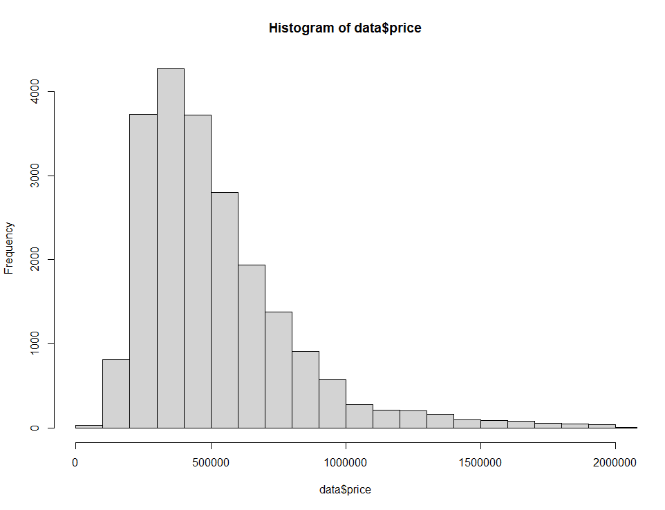
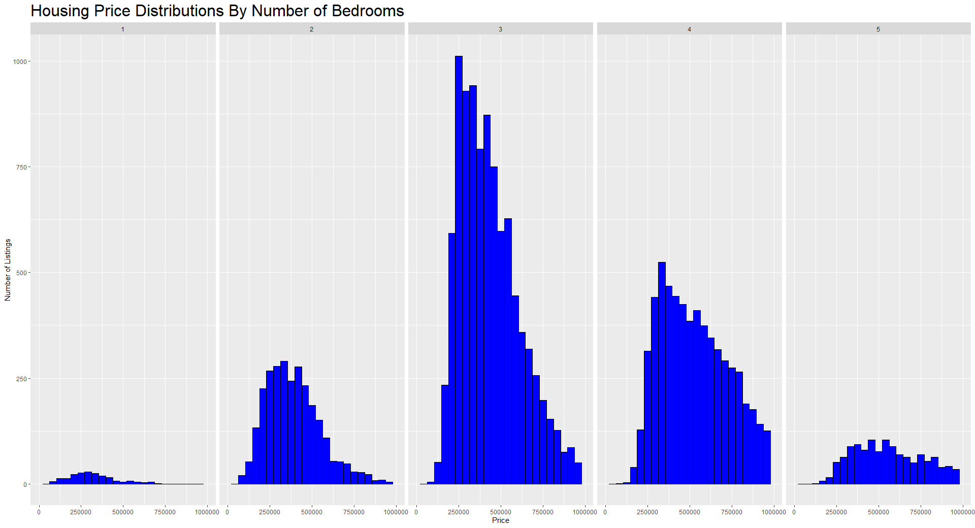
As you get more comfortable with R, you can explore more powerful packages that make it easier to build more interesting and useful visualizations. A very popular and easy-to-use library for plotting in R is called ggplot2. Below we create an interesting view of the distributions of prices based on the number of bedrooms in the house.
ggplot2 is the best way to visualize data in R, and you can learn about using it to create histograms in the How to make a histogram in R in ggplot2 tutorial. Check out our Introduction to ggplot2 course and our Intermediate ggplot2 course to learn how to make more interesting visualizations in R.
In this tutorial, we learned that histograms are great visualizations for looking at distributions of continuous variables. We learned how to make a histogram in R, how to plot summary statistics on top of our histogram, how to customize features of the plot like the axis titles, the color, how we bin the x-axis, and how to set limits on the axes. Finally, we demonstrated some of the power of the ggplot2 library.
Further Reading and Resources for Histogram Plotting in R:
Our certification programs help you stand out and prove your skills are job-ready to potential employers.
R Courses
Course
Course
Course
blog
Kevin Babitz
5 min
blog
Kevin Babitz
6 min
podcast
Richie Cotton
39 min
podcast
Richie Cotton
40 min
tutorial
Adel Nehme