Line Plots in MatplotLib with Python

Data visualization and storytelling are vital for data scientists as they transform complex data insights into compelling, easily digestible narratives for effective communication. While newer and fancier libraries are released, Matplotlib remains one of the most popular plotting libraries and builds the foundation for the newer ones.
This tutorial focuses on one of the most common types of Matplotlib plots, the line plot. Line plots are excellent at showcasing trends and fluctuations in data over time, connecting the dots (literally) to paint a vivid picture of what’s happening.
This tutorial starts with the basics of creating a simple line plot and then moves on to more advanced techniques, such as adding statistical information to plots. By the end of this tutorial, you will have a solid understanding of how to create different types of line plots in Matplotlib and how to use them to communicate your data insights to others effectively.
Are you ready to enhance your data visualization skills? Let’s begin!
The Libraries, Data, and Pre-Processing
Before we start creating line plots with Matplotlib, we must set up our environment. This involves installing Matplotlib, importing the required libraries, and pre-processing the dataset that we will use for our examples.
Installing matplotlib
To install Matplotlib, you can use pip, the package installer for Python. Simply open a terminal or command prompt and type:
pip install matplotlibThis will install the latest version of Matplotlib on your machine.
Importing the required libraries
Once Matplotlib is installed, we must import it with other required libraries such as NumPy and Pandas. NumPy is a library for working with arrays, while Pandas is for data manipulation and analysis.
To import these libraries, simply type the following code:
import matplotlib.pyplot as plt
import numpy as np
import pandas as pd
Reading and pre-processing the data
For this tutorial, we will be using a dataset containing the daily prices of the DJIA index. The dataset includes five columns:
- Date column provides the date on which the remaining stock price information were recorded
- Open, Close: The price of DJIA at the opening and closing of the stock market for that particular day
- High, Low: The highest and lowest price the DJIA reached during the particular day
After loading the dataset, we’d do some basic data pre-processing such as renaming the column, converting it to datetime variable, and sorting the data in ascending order of date.
Here’s the code for the above:
# Load the dataset into a Pandas DataFrame
df = pd.read_csv("HistoricalPrices.csv")

# Rename the column to remove an additional space
df = df.rename(columns = {' Open': 'Open', ' High': 'High', ' Low': 'Low', ' Close': 'Close'})

# Convert the date column to datetime
df['Date'] = pd.to_datetime(df['Date'])

# Sort the dataset in the ascending order of date
df = df.sort_values(by = 'Date')
Now that we have set up the environment and loaded the dataset, we can move on to creating line plots using Matplotlib.
Creating a Basic Line Plot in Matplotlib
We will start by creating a basic line plot and then customize the line plot to make it look more presentable and informative.
Using plt.plot() to create a line plot
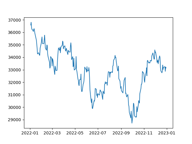
To create a line plot, we will use the plt.plot() function. This function takes two parameters; the x-axis values and y-axis values. In our case, the date column will be our x-axis values, while the close column will be our y-axis values. Here is the code:
# Extract the date and close price columns
dates = df['Date']
closing_price = df['Close']

# Create a line plot
plt.plot(dates, closing_price)

# Show the plot
plt.show()
When you run the above code, you should see a basic line plot of the DJIA stock.
Customizing the Line Plot
Matplotlib presents us with plenty of further customizations, which we can utilize per our needs.
Setting the line color
By default, the plt.plot() function plots a blue line. However, you can change the line color by passing a color parameter to the function. The color parameter can take a string representing the color name or a hexadecimal code.
Here is an example:
# Plot in Red colour
plt.plot(dates, closing_price, color='red')

# Show the plot
plt.show()
This code will plot a red line instead of a blue one as shown below:
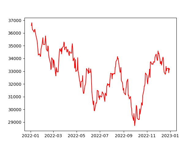
Basic line plot in red
Setting the line width
You can also change the line width by passing a linewidth parameter to the plt.plot() function. The linewidth parameter takes a floating-point value representing the line's width.
Here is an example:
# Increasing the linewidth
plt.plot(dates, closing_price, linewidth=3)

# Show the plot
plt.show()
This code will plot a line with a width of 3 instead of the default width as shown below:
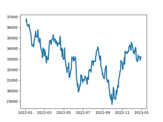
Thicker lines in the plot due to higher linewidth
Setting the line style
You can change the line style by passing a linestyle parameter to the plt.plot() function. The linestyle parameter takes a string that represents the line style. The matplotlib documentation provides an extensive list of styles available.
Here’s how these can be used in code:
# Individually plot lines in solid, dotted, dashed and dashdot

plt.plot(dates, closing_price, linestyle='solid') # Default line style
plt.plot(dates, closing_price, linestyle='dotted')
plt.plot(dates, closing_price, linestyle='dashed')
plt.plot(dates, closing_price, linestyle='dashdot')

# Show the plot
plt.show()
Adding markers to line plots
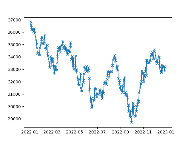
Markers can be used to highlight specific points in the line plot. Various kinds of symbols can be used as markers and can be referenced from the matplotlib documentation.
Here is an example of using markers in a line plot:
# Add a cross marker for each point
plt.plot(df['Date'], df['Close'], marker='x')

# Show the plot
plt.show()
In the above code, we are using cross (x) markers to highlight the Close prices of the DJIA stock as shown below:
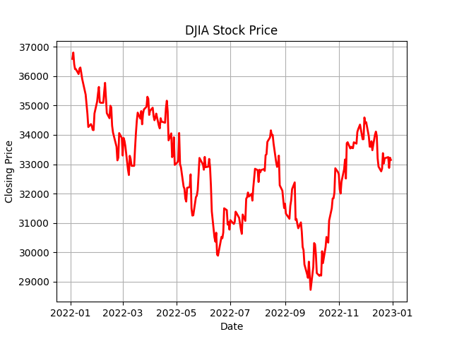
Adding labels and title
To make the plot more informative, we can add axis labels and a title. We can achieve this by using the plt.xlabel(), plt.ylabel(), and plt.title() functions, respectively.
Here is an example:
plt.plot(dates, closing_price, color='red', linewidth=2)
plt.xlabel('Date')
plt.ylabel('Closing Price')
plt.title('DJIA Stock Price')

# Show the plot
plt.show()
This code will plot a red line with a width of 2, with the x-axis labeled ‘Date,’ the y-axis labeled ‘Closing Price,’ and the title ‘DJIA Stock Price.’

Adding grid lines
We can also add grid lines to our plot to make it more readable. We can achieve this by using the plt.grid() function. The plt.grid() function takes a boolean value representing whether the grid should be shown.
Here is an example:
plt.plot(dates, closing_price, color='red', linewidth=2)
plt.xlabel('Date')
plt.ylabel('Closing Price')
plt.title('DJIA Stock Price')

# Add the grid
plt.grid(True)

# Show the plot
plt.show()
You’d see added grids to the plot:
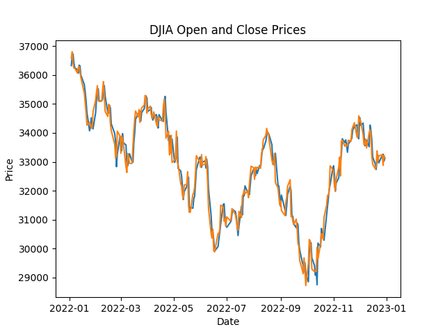
Matplotlib Line Plots with Multiple Lines
In some cases, you may want to plot multiple lines on the same graph. To do this, you can call the plt.plot() function multiple times with different data for each call. Here is an example:
# Line plot of Open and Close prices

plt.plot(df['Date'], df['Open'])
plt.plot(df['Date'], df['Close'])
plt.title('DJIA Open and Close Prices')
plt.xlabel('Date')
plt.ylabel('Price')

plt.show()
In the above code, we are plotting both the Open and Close prices of the DJIA stock on the same graph.
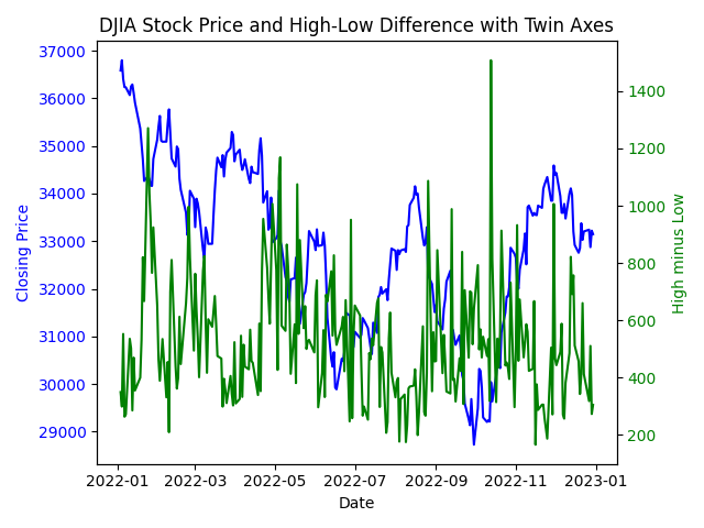
Matplotlib Line Plots with Twin Axes
There might be cases where you want to represent two variables with different scales on the same plot. In such situations, using twin axes is an effective way to visualize the relationship between the variables without losing the clarity of the individual scales.
To create a line plot with twin axes, we need to use the twinx() function. This function creates a new y-axis that shares the same x-axis as the original plot.
Here's an example:
# Create a new variable for demonstration purposes
df['High_minus_Low'] = df['High'] - df['Low']

# Create a basic line plot for the Close prices
fig, ax1 = plt.subplots()
ax1.plot(df['Date'], df['Close'], color='blue', label='Close Price')
ax1.set_xlabel('Date')
ax1.set_ylabel('Closing Price', color='blue')
ax1.tick_params(axis='y', labelcolor='blue')

# Create a twin axis for the High_minus_Low variable
ax2 = ax1.twinx()
ax2.plot(df['Date'], df['High_minus_Low'], color='green', label='High - Low')
ax2.set_ylabel('High minus Low', color='green')
ax2.tick_params(axis='y', labelcolor='green')

# Add a title and show the plot
plt.title('DJIA Stock Price and High-Low Difference with Twin Axes')
plt.show()
And the resulting plot with twin axes:
Adding Statistical Information to Matplotlib Line Plots
In addition to visualizing trends and patterns in data, line plots can also display statistical information such as regression lines and error bars.
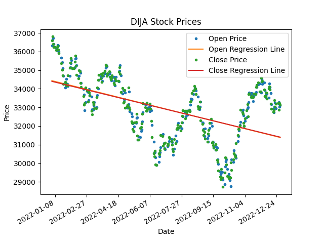
Adding a Matplotlib Regression Line
A regression line is a line that best fits the data points in a plot and can be used to model and predict future values. We can add a regression line to our line plot by using the polyfit() function from the NumPy library, which fits a polynomial regression line to our data points.
import matplotlib.dates as mdates

# Convert Date column to numeric value
df['Date'] = mdates.date2num(df['Date'])

# Add regression line to plot
coefficients_open = np.polyfit(df['Date'], df['Open'], 1)
p_open = np.poly1d(coefficients_open)

coefficients_close = np.polyfit(df['Date'], df['Close'], 1)
p_close = np.poly1d(coefficients_close)

fig, ax = plt.subplots()
ax.plot(df['Date'], df['Open'], '.', label='Open Price')
ax.plot(df['Date'], p_open(df['Date']), '-', label='Open Regression Line')
ax.plot(df['Date'], df['Close'], '.', label='Close Price')
ax.plot(df['Date'], p_close(df['Date']), '-', label='Close Regression Line')
ax.set_title('DIJA Stock Prices')
ax.set_xlabel('Date')
ax.set_ylabel('Price')
ax.legend()

# Format x-axis labels as dates
date_form = mdates.DateFormatter("%Y-%m-%d")
ax.xaxis.set_major_formatter(date_form)
plt.gcf().autofmt_xdate()

plt.show()
In this code, we first convert dates to numeric values using date2num() function and then use the polyfit() function to obtain the coefficients for the regression line. We use to plot the line using the poly1d() function. We plot the original data points using dots and the regression line using a solid line.
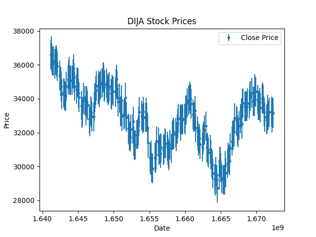
Adding Error Bars
Error bars are a graphical representation of the variability of data and can be used to indicate the uncertainty in the measurements.
This is particularly useful when you’re expecting some errors in the data collection process, like temperature data, air quality data, and so on. Though certain about the stock prices, let’s assume a potential error of one standard deviation and plot it using the errorbar function in matplotlib.
# Calculate standard deviation of data
std = df['Close'].std()

# Add error bars to plot
plt.errorbar(df['Date'], df['Close'], yerr=std/2, fmt='.', label='Close Price')
plt.title('DIJA Stock Prices')
plt.xlabel('Date')
plt.ylabel('Price')
plt.legend()
plt.show()
In this code, we first calculate the standard deviation of the Close prices in our dataset. We then use the errorbar() function to add error bars to the line plot, with the error bar size set to half of the standard deviation.
These techniques allow us to add statistical information to our line plots and gain deeper insights into our data.
Conclusion
Line plots are a powerful tool for visualizing trends and patterns in data, and Matplotlib provides a user-friendly interface to create them.
As a next step, you might want to follow our Intermediate Python course, where you apply everything you’ve learned to a hacker statistics case study.
We hope this tutorial has helped get you started with creating line plots in Matplotlib. We’ve also covered extensively the other matplotlib plots in another tutorial, which can briefly introduce you to what else you can do with Matplotlib.
Keep exploring and experimenting with creating stunning visualizations and uncovering insights from your data!
cheat sheet
Matplotlib Cheat Sheet: Plotting in Python

Karlijn Willems
6 min
tutorial
Introduction to Plotting with Matplotlib in Python
Kevin Babitz
25 min
tutorial
Matplotlib time series line plot

Elena Kosourova
8 min
tutorial
Python Seaborn Line Plot Tutorial: Create Data Visualizations
Elena Kosourova
12 min
tutorial
Histograms in Matplotlib

Aditya Sharma
8 min
code-along
Data Visualization in Python for Absolute Beginners

Justin Saddlemyer