course
Introduction to R
4 hours
2.7M
Plot character or pch is the standard argument to set the character that will be plotted in a number of R functions.
Explanatory text can be added to a plot in several different forms, including axis labels, titles, legends, or a text added to the plot itself. Base graphics functions in R typically create axis labels by default, although these can be overridden through the argument xlab() that allows us to provide our own x-axis label and ylab() that allows us to provide our own y-axis label.
Some base graphics functions also provide default titles, but again, these can be overridden has we see here:
library(MASS)
par(mfrow = c(1, 2))
plot(density(geyser$waiting))
plot(density(geyser$waiting), main = "Estimated density: \n Old Faithful waiting times")
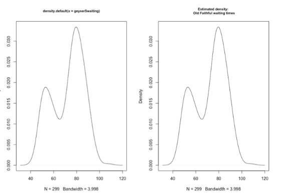
The plot on the left uses the default title returned by the density function, which tells us that the plot was generated by this function using its default options and also gives the R specification for the variable whose density we are plotting. In the right-hand plot, this default title has been overridden by specifying the optional argument main. Note that by including the return character, backslash n, we are creating a two-line title in this character string.
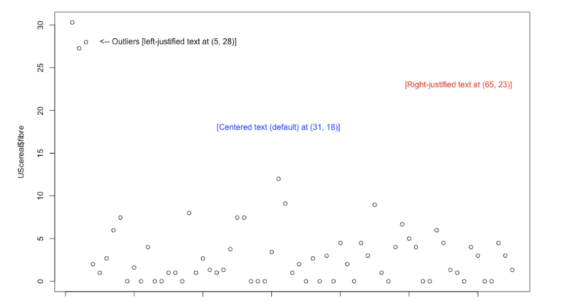
text() FunctionLike the lines and points functions, text is a low-level graphics function that allows us to add explanatory text to the existing plot. To do this, we must specify the values for x and y, the coordinates on the plot where the text should appear, and labels, a character vector that specifies the text to be added.
text(x, y, adj)
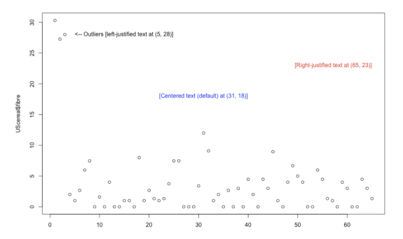
By default, the text added to the plot is centered at the specified x values, but the optional argument adj can be used to modify the alignment.
It is noted that the adj argument to the text() function determines the horizontal placement of the text, and it can take any value between 0 (left-justified text) and 1 (right-justified text). In fact, this argument can take values outside this range. That is, making this value negative causes the text to start to the right of the specified x position. Similarly, making adj greater than 1 causes the text to end to the left of the x position.
library(MASS)
plot(UScereal$fibre)
text(5, 28, "<-- Outliers [left-justified text at (5, 28)]", adj = 0)
text(65, 23, "[Right-justified text at (65, 23)]", adj = 1, col = "red")
text(5, 28, "[Centered text (default) at (31, 18)]", col = "blue")
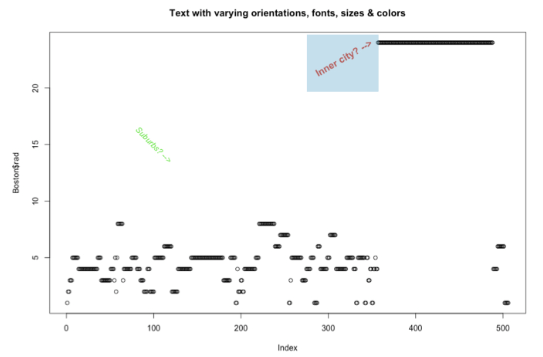
Below we see some of the ways the appearance of added text can be changed through optional arguments to the text function. By default, text is created horizontally across the page, but this can be changed with the srt argument, which specifies the angle of orientation with respect to the horizontal axis.
Next, the text in red angles upward as a result of specifying srt as the positive value 30 degrees, while the text in green angles downward by specifying srt equals -45.
We can also specify the color of the text with the col argument, and the red text shows that we can change the text size with the cex argument. By specifying cex = 1.2, we have specified the text to be 20% larger than normal.
The other text characteristic that has been modified in this example is the font, set by the font argument. The default value is font = 1, which specifies normal text, while font = 2 specifies boldface, font = 3 specifies italics, and font = 4 specifies both boldface and italics.
library(MASS)
plot(Boston$rad)

# "Inner city" with adjusted colour and rotation
text(350, 24, adj = 1, "Inner city? -->", srt = 30, font = 2, cex = 1.2, col = "red")

# "Suburbs" with adjusted colour and rotation
text(100, 15, "Suburbs? -->", srt = -45, font = 3, col = "green")

title("Text with varying orientations, fonts, sizes & colors")
In the following example, you will:
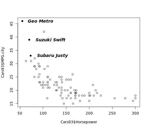
MPG.city vs. Horsepower from the Cars93 data frame, with data represented as open circles (default pch).index3 using the which() function that identifies the row numbers containing all 3-cylinder cars.points() function to overlay solid circles, pch = 16, on top of all points in the plot that represent 3-cylinder cars.text() function with the Make variable as before to add labels to the right of the 3-cylinder cars, but now use adj = 0.2 to move the labels further to the right, use the cex argument to increase the label size by 20 percent, and use the font argument to make the labels bold italic.# Plot MPG.city vs. Horsepower as open circles
plot(Cars93$Horsepower, Cars93$MPG.city)
# Create index3, pointing to 3-cylinder cars
index3 <- which(Cars93$Cylinders == 3)
# Highlight 3-cylinder cars as solid circles
points(Cars93$Horsepower[index3],
Cars93$MPG.city[index3],
pch = 16)
# Add car names, offset from points, with larger bold text
text(Cars93$Horsepower[index3],
Cars93$MPG.city[index3],
Cars93$Make[index3],
adj = -0.2, cex = 1.2, font = 4)
When we run the above code, it produces the following result:
To learn more about adding text to plots, please see this video from our course Data Visualization in R.
This content is taken from DataCamp’s Data Visualization in R course by Ronald Pearson.
R Courses
course
course
course
tutorial
Karlijn Willems
33 min
tutorial
Nishant Singh
12 min
tutorial
DataCamp Team
8 min
tutorial
Zoumana Keita
15 min
tutorial
DataCamp Team
4 min
tutorial
Kevin Babitz
15 min