course
Introduction to Data Visualization with Plotly in Python
4 hours
13K
Histograms are popular graphical displays of data points organized into specified ranges. We typically see them in statistics, used to display the amount of a specific type of variable that appears within a certain range. For example, your old math teacher may have used a histogram to visualize the number of marks obtained for all the people in your class.
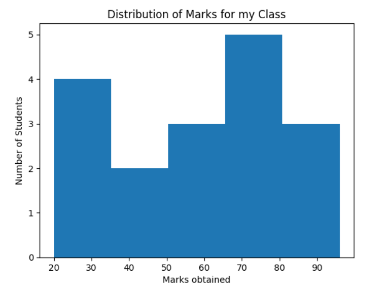
Figure 1: An example Histogram displaying the distribution of marks for a class.
[Source: Example Histogram with Matplotlib]
Their distinctive bars of varying heights resemble the aesthetics of bar charts, except histograms are used to visualize quantitative data instead of categorical data – which is the case for bar charts.
Generally, numerical data visualized in histograms are continuous, meaning they have infinite values. Attempting to plot the values of continuous variables is often impractical. Histograms mitigate this issue by grouping several data points into logical ranges (known as bins) and allowing them to be visualized.
In this tutorial, we will cover how to implement histograms in Python using the Plotly data visualization library. We will also touch on different ways to customize your Plotly histogram and why data visualization is important in the first place.
Check out this DataLab workbook to follow along with the code in this tutorial.
No business can claim it will not benefit from understanding its data better. The role of data analysis is to help businesses optimize their performance and improve their bottom line; this science spans its wings to all fields where data exists since insight is generally regarded as leverage.
Data visualizations are the graphical representations analysts use to represent information and data. Its purpose is to summarize data to be presented in an easily understandable format, highlighting vital lessons from the data to its readers.
In other words, businesses use data visualizations to aid in rapidly identifying data trends which would otherwise be difficult without visual assistance. Graphical representations make it easy to communicate information in a manner that is universal, fast, and effective.
Plotly is an interactive, open-source data visualization library for Python and R written in JavaScript. For this article, we will focus on Plotly Python, occasionally referred to as “plotly.py,” to distinguish it from its JavaScript counterpart.
Tip: Take the Introduction to data visualization with Plotly in Python or Interactive data visualization with Plotly in R courses to get to grips with Plotly.
Many users of Ploty often remark they were initially “captivated” by the modern aesthetics the library enables storytellers to implement quite easily. Plotly Python allows users to create attractive, interactive web-based visualizations that can be:
Another appeal of Plotly is the vast range of chart types available. The library supports more than 40 unique charts spanning various use cases, including statistics, finance, geography, science, and 3-dimensional charts.
It’s easy to export visualizations created with Plotly due to the library's deep integration with Kaleido – an image export utility. There’s also extensive support for non-web contexts, including desktop editors (i.e., Spyder, PyCharm, etc.) and publishing static documents (i.e., exporting Jupyter notebooks to PDF format).
Installing plotly.py is reasonably straightforward; It may be installed using pip:
pip install plotly>=5.11.0, <5.12.0Or using Conda:
conda install -c plotly plotly>=5.11.0, <5.12.0Note: It’s recommended to install libraries in a virtual environment to keep the dependencies for different projects separate. You can also get started with a DataLab workbook - a Python & R Data Science IDE in the cloud.
DataLab is an online Integrated Development Environment (IDE) that allows users to write code, analyze data individually or collectively, and share data insights. In other words, you can think of DataLab as a kind of Google Docs specifically conceived for data science; learn more about how they work in our article on Using DataLab in the Classroom.
For this task, we must create a workbook from a dataset. Fortunately, DataCamp provides a rich and growing body of interesting datasets to analyze. When we create a workbook from a dataset, the environment will contain all the pre-configured data and a brief description of the data so you can get your hands dirty from the offset.
The steps to create a workbook using a DataCamp dataset are as follows:
Figure 2: A GIF demonstrating the steps to create a workbook from a dataset.
Note: View Creating a Plotly Histogram with Olympics Data to follow along with the code.
We will use the Olympics Data dataset from DataCamp’s internal data collection. According to the description, this is a historical dataset on the modern Olympic Games, from Athens 1896 to Rio 2016. Each row consists of an individual athlete (271116 instances) competing in an Olympic event and which medal was won (if any).
The columns consist of the following:
|
Column |
Explanation |
|
id |
Unique number for each athlete |
|
name |
Athlete's name |
|
sex |
M or F |
|
age |
Age of the athlete |
|
height |
In centimeters |
|
weight |
In kilograms |
|
team |
Team name |
|
noc |
National Olympic Committee 3 |
|
games |
Year and season |
|
year |
Integer |
|
season |
Summer or Winter |
|
city |
Host city |
|
sport |
Sport |
|
event |
Event |
|
medal |
Gold, Silver, Bronze, or NA |
Given our current understanding, the columns we can expect to build a histogram from are: age, height, weight, and year. This is because histograms are constructed using continuous numerical values - they are used to represent the distribution of numerical data, where the data are binned, and the count for each bin is displayed.
We will use the age column to create our histogram.
Creating a histogram in Python with Plotly is pretty simple; We can use Plotly Express, which is an easy-to-use, high-level interface…
import plotly.express as px
# Create a histogram
fig = px.histogram(olympic_data.age, x="age",
title="Distribution of Athletes age")
fig.show()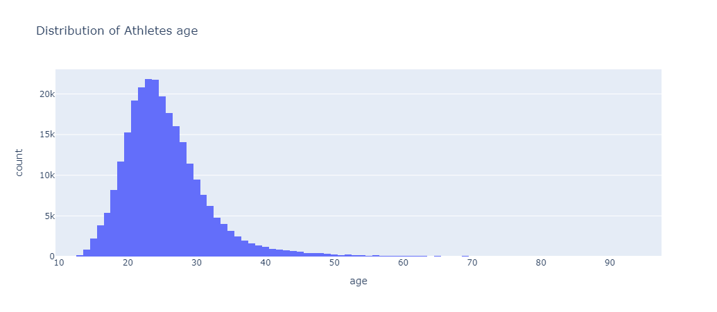 Figure 3: A histogram created using Plotly Express
We also have the option to use Graph Objects.
import plotly.graph_objects as go

fig = go.Figure(data=[go.Histogram(x=olympic_data.age)])

# add the title
fig.update_layout(title=dict(text="Distribution of Athletes age"))
fig.show()
Figure 4: A histogram created using Plotly Graph Objects.
Plotly express functions internally make calls to graph_objects, which returns a value. Therefore, Plotly express functions are useful because they enable users to draw data visualizations that would typically take more lines of code if they were to be drawn using graph_objects.
“The plotly.express module (usually imported as px) contains functions that can create entire figures at once and is referred to as Plotly Express or PX. Plotly Express is a built-in part of the Plotly library and is the recommended starting point for creating most common figures. Every Plotly Express function uses graph objects internally and returns a plotly.graph_objects.Figure instance.”
Source: Plotly Express in Python.
Despite Plotly express being the recommended entry point to the Plotly library, we will use graph_objects to customize the appearance of our histogram as it has more flexibility.
Currently, our histogram is pretty bland. Let’s spice it up by changing the fonts we use for our title and adding axis labels.
# Create histogram
fig = go.Figure(data=[go.Histogram(x=olympic_data.age)])
fig.update_layout(
# Set the global font
font = {
"family":"Times new Roman",
"size":16
},
# Update title font
title = {
"text": "Distribution of Athletes age",
"y": 0.9, # Sets the y position with respect to `yref`
"x": 0.5, # Sets the x position of title with respect to `xref`
"xanchor":"center", # Sets the title's horizontal alignment with respect to its x position
"yanchor": "top", # Sets the title's vertical alignment with respect to its y position. "
"font": { # Only configures font for title
"family":"Arial",
"size":20,
"color": "red"
}
}
)
# Add X and Y labels
fig.update_xaxes(title_text="Age")
fig.update_yaxes(title_text="Number of Athletes")
# Display plot
fig.show()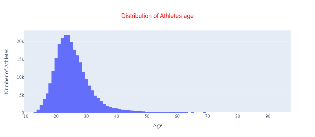 Figure 5: Plotly histogram with an updated title and axis labels added in.
Our histogram is more informative with these additions.
Next, let’s change the size of each bin.
# Create histogram
fig = go.Figure(data = [
go.Histogram(
x = olympic_data.age,
xbins=go.histogram.XBins(size=5) # Change the bin size to 5
)
]
)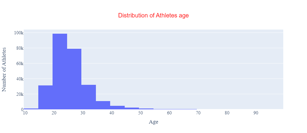 Figure 6: Plotly histogram with bin size equal to 5.
In the code above, we set the xbins parameter in the go.Histogram instance to a go.histogram.Xbins instance and defined the bin size we want as a parameter of that instance. Note we could have also performed this step using a dict object with compatible properties.
Lastly, let’s change the color of the bins to orange to make the visualization stand out a little.
# Create histogram
fig = go.Figure(data = [
go.Histogram(
x = olympic_data.age,
xbins=go.histogram.XBins(size=5), # Change the bin size
marker=go.histogram.Marker(color="orange") # Change the color
)
]
)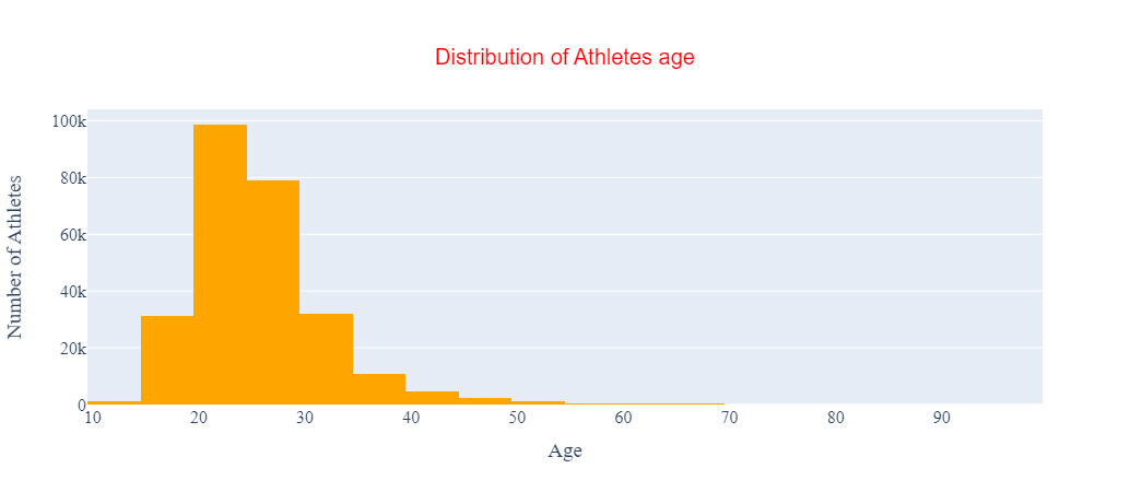 Figure 7: Plotly histogram with orange bins.
Much better.
In the code above, we set the marker parameter in the go.Histogram instance to a go.histogram.Marker instance and defined the color we want as a parameter of that instance.
However, there are many other customizations we can make to our Plotly histogram, such as adding hover text.
Text detailing what each bar represents is displayed whenever you hover over a bar in the current histogram - see Figure 8.
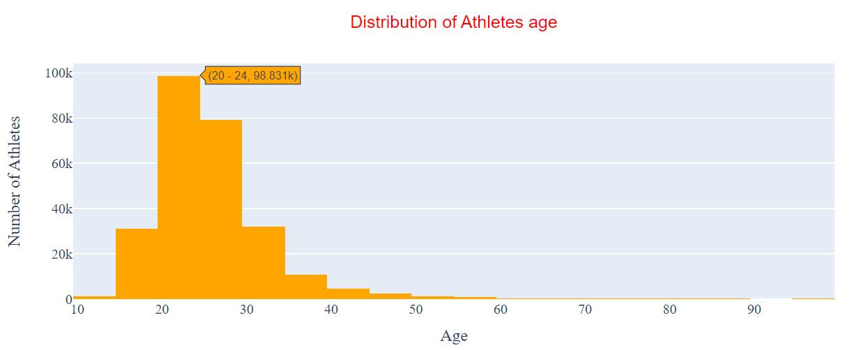
Figure 8: The current hover text displayed when hovering over our histogram.
This is not very intuitive. When we perform data visualization, we want our plots to be self-explanatory - even down to the hover text. Therefore, let’s update the information displayed when we hover over a bin.
# Create histogram
fig = go.Figure(data = [
go.Histogram(
x = olympic_data.age,
xbins=go.histogram.XBins(size=5), # Change the bin size
marker=go.histogram.Marker(color="orange"), # Change the color
hovertemplate="<br>".join([
"Age Range: %{x}",
"Number of Athletes: %{y}"]) # Make hover text more informative
)
]
)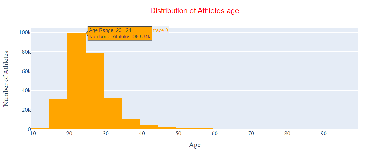 Figure 9: The updated hover text information.
The text shown when we hover over a bin is much more informative, which makes our visualization much easier to interpret. We did this by updating the hovertemplate parameter in our go.Histogram instance.
Earlier in the tutorial, we said we could expect to build a histogram including the age, height, weight, and year features. There’s no need for us to build an individual histogram for each one.
Instead, we could build a single histogram and add filter buttons that allow you to toggle through which feature to display on the visualization.
Here’s how it looks in code.
"""
Starter code provided by vestland on StackOverflow
Link: https://bit.ly/3ipqOMo
"""
# continuous features
continuous_vars = ["age", "height", "weight", "year"]
# plotly
fig = go.Figure()
# set up ONE trace
fig.add_trace(
go.Histogram(x = olympic_data.age,
xbins=go.histogram.XBins(size=5), # Change the bin size
marker=go.histogram.Marker(color="orange"), # Change the color
)
)
buttons = []
# button with one option for each dataframe
for col in continuous_vars:
buttons.append(dict(method='restyle',
label=col,
visible=True,
args=[{"x":[olympic_data[col]],
"type":'histogram', [0]],
)
)
# some adjustments to the updatemenus
updatemenu = []
your_menu = dict()
updatemenu.append(your_menu)
updatemenu[0]['buttons'] = buttons
updatemenu[0]['direction'] = 'down'
updatemenu[0]['showactive'] = True
# add dropdown menus to the figure
fig.update_layout(showlegend=False, updatemenus=updatemenu)
fig.show()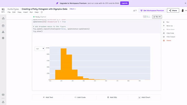 Figure 10: The histogram with filters applied that enable users to toggle through various features on a single visualization.
And there you have it; be sure to check out the Creating a Plotly Histogram with Olympics Data workbook, and play around with what we’ve built in this tutorial.
You now know how to create a histogram in Plotly Python; In this tutorial, we covered:
If you’re looking for further resources about creating histograms or using Plotly, check out the links below:
Plotly Courses
course
course
course
tutorial
Aditya Sharma
8 min
tutorial
Austin Chia
9 min
tutorial
Bekhruz Tuychiev
10 min
tutorial
Kevin Babitz
25 min
code-along
Justin Saddlemyer
code-along
Filip Schouwenaars