HomeTutorialsTableau

Tableau Parameters: An Introductory Guide and How to Use Them

Learn all about parameters in Tableau and how to use them.
Updated Apr 2024

If you're looking to create more complex data visualizations, you may have come across the term "parameters" in Tableau. This powerful feature allows users to interact with their data and customize visualizations on the fly.

In this guide, we'll introduce you to parameters in Tableau and show you how to use them effectively, as well as give some examples of how they can be used.

What Are Parameters in Tableau?

Parameters in Tableau are dynamic values that can be used to change the behavior of a visualization. They allow users to interact with their data by choosing from a list of predefined values or by entering specific values themselves.

parameter introduction example

Parameters can be used in calculations, filters, and reference lines, making them incredibly versatile for creating customized visualizations.

I like to think of them as customizable and flexible filters that can be applied to your entire dashboard or specific visualizations. You can learn more about data visualization in our Understanding Data Visualization course.

Parameters vs Filters: What's the Difference?

Filters are used to limit the data that is included in a visualization. For example, you may filter your data only to show sales from a certain region or time period.

Parameters, on the other hand, allow users to dynamically change certain aspects of a visualization, such as the color scheme or the level of detail shown.

While filters are fixed and set before a visualization is created, parameters can be changed on the fly while viewing the data.

Even though parameters and filters can control what data is shown in your visualizations, they work differently.

Step-by-step Guide on How to Create Tableau Parameters.

Prerequisites

  • Tableau Desktop/Public
  • Superstore dataset (comes with Tableau Desktop/Public)

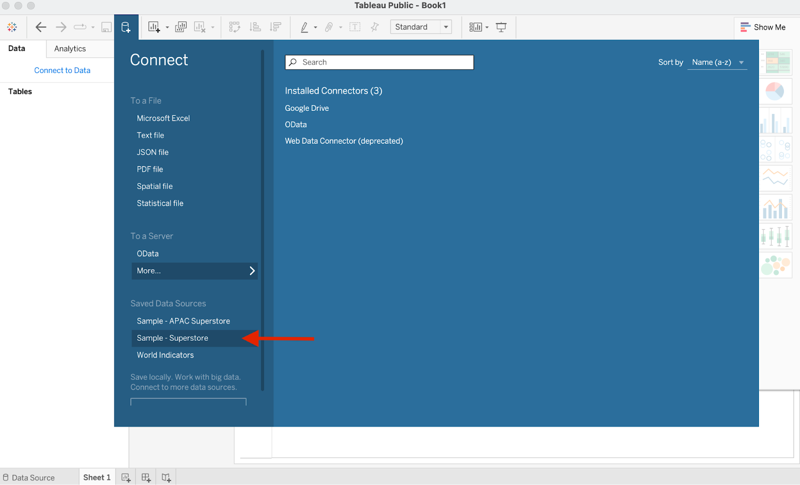
In this example, we’ll use Tableau Public, which is the free version of Tableau available for download.

We’ll also load up the Sample - Superstore dataset to demonstrate the use of parameters. Here’s how you can set that up:

Click "Connect to Data" at the top left corner of the screen and choose “Sample - Superstore” as your data source.

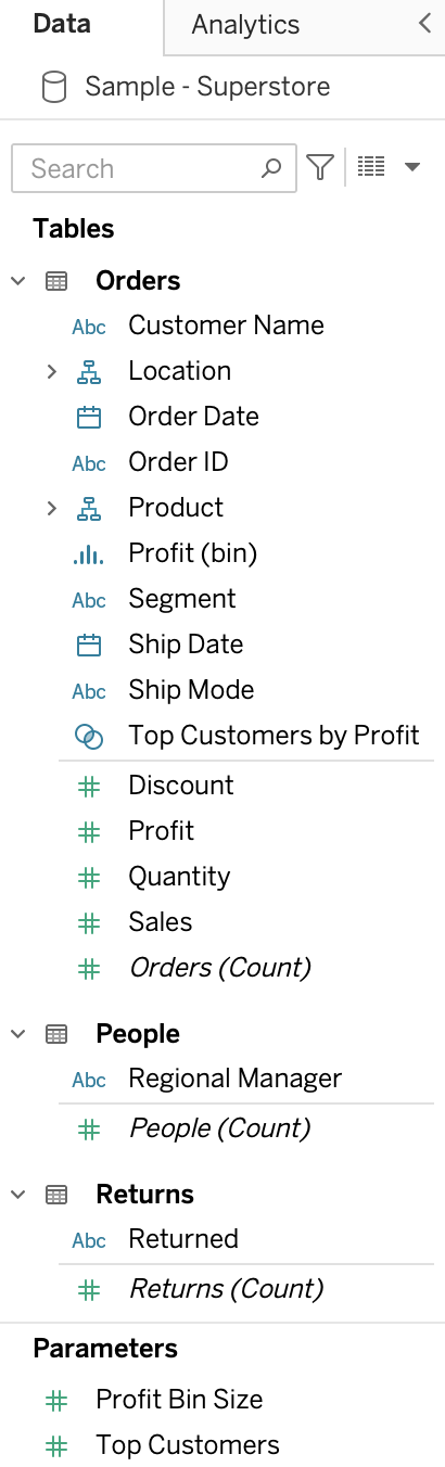
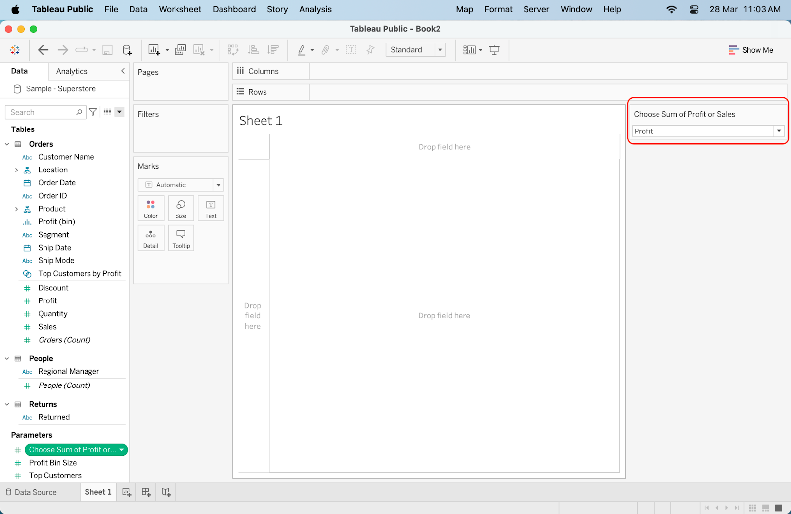
Let the data load up for a few seconds, and you’ll be ready to go. Your data pane should be filled up like this:

tableau superstore data pane

Let's now run through a simple example of how to create parameters in Tableau:

Step 1: Create a Parameter

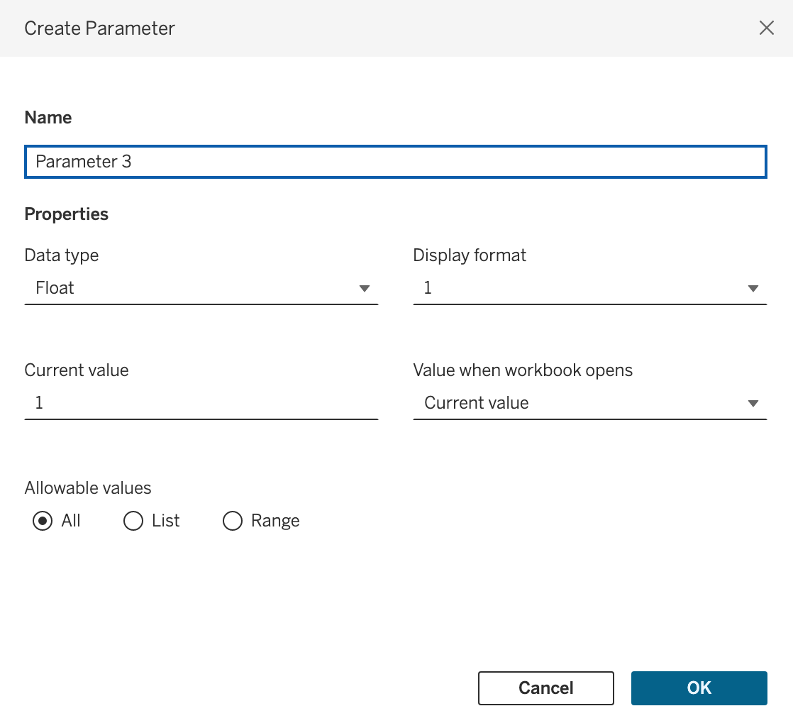
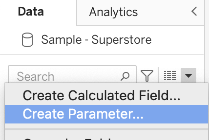
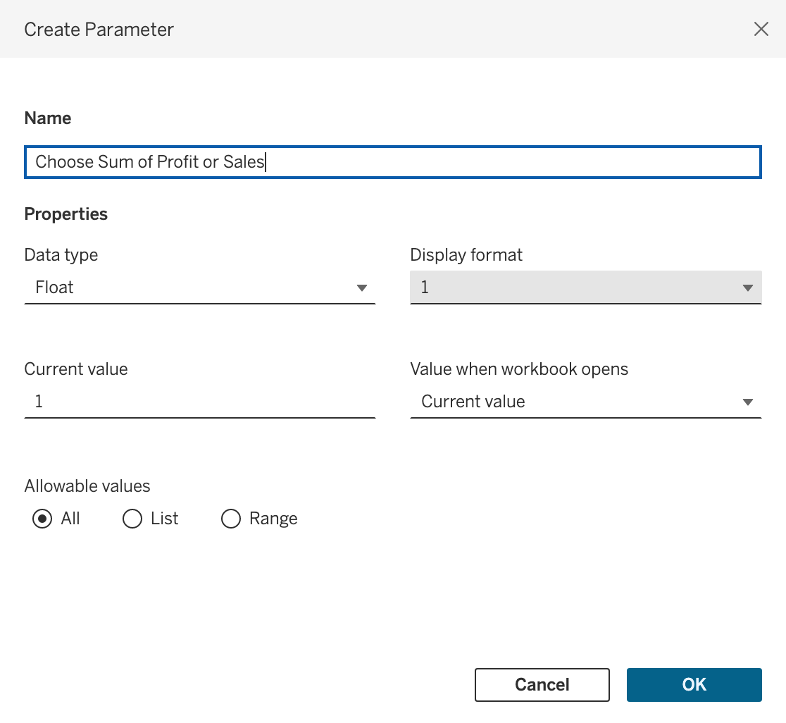
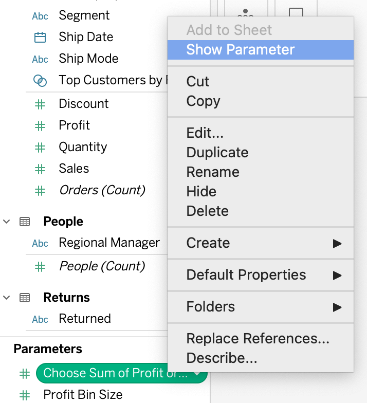
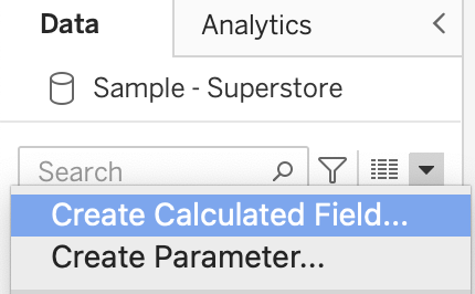
First, you'll have to create a parameter using the built-in function in Tableau.

Here's how to do it:

  1. In the data pane on the left, Select “Create Parameter” from the drop-down list. A popup window will appear.

create parameter

  1. Give your parameter a name like “Choose Sum of Profit or Sales.” This makes it more readable for your users.

create parameter window

  1. Leave your data type as Float.
  2. Select “List” from the "Allowable values" option. In the value table that appears, click on the table that reads “Click to Add.”

parameter list values

  1. Type in “1” in the first row, press "Enter" and type in “2” in the second row. Press "Enter" again. These are values that will be linked to your calculated field later on.

parameter list value

  1. In the “Display As” column in the table, rename the fields to "Profit" and "Sales" respectively as shown in the the image below.

parameters list display as values

  1. Click OK to save the parameter.

Step 2: Show the Parameter

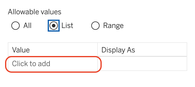
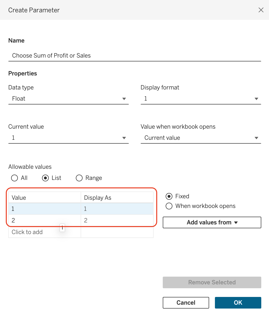
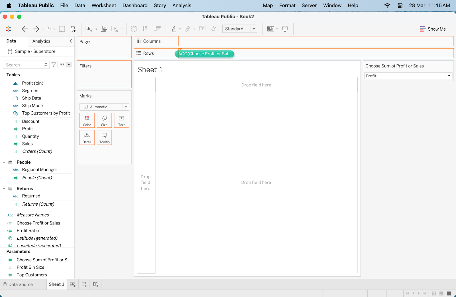
Next, you’ll want to show the parameter you’ve just created in your view. This action will be similar to adding a filter to a view.

  1. Right-click on the newly created parameter “Choose Sum of Profit or Sales.”

show parameter

  1. Click on "Show Parameter". A new parameter control selection box will appear on the right-hand side of the view.

parameter control

  1. Place the parameter control in a convenient location in your dashboard or worksheet.

Step 3: Create a Calculated Field

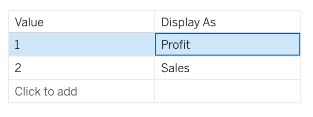
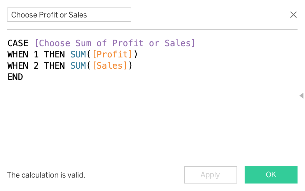
This step helps build the logic behind the parameter. It also helps link the user's selection to the right measure shown in the view.

  1. In the dropdown arrow in the "Data" pane, select "Create Calculated Field."

create calculated field for parameter

  1. Name your calculated field (e.g., "Choose Profit or Sales"). In the editor field, use a CASE statement to switch between measures based on the parameter's value.

For example:

CASE [Choose Sum of Profit or Sales]
WHEN 1 THEN [Profit]
WHEN 2 THEN [Sales]
END

This is how it should look:

calculated field choose profit or sales

  1. Click on "OK."

Step 4: Build Your Visualization

  1. Drag the newly created calculated field to the "Rows" shelf.

adding calculated field to rows shelf

  1. Add the "Location" field to the "Columns" shelf. A bar chart should appear automatically.

adding location to columns shelf

Step 6: Customize and Refine

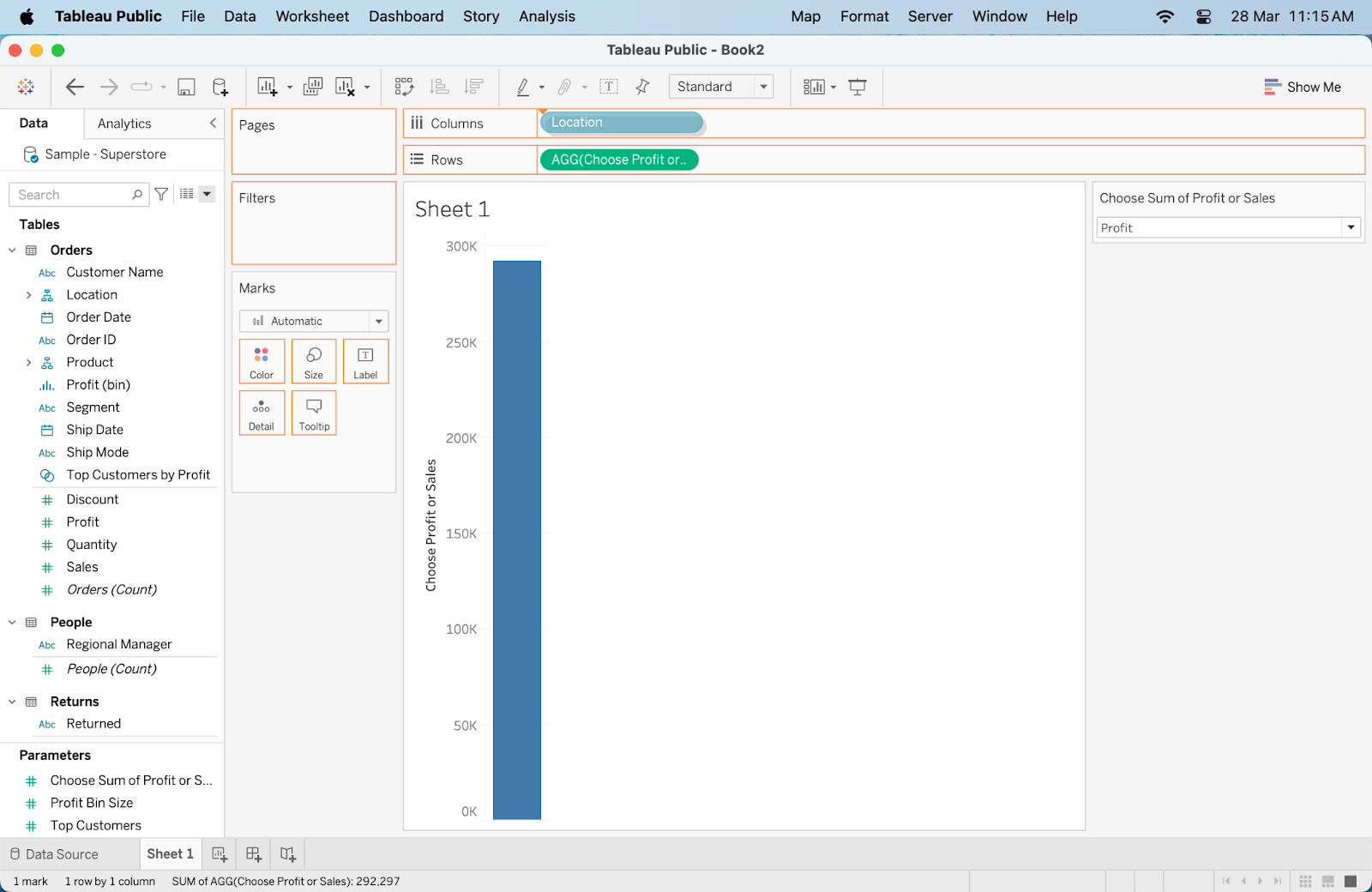
The last step is to customize and refine your visualization as desired, using any formatting, filters, or other options available in Tableau.

This creates a better user experience for your dashboard viewers, which can make a big difference in data storytelling.

Let's look at some of the things you can refine:

  1. Customize the look and feel: Adjust colors, fonts, and labels to make your visualization more informative and appealing.
  2. Hide the y-axis to make the chart more clean and intuitive.
  3. Enhance Interactivity: Consider adding tooltips, filters, or additional parameters to make your visualization more interactive.
  4. Create Dashboards: Combine multiple visualizations into a dashboard for a comprehensive view of your data, adding actions for interactivity between components.

There you have it! You’ve now created your first parameter. Try making different selections using the parameter control you’ve created. The view of the bar chart should change according to your selection.

Advanced Parameter Techniques

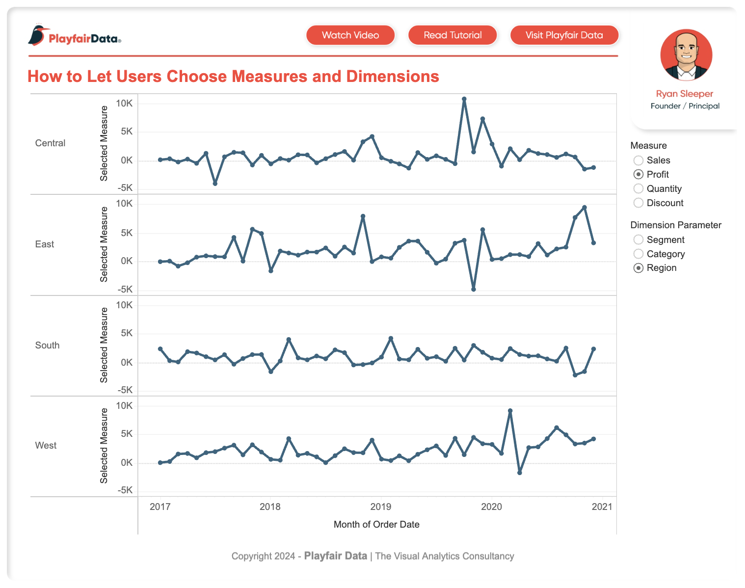
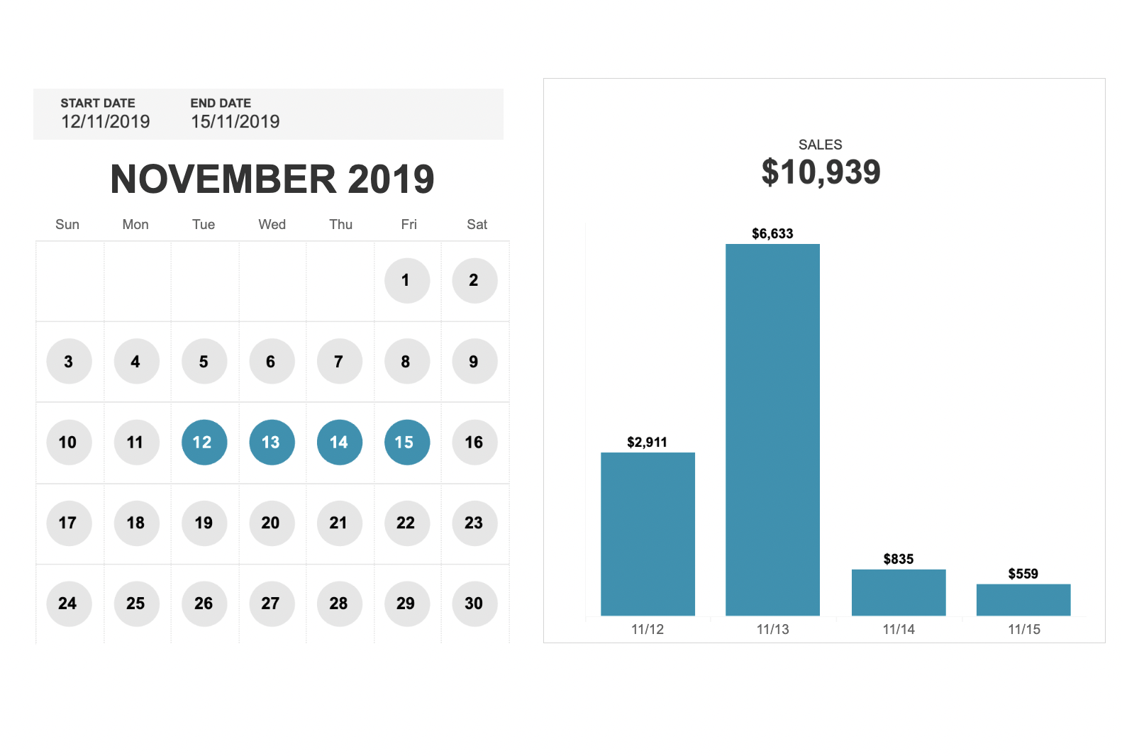
Here are some other ways of leveraging parameters for more complex data manipulation and analysis:

  1. Conditional formatting using parameters: You can use parameters to change the color palette or the formatting of a visualization based on specific conditions, such as thresholds or trend lines.
  2. Switching between different measures and dimensions: Parameters can be used to change the measure or dimension being displayed in a visualization, allowing for easy comparison between different data points.
  3. Using parameter actions to use measure names in calculated fields: Parameters can also be used to give the dashboard users more flexibility by giving them the choice of which measures they would like to see.
  4. Show/hide measures: By using a parameter, you can create a toggle button to show or hide certain measures in your visualization, providing more control and customization options for the user.

If you’re keen to learn more about these advanced features, try working on a Tabelau project and learn as you go.

Real-world Examples of Parameters in Action

To further illustrate the power of parameters, here are some real-world examples of how companies have used them to enhance their data visualizations:

  1. Measure and Dimension Selector: This dashboard shows how parameters can be used to allow users to switch between measures and dimensions dynamically without the need for multiple sheets.

measure selector example

  1. Calendar Selector: Parameters can also be used to create a customizable calendar selector that allows users to switch between different time periods in their data visualizations.

calendar selector example

Best Practices for Using Parameters

If you're using parameters for the first time, here are some best practices to keep in mind:

  1. Use descriptive parameter names to make it clear what they control (e.g., "Select Measure" instead of "Parameter 1").
  2. Consider adding a default value for your parameter so that your visualization has a starting point before the user interacts with it.
  3. Test your calculations and visualizations thoroughly to ensure they are dynamic and responsive to the parameter changes.
  4. Document your parameters and their purpose for future reference or if you share your work with others.

Tips for Naming and Organizing Parameters

Naming your parameters with the right names can make all the difference in helping with their usability and maintenance:

Here are some tips to follow:

1. Be Descriptive and Precise

  • Clear Purpose: Names should clearly describe the parameter's purpose or what it controls. For example, "Select Measure" is more descriptive than just "Measure" because it implies that the parameter allows for the selection among multiple measures.
  • Specificity: If a parameter targets a specific aspect or dataset, include that in the name, e.g., "Sales Trend Period" instead of just "Period."

2. Use Simple and Understandable Language

  • Avoid Jargon: Unless your audience is familiar with certain terms, avoid technical jargon or acronyms that might be confusing.
  • User-Friendly: Opt for words that are easy to understand for someone with little to no background in the data being analyzed.

See this dashboard designs checklist to get a better understanding of user-friendly interfaces.

3. Maintain Consistency

  • Naming Conventions: Establish and follow consistent naming conventions across your parameters. This could relate to capitalization, use of spaces vs. underscores, or prefixes/suffixes (e.g., "Param - Sales Region" vs. "Param - Product Category").
  • Similar Functionality: For parameters with similar functionality, use parallel structure in their names to help users quickly grasp their purpose.

4. Include Units of Measure Where Applicable

  • Clarify Units: If the parameter is used to adjust a numeric value, including the unit of measure can be very helpful (e.g., "Maximum Displayed Sales (USD)" or "Temperature Threshold (°F)").
  • Precision: This helps in setting the right expectations about the data input or output.

Here are some good examples of names you should follow:

  • "Select Measure"
  • "Select Time Period"
  • "Product Category Picker"
  • "Display Top N Items"
  • "Show Detailed Labels: Yes/No"

Wrapping Up

Parameters are a versatile and powerful tool in Tableau that can greatly enhance the interactivity and flexibility of your data visualizations.

Through its flexibility, you're able to create dynamic and customizable dashboards that cater to different user needs and preferences.

If you've learned something new through this tutorial guide, make sure to start incorporating parameters in your next dashboard creation!

Thinking of learning a little deeper? Try our Analyzing Data in Tableau course next! Want a more structured approach to learning all Tableau has to offer? Then, the Tableau Fundamentals skill track might be for you.


Photo of Austin Chia
Author
Austin Chia

I'm Austin, a blogger and tech writer with years of experience both as a data scientist and a data analyst in healthcare. Starting my tech journey with a background in biology, I now help others make the same transition through my tech blog. My passion for technology has led me to my writing contributions to dozens of SaaS companies, inspiring others and sharing my experiences.

Topics

Continue Your Tableau Journey Today!

Course

Introduction to Tableau

6 hr
213.2K
Start your Tableau journey with our Introduction to Tableau course. Discover Tableau basics such as its features and dashboards.
See DetailsRight Arrow
Start Course
See MoreRight Arrow
Related

Tableau Certifications Guide: Certification Levels, Costs & How to Pass

Unlock Tableau certification success! Explore certification levels, costs, and expert strategies to pass. Start your journey to becoming a Tableau pro today.
Adel Nehme's photo

Adel Nehme

15 min

Top 32 AWS Interview Questions and Answers For 2024

A complete guide to exploring the basic, intermediate, and advanced AWS interview questions, along with questions based on real-world situations. It covers all the areas, ensuring a well-rounded preparation strategy.
Zoumana Keita 's photo

Zoumana Keita

15 min

Looker vs Tableau: Which is The Best BI Tool For Your Needs?

An in-depth comparison of Looker vs Tableau for your organization's data-driven success.
Nisha Arya Ahmed's photo

Nisha Arya Ahmed

9 min

Becoming Remarkable with Guy Kawasaki, Author and Chief Evangelist at Canva

Richie and Guy explore the concept of being remarkable, growth, grit and grace, the importance of experiential learning, imposter syndrome, finding your passion, how to network and find remarkable people, measuring success through benevolent impact and much more. 
Richie Cotton's photo

Richie Cotton

55 min

Tableau Prep Builder: A Comprehensive Guide to Data Preparation

Learn all about Tableau Prep Builder and its functions in preparing and loading data into Tableau.
Austin Chia's photo

Austin Chia

11 min

LOD Expressions in Tableau: A Tutorial With Examples

Learn more about LOD expressions in Tableau and how to use them.
Austin Chia's photo

Austin Chia

See MoreSee More