
Maps have been used for centuries to help people navigate and understand their surroundings. In the age of big data, maps have become an essential tool for data visualization. They allow us to visualize data in a way that is intuitive, interactive, and easy to understand. Maps can help us identify patterns and relationships that might be difficult to see in other types of visualizations.
Plotly is a powerful data visualization library for Python that allows you to create a wide range of interactive visualizations, including maps. One of the advantages of Plotly is that it is designed to work seamlessly with other Python libraries, such as Pandas and NumPy. This makes it easy to import and manipulate data and to create visualizations that are customized to your specific needs. If you want to learn Plotly, check out our Introduction to Data Visualization with Plotly in Python course.
In this tutorial, you will learn step-by-step how to create and customize simple and interactive maps using Plotly in Python. You will also learn how to create Choropleth maps, a specific type of map that uses color-coding to represent data for specific geographic areas, such as countries, states, or cities.
Common Plotly Map Visualizations
Let’s start by looking at some of the different types of Plotly maps you can create.
ScatterGeo Plot
The Scattergeo() function is used to create a scatter plot on a geographic map. This means that it can help you plot points on a map where each point represents a specific geographic location, like a city or a landmark.
For example, if you have a dataset that contains the latitude and longitude coordinates of different cities around the world, you can use Scattergeo() to plot each city on a world map.
Each point on the map will represent the location of a specific city, and you can customize the size, color, and shape of each point to represent different characteristics of the cities, such as population or temperature.
This function is commonly used in data visualization and analysis applications, such as weather forecasting, population analysis, and business mapping. It can help you visualize data in a more meaningful way by showing the spatial distribution of your data points and highlighting patterns or trends that may not be visible in a table or a chart.
Creating a ScatterGeo plot in Plotly example
import plotly.express as px
import pandas as pd
# Import data from USGS
data = pd.read_csv('https://earthquake.usgs.gov/earthquakes/feed/v1.0/summary/all_month.csv')
# Drop rows with missing or invalid values in the 'mag' column
data = data.dropna(subset=['mag'])
data = data[data.mag >= 0]
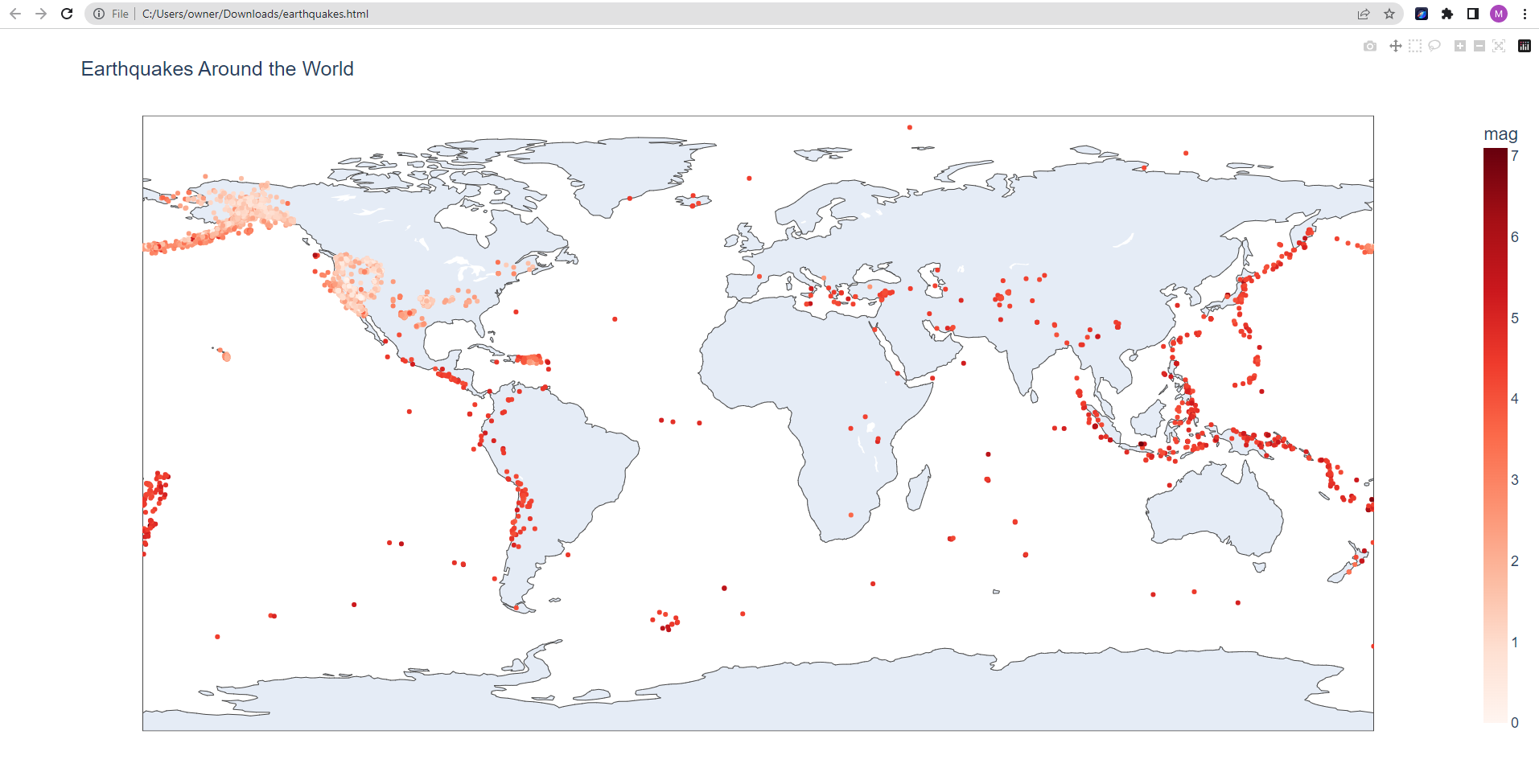
# Create scatter map
fig = px.scatter_geo(data, lat='latitude', lon='longitude', color='mag',
hover_name='place', #size='mag',
title='Earthquakes Around the World')
fig.show()Output:
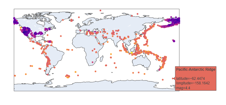
This code example uses Plotly to create an interactive geo map of earthquake locations worldwide. It imports earthquake data from the USGS website into a pandas DataFrame and drops any rows with missing or invalid magnitude values.
The code then uses px.scatter_geo method to create a scatter map that shows earthquake locations, with larger earthquakes shown in darker colors. The hover_name parameter is set to show the location name when hovering over a marker.
Finally, the code sets the map title and displays the map using fig.show(). This type of map can be used to explore earthquake patterns and gain insight into global seismic activity.
Customizing basic plots
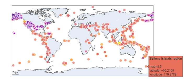
1. Change the color scale: The color parameter in the scatter_geo function maps the magnitude of the earthquakes to the color of the markers. You can customize the color scale to better represent the magnitude values.
fig = px.scatter_geo(data, lat='latitude', lon='longitude', color='mag',
                     hover_name='place', color_continuous_scale='reds',
                     title='Earthquakes Around the World')
fig.show()Output:
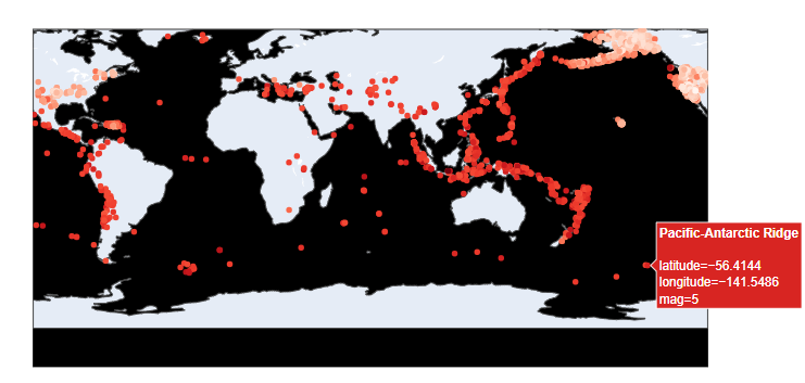
2. Change the marker size: You can customize the size of the markers to better represent the magnitude of the earthquakes.
fig = px.scatter_geo(data, lat='latitude', lon='longitude', color='mag',
                     hover_name='place', size='mag', size_max=10,
                     title='Earthquakes Around the World')
fig.show()
Output:
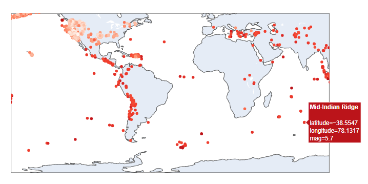
3. Change the background color: You can change the background color of the map to make it more visually appealing.
fig = px.scatter_geo(data, lat='latitude', lon='longitude', color='mag',
                     hover_name='place', color_continuous_scale='reds',
                     title='Earthquakes Around the World')
fig.update_layout(geo=dict(bgcolor='black'))
fig.show()
If you want to learn more about the possibilities of visualization and advanced customization in Plotly check out our Python Plotly Express Tutorial: Unlock Beautiful Visualizations by Bekhruz Tuychiev.
Saving the map as an interactive HTML file
You can save a Plotly figure as an HTML file using the write_html() function from the plotly.io module. Here's an example:
import plotly.io as pio
pio.write_html(fig, file='earthquakes.html', auto_open=True)
Choropleth maps
A choropleth map is a type of map that uses different colors or shades to represent data values in different regions, such as countries, states, or provinces. In a choropleth map, each region is colored according to the value of a specific data variable, such as population, income, or temperature.
Choropleth maps can be used in a variety of applications, such as election mapping, demographic analysis, and geographic data visualization. They can help you see patterns and trends in your data that may not be apparent in a table or a chart and provide a powerful way to communicate information to your audience.
While both the scatter_geo and Choropleth functions in Plotly are used to create geographic visualizations, they are different in terms of the types of data they are best suited for and the way they represent that data on a map. The scatter_geo function is best used for plotting individual data points on a map, where each point represents a specific geographic location, such as a city, a landmark, or an earthquake.
In contrast, the Choropleth function is used to visualize data that is aggregated or averaged across regions, such as countries, states, or provinces. Each region is shaded or colored according to the value of a specific data variable, such as population density, average income, or unemployment rate.
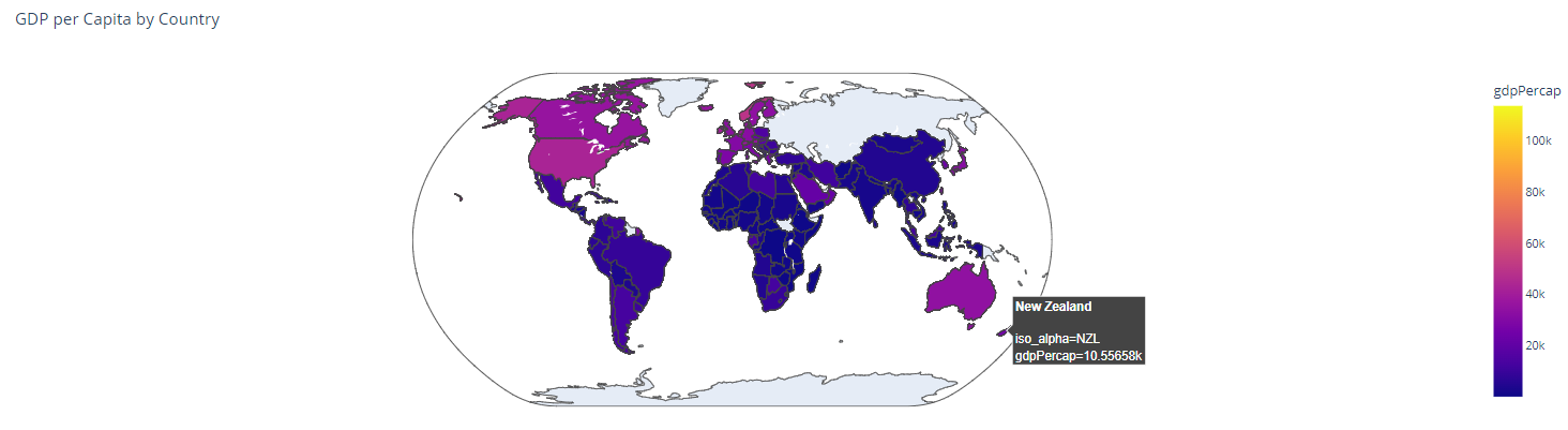
Creating a Choropleth map in Plotly example
import plotly.express as px
import pandas as pd
# Import data from GitHub
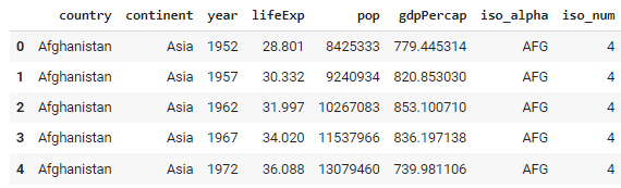
data = pd.read_csv('https://raw.githubusercontent.com/plotly/datasets/master/gapminder_with_codes.csv')
# Create basic choropleth map
fig = px.choropleth(data, locations='iso_alpha', color='gdpPercap', hover_name='country',
projection='natural earth', title='GDP per Capita by Country')
fig.show()
Output:
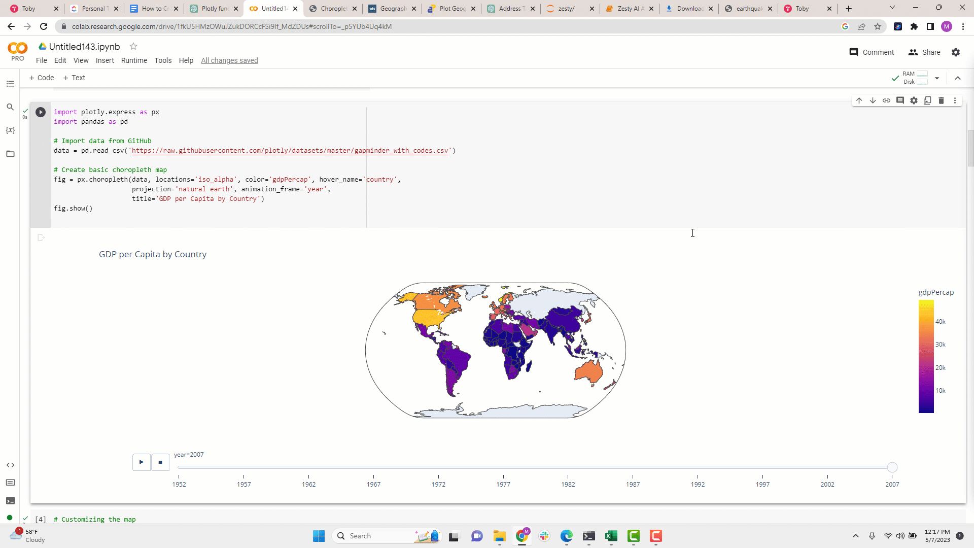
Notice that we have a time frame in our dataframe year. It goes from 1952 to 2007. We can use this dimension to animate the visualization. See the example below.
Sample Dataset:
import plotly.express as px
import pandas as pd


# Import data from GitHub
data = pd.read_csv('https://raw.githubusercontent.com/plotly/datasets/master/gapminder_with_codes.csv')


# Create basic choropleth map
fig = px.choropleth(data, locations='iso_alpha', color='gdpPercap', hover_name='country',
                    projection='natural earth', animation_frame='year',
                    title='GDP per Capita by Country')
fig.show()Output:
Conclusion
Maps are essential for data visualization in the era of big data. Plotly is a powerful data visualization library for Python that lets you create a range of interactive maps. With Scattergeo, you can plot data points that correspond to specific geographic locations, while Choropleth is ideal for visualizing aggregated data across different dimensions such as region, city, country, etc.
If you're interested in exploring more advanced customization options in Plotly or want to learn more about its possibilities, Check out the Python Plotly Express Cheat Sheet, which provides a quick reference to the most commonly used Plotly functions and options.

blog
Intermediate Python for Data Science: Matplotlib

Karlijn Willems
11 min
tutorial
Introduction to Plotting with Matplotlib in Python
Kevin Babitz
25 min
tutorial
Line Plots in MatplotLib with Python

Arunn Thevapalan
11 min
tutorial
Python Plotly Express Tutorial: Unlock Beautiful Visualizations

Bekhruz Tuychiev
10 min
tutorial
How to Create a Histogram with Plotly

Kurtis Pykes
12 min
code-along
Data Visualization in Python for Absolute Beginners

Justin Saddlemyer