By continuing, you accept our Terms of Use, our Privacy Policy and that your data is stored in the USA.
HomeResourcesWebinars

RADAR: The Analytics Edition - The Art of Data Storytelling: Driving Impact with Analytics

Webinar

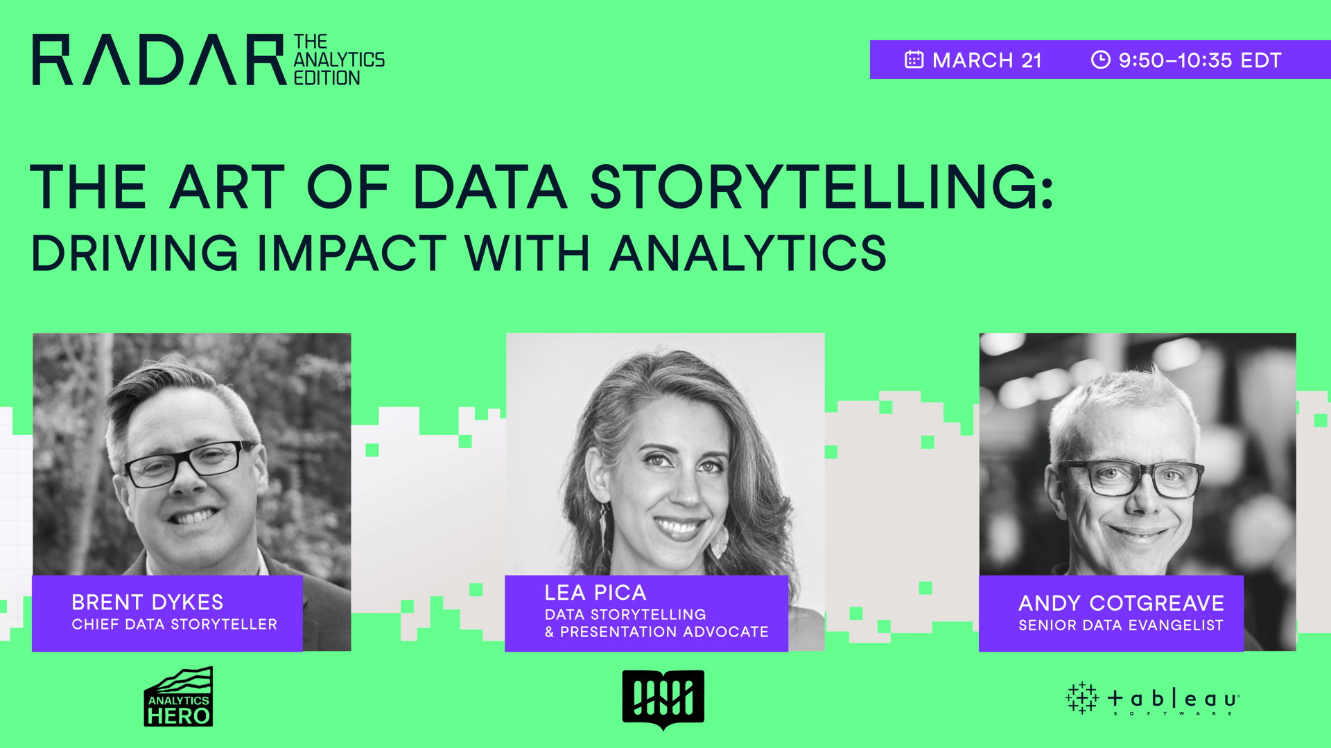
Driving impact with analytics goes beyond numbers and graphs; it's about telling a story that resonates. In this session, Brent Dykes, author of "Effective Data Storytelling" & the Founder & Chief Data Storyteller at AnalyticsHero, Lea Pica, author of "Present Beyond Measure" & the Founder at Story-driven by Data, and Andy Cotgreave, co-author of "The Big Book of Dashboards" and Senior Data Evangelist at Tableau, will unveil how to transform data into compelling narratives. They will shed light on the art of blending analytics with storytelling, a key to making data-driven insights both understandable and influential within any organization.

Summary

Data storytelling is vital for analysts aiming to translate their insights into meaningful actions. Without a compelling narrative, even the most insightful data can fail to make an impact. The webinar explored the essential components of data storytelling, stressing the necessity of a well-structured story arc. This narrative begins with a strong hook and builds towards a climax, all while maintaining engagement and delivering the 'aha' moment. Expert speakers emphasized the importance of adapting data stories to different audiences, noting the differences between technical and non-technical listeners. Additionally, they discussed common errors in data presentation, highlighting the need for clarity and the reduction of jargon. The session also looked at the role of data visualization as a tool for enhancing storytelling, focusing on simplicity and audience understanding. Lastly, the webinar touched on the implications of using generative AI in data storytelling, urging caution and highlighting its current limitations. Leah Peeker noted, "Generative AI is a tool like PowerPoint; it requires skill and intention to be used effectively."

Key Takeaways:

  • Data storytelling converts raw data into compelling narratives that prompt action.
  • Adapting your data story to your audience is vital; different audiences require different approaches.
  • Common errors in data presentations include providing too much information and failing to engage the audience.
  • Effective data visualization should be simple, clear, and suitable for the audience.
  • Generative AI can assist with data storytelling, but it has significant limitations and should be used carefully.

Deep Dives

Importance of Data Storytelling

Data storytelling goes beyond simply p ...
Read More

resenting numbers; it involves crafting a narrative that educates and engages. According to Andy Cockereve, "Data doesn't speak for itself... the second we take those atoms of information, we are curating and editing the insights to convey information to make decisions." This process involves creating a story arc, which includes a hook to engage the audience, a buildup to a climax, and a conclusion offering actionable insights. The goal is to make the data memorable and actionable, changing it from mere statistics into a story that evokes emotion and prompts change.

Adapting Stories for Different Audiences

Understanding your audience is key to effective data storytelling. As Brent Dykes noted, "You have to know which audience you are targeting and design for those people." Different audiences have varying levels of data literacy; therefore, the complexity and focus of the story must be adjusted accordingly. A technical audience might appreciate detailed analyses, while a business audience might need the implications spelled out in simpler terms. Adapting the narrative ensures that the message is not only heard but understood and acted upon. Leah Peeker emphasized the importance of empathy, suggesting that "pretend you're explaining to a 12-year-old" to ensure clarity and accessibility.

Common Mistakes in Data Presentations

Presenting data is packed with potential errors, from overly complex charts to unclear conclusions. Andy Cockereve recounted a common error: "If you copy and paste a dashboard onto a PowerPoint slide and say, 'As you can see...,' that's a failure." Clear communication requires not only simplifying data visuals but also ensuring that each slide or data point has a clear purpose and takeaway. It's vital to avoid the curse of knowledge, where presenters assume their audience understands the data as well as they do. Instead, presenters should focus on delivering a clear, concise message that guides the audience through the data story.

Data Visualization Best Practices

Data visualization is a potent tool in storytelling, capable of making complex data accessible and engaging. Leah Peeker explained, "The visualization you choose absolutely matters." The key is to select visuals that are appropriate for the audience's level of expertise and the story being told. Overly complex graphs can confuse rather than clarify, so simplicity is often best. Visuals should highlight the key points of the data story, guiding the audience to the intended conclusions. As Andy Cockereve pointed out, even simple bar charts can effectively convey insights when designed with care and intention.

Brent Dykes Headshot
Brent Dykes

Senior Director of Insights and Data Storytelling at Blast Analytics

Lea Pica Headshot
Lea Pica

Founder, Story-driven by Data

Andy Cotgreave Headshot
Andy Cotgreave

Senior Data Evangelist at Tableau

View More Webinars

Related

webinar

The Art of Data Storytelling: Driving Impact with Analytics

In this session, three industry leaders will shed light on the art of blending analytics with storytelling, a key to making data-driven insights both understandable and influential within any organization.

webinar

Radar Data & AI Literacy Edition: From Insight to Impact with Data Storytelling

In this session, join Gary Wolf, Lea Pica and Jason Forrest as they delve into the world of data stories and how they play out in our lives. 

webinar

RADAR: The Analytics Edition - From Data Governance to Data Discoverability: Building Trust in Data Within Your Organization

In this session, industry leaders share strategies for improving data quality, fostering a culture of trust around data, and balancing robust governance with the need for accessible, high-quality data.

webinar

RADAR: The Analytics Edition - Building a Learning Culture for Analytics Functions

In the session, Russell Johnson, Denisse Groenendaal-Lopez and Mark Stern address the importance of fostering a learning environment for driving success with analytics.

webinar

RADAR: The Analytics Edition - Scaling Data ROI: Driving Analytics Adoption Within Your Organization

In this session, Laura Gent Felker, Tiffany Perkins-Munn, and Omar Khawaja will explore best practices when it comes to scaling analytics adoption within the wider organization.

webinar

RADAR: The Analytics Edition - Opening Session: A Tipping Point in Data Democratization

In this session, Jonathan Cornelissen, CEO at DataCamp, will unpack how we are at a tipping point in data democratization, and how individuals and organizations can succeed with analytics in an AI-driven world.

Hands-on learning experience

Companies using DataCamp achieve course completion rates 6X higher than traditional online course providers

Learn More

Upskill your teams in data science and analytics

Learn More

Join 5,000+ companies and 80% of the Fortune 1000 who use DataCamp to upskill their teams.

Don’t just take our word for it.