Pular para o conteúdo principal

Preencha os detalhes para desbloquear o webinar

Ao continuar, você aceita nossos Termos de Uso, nossa Política de Privacidade e que seus dados são armazenados nos EUA.

Falantes

Saiba Mais

Treinar 2 ou mais pessoas?

Obtenha acesso à biblioteca completa do DataCamp, com relatórios, atribuições, projetos e muito mais centralizados
Experimente O DataCamp for BusinessPara uma solução sob medida , agende uma demonstração.

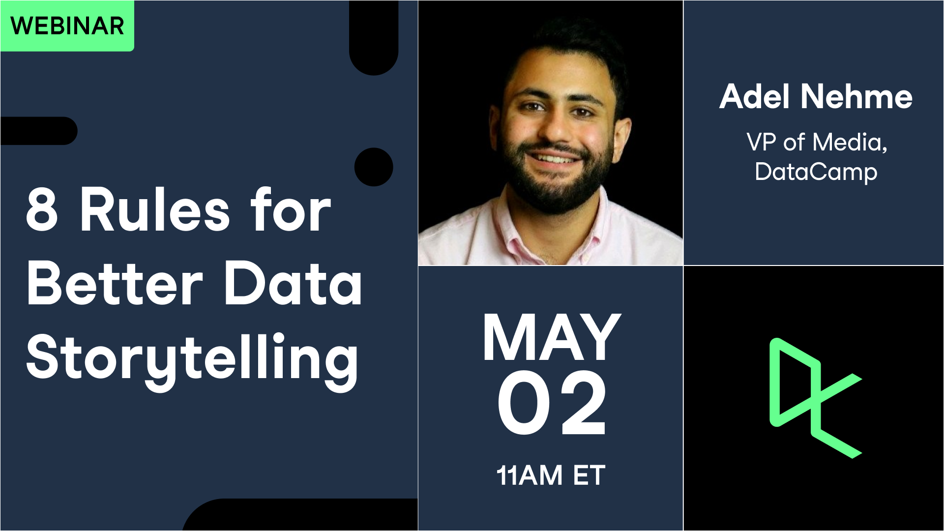
8 Rules for Better Data Storytelling

May 2024
Compartilhar

No matter how impactful your analysis and insights may be—gaining buy-in from various stakeholders is paramount for the success and adoption of data science within organizations. As such, it is the responsibility of data practitioners to translate their findings that persuade and drive actions out of insights. This is where data storytelling comes in.

In this session, Adel Nehme, VP of Media at DataCamp, will share 8 practical steps and best practices for telling better data stories that drive business impact. He’ll dive into the types of visualizations to choose for a data story, how to craft audience-specific messages, how to develop a narrative around data stories, and more.

Key Takeaways:

  • A discussion of how data storytelling empowers data practitioners to become impactful
  • 8 best practices anyone can adopt to become a better data storyteller
  • Resources to further your data visualization and data storytelling skills

Resources

Summary

In an environment brimming with data, the skill to tell a compelling data story is essential for driving significant changes. Data storytelling is defined as the concluding stage of analytics, where intricate data insights are converted into comprehensible and persuasive narratives. The webinar discussed eight vital rules for improved data storytelling, emphasizing the necessity of choosing suitable visualizations and creating effective narratives. Experts like Brent Dykes and Andy Cotgrave highlight the potential of storytelling to structure arguments and influence decisions within organizations. The session underscored practical techniques for selecting the appropriate visualizations, reducing clutter, and using color innovatively. It also explored narrative structures that boost the clarity and impact of data presentations. A consistent theme was the need for empathy towards the audience, adjusting stories to their data literacy and concerns. Ethical storytelling practices were also emphasized to avoid deceptive narratives. Ultimately, the session motivated participants to continually refine their storytelling skills as they adapt to the continually changing environment of data analytics.

Key Takeaways:

  • Data storytelling is the concluding step in analytics that translates insights into influential narratives.
  • Choose visualizations based on the data story you aim to tell, not the visuals you wish to use.
  • Reduce clutter in visualizations to maintain a high signal-to-ink ratio.
  • Use color innovatively to highlight key data points and distinguish between groups.
  • Acknowledge your audience's data literacy to adjust your narrative effectively.

Deep Dives

Choosing the Right Visualization

The first rule of effective data storytelling str ...
Ler Mais

esses the importance of selecting the suitable visualization for your data narrative. Idel, VP of Media at DataCamp, explains that data visualizations should be chosen based on the data's nature and the story you aim to tell. For example, bar charts are perfect for comparing categories, while line charts effectively depict changes over time. Scatter plots are great for demonstrating relationships between variables. The goal is to start with the data and work backward to find the visualization that best communicates the insights. As Idel puts it, "Don't start with what visualizations you wish to show. Think about what data you're trying to show and adapt your visualization to fit the data."

Minimizing Clutter in Visualizations

Clutter can obscure the message in data visualizations, making it essential to keep them simple. The session highlighted techniques to reduce unnecessary elements in visuals, such as removing redundant labels, borders, and needless effects like shadows. The goal is to maximize the signal-to-ink ratio, where the ink used in the visualization directly contributes to conveying the message. As Idel demonstrated, simplifying a colorful and cluttered chart into a cleaner version can significantly enhance clarity and focus, allowing the audience to grasp the insights more effectively.

Using Colors Creatively

Colors can be powerful tools in data storytelling when used strategically. Innovative use of color helps distinguish between groups or highlight intensity within data sets. The session provided examples from electoral data and COVID-19 visualizations, demonstrating how color can instantly communicate complex information. By associating colors with specific categories or highlighting key data points, storytellers can guide the audience's attention and enhance understanding. This innovative approach to color not only aids in visual distinction but also taps into the audience's subconscious associations, making the data story more memorable.

Crafting Effective Narratives

An effective narrative is as essential as the data itself in storytelling. Knowing your audience is the first step in crafting a compelling narrative. Different stakeholders require different levels of detail and focus. Executives, for example, prioritize business outcomes over technical details, while data scientists may seek rigor in insights. The session stressed starting with a clear goal and avoiding overwhelming the audience with unnecessary data. Moreover, the narrative should avoid deceptive representations, ensuring axes scales are appropriate and data contexts are accurately represented. As Idel advised, "Practice empathy with your audience" to ensure the story resonates and achieves its intended impact.


Relacionado

white paper

8 Rules for Better Data Storytelling

8 Rules for Better Data Storytelling

white paper

8 Rules for Better Data Storytelling

8 Rules for Better Data Storytelling

webinar

8 Rules for Effective Data Storytelling

Best practices for crafting actionable data stories that drive business impact.

webinar

How to Write Effective Data Stories

In the second of three data storytelling sessions, a leading data journalist will teach you how to write about data.

webinar

Effective Data Storytelling for Financial Services

Learn simple communication techniques to make your ideas understood, whether you are speaking to a technical audience or a business audience.

webinar

From Insight to Impact with Data Storytelling

In this session, join Gary Wolf, Lea Pica and Jason Forrest as they delve into the world of data stories and how they play out in our lives. 

Hands-on learning experience

Companies using DataCamp achieve course completion rates 6X higher than traditional online course providers

Learn More

Upskill your teams in data science and analytics

Learn More

Join 5,000+ companies and 80% of the Fortune 1000 who use DataCamp to upskill their teams.

Don’t just take our word for it.